Archive for the ‘bunk2’ Category


DS106: I’ll Have What She’s Having!

Saturday, June 23rd, 2012

One of this week’s require assignment is Audio Assignments 36—Create a ds106 radio bumper (2 stars). I confess that I have not yet tuned into ds106 radio. To get a sense of some of the other bumpers that have been created I started trolling my way through other campers blogs, noting what I liked or didn’t about each piece.

Ultimately, I wanted to do something that would stand out and be attention getting. I don’t like the sound of my recorded voice so I wanted to minimize my vocal participation. I started thinking through song lyrics and tunes that might be cool to smash together, but my technical skills are inhibiting me.

Then I remembered a classic scene from the movie “When Harry Met Sally”. You know the one…in the restaurant, Meg Ryan’s character Sally shows Harry her version of a fake orgasm. It was a great scene that makes many people giggle and blush. When Sally is done, an older woman at another table tells the waitress “I’ll have what she’s having.”

I thought that sounds effects of the fake orgasm and the older woman’s line would be a great way to peak curiosity about ds106.

DS106 I’ll Have What She’s Having… by Chanda Sorrell Cowger

Once I had my idea, I went in search of the sound clip from the movie. Finding it on JoBlo.com, I downloaded the mp3 file to my laptop so that I import it into Audacity. Once in the program, I listened to it a few times, trimming it and looking for where to incorporate the DS106 plug. I was about to shortened the pause in the clip, when I decide to just use that break in the sound to insert the words DS106 there. I like the way it turned out. Simple to do and effective, I think.

You’ve Come a Long Way, Jerry

Thursday, June 21st, 2012

After the few very indirect references to Virginia Slims cigarettes in the season finale of Mad Men, I was inspired to search for the now famous 1969 “You’ve Come a Long Way, Baby” TV commercial. After finding a number of Virginia Slims ads created for the Australian market in the late 60s on Archive.org, I came across this one:

Click here to view the embedded video.

This particular cigarette commercial, this petty bit of TV ephemera that playfully yet insidiously co-opts and trivializes the feminist movement, is actually quite special to me and my family. The angry man at the gazebo in the first vignette in the ad is my late father-in-law, Jeremiah Morris, who had a long career in theater and television as both an actor and a director until his death in 2005. A framed still from the commercial showing Jeremiah in a bowler hat scolding the young woman for smoking hung proudly in my in-laws’ house for years and the ad was stuff of Morris family legend though neither Jennie nor I had ever seen it until now. Family lore also had it that Jerry’s Virginia Slims ad was the very last cigarette commercial to air on network television, on Johnny Carson’s Tonight Show at 11:59pm on January 1, 1971, according to TV Party. I have not yet been able to confirm this.

According to lots of sources, that last cigarette ad featured Hill Street Blues actress Veronica Hamel (crossword puzzle freaks will recognize that name from clues and answers) but the model in Jerry’s ad doesn’t really look like her. In fact, according to this site, it appears that the last cigarette ad to run was among those in the You’ve Come a Long Way Baby campaign, but not the one featuring Jerry.

After I tweeted the link to the ad, my DS106 compadre, the great Scott Lockman, who teaches new media and radio broadcasting courses in Tokyo, went to work creating an animated GIF from the ad. Scott’s GIF is wearable in Second Life as a broach — this means that, for a small fee in in-game currency, you can purchase the broach from Scott and adorn your avatar with this piece of animated jewelry. You can listen to Scott discussing and demonstrating the Jerry broach here.

Not to be outdone, I also created an animated GIF of the last bits of the gazebo sequence:

And now Jerry runs out from behind the gazebo, chasing that poor woman ad infinitum, endlessly calling our attention to the cultural artifact that this commercial is and mesmerizing us all the while.

All that said, I am struck by on the just how easy it was to find this ad that basically vanished into the ether after that last airing in 1971, a few months before I was born. And now here it is. You can even download it and remix it or make animated GIFs or broaches or whatever. As Jim noted in this tweet, Jerry, who died when Jonah was just a year and a half old, is that much more real and present for my kids — in a very real sense, I’ve interacted with his legacy in a way that was unimaginable just a few years ago.

I’m also fascinated by how a simple activity of deriving something simple like an animated GIF of a few frames from an artifact of cultural history as Scott and I did can be, potentially, an act of critical cultural preservation. In taking that bit of the ad and engaging it in a new way, I created an opportunity to reflect on its historical context and cultural significance, not to mention the sentimental value it holds for me. There’s great potential here for us digital pedagogues. Consider this as a possible assignment: take a bit of classic nostalgia or a video that is somehow culturally and historically significant, create an animated GIF from it and reflect on the relationship of the GIF to the original and on the process of creating the GIF, particularly on the choices you’ve made in making it.

There’s more to be said about this and I am looking forward to thinking it through.

Jumping the Shark

Wednesday, June 20th, 2012

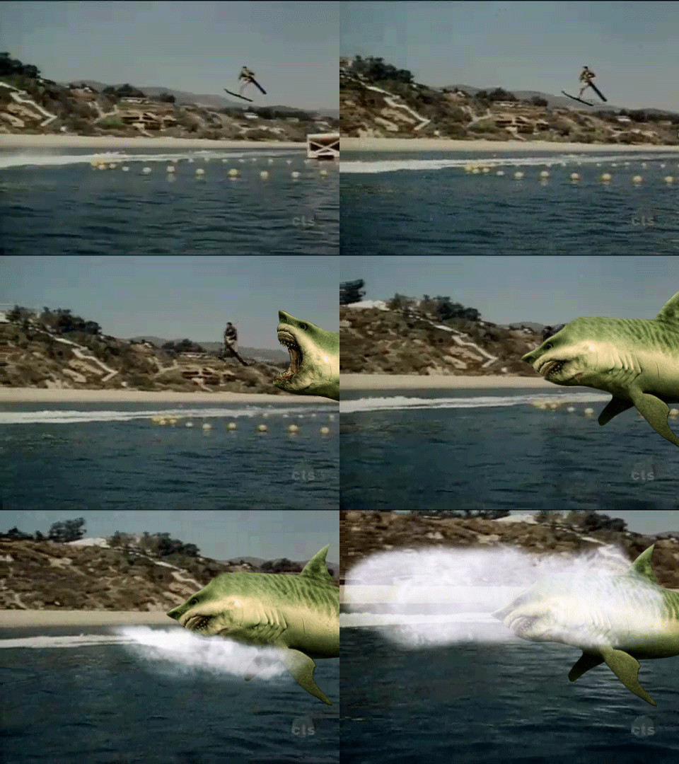
After some discussion about whether a certain conference has “jumped the shark,” I was inspired to create an animated GIF of Fonzie’s legendary water skiing jump over an ostensibly man-eating shark in a 1977 episode of Happy Days, which, to some observers, signaled the beginning of the venerable sit-com’s steady decline and which inspired the very useful notion of “jumping the shark.” Here’s my first stab:

This is a big file, around 5MBs so not necessarily all that useful and it’s long. I felt the shark was essential and I didn’t really want to re-edit Happy Days so I included a fairly long portion of the jump sequence. In playing around with individual shots from the water skiing scene, I came up with this version where Fonzie skis and skis on forever, unconcerned with sharks or his show’s hearty embrace of the absurd and implausible, like the idea that someone “cool” would water-ski in a bomber jacket:

After I shared these on Twitter, the inimitable Scott Leslie, with whom I had the aforementioned discussion about that certain conference (which I’m not convicted has shark-jumped, fwiw), created two shorter versions from my original:

So there you have it: an iconic TV moment ad infinitum and some collaborative GIF-ing. DS106 4 life, bucko!

UPDATE:

Michael Branson Smith added this to the mix: “Megaladon eats the idiom . . . never ‘jump the shark!’”


Bobbie and Me

Tuesday, June 19th, 2012

SongStory — MISSION: DS106

My memories fade over time, but sometimes there is a song that can take me back to a place that revives the memories of my past. The song allows me to remember things I thought I had forgotten. So, for an assignment, pick a song that does that for you, and tell some stories about what you remember…  …In the assignment you might want to mix your voice over parts of the song, give an intro, tell the story first and play the song, break up the song with the story – lots of options. But nothing too long – my attention span is short. These would be great to post on ds106 radio.

About two minutes, hopefully not too long.

bobbie and me


Behind Door Four…Design and More!

Tuesday, June 19th, 2012

Hi Mom, Hi Dad! :)

(**yes, I know they will REALLY see this! I’ve shared my web address with them!)

Week 4 at Camp MacGuffin was Design Week! Learned lots and accomplished a lot, but still lagged by a day or so. So here’s an overview of what the last week held for me in ds106:

I started by researching Creative Commons and copyright. Although I already knew a lot about copyrights, from my time spent as a department manager and copyright manager at Kinko’s…although that was many moons ago now. Creative Commons (CC) was new territory for me and I found it exciting! I chose to license my photos and other image work on Flickr, as well as my this website and its contents, under a the Creative Commons Attribution-NonCommercial-ShareAlike (CC BY-NC-SA) license, so that others can share, use, and alter my works, as long as they credit me for the contribution and do not use the work for any commercial purposes. I was a little late blogging about CC in Copyrights, Creative Commons, & Immortality mostly because I was hung up on creating the CC promotional poster and I wanted to incorporate it into the CC post, instead of posting it separately. I spent WAY too much time trying to figure out how to make the background of the logo transparent, but I finally figured it out and I think it turned out pretty well, if I do say so myself.

This week’s theme was design. After researching and refreshing my artistic knowledge of design concepts, I went on a Design Safari, scouting for real-world examples of the different design elements. I published the examples and an explanation of each concept individually. I mainly did this so I could feel like I was making SOME progress without waiting until the end of the week to do one comprehensive post. Fallout in Fredericksburg shows symbolism in design and Domineering Downtown Dwelling is an example of dominance. I found these two as I reviewed the dozens of images from my photo shoot excursion to Fredericksburg a week or so ago. Mother Nature’s Mountain Rhythm and Memorial Minimalism in Design showcases rhythm and minimalism respectively. These images were both captured in the Virginia mountains, at two different scenic overlook stops along I-64 on Friday.

Two of our Design Assignments for the week were given to us. Okay, it was a choice to pick 2 out of 3 on a list, but I discarded one, because, well…Minecraft is kinda my worst nightmare. I spent a week or more fumbling around, unable to even move my little guy around. After some help from the oh-so-patient and helpful Martha, I finally got enough of a hang out it to move around, place blocks/items, and blow things up, but flying is dangerous! I got hung in a tree once and several times, I’ve gone flying and can’t get down! I even solicited assistance from my 13-soon-to-be-14-year old son, Austin, who was just THRILLED to know he could teach ME something. Almost. I think I know enough to participate when necessary now. I’m just NOT a virtual world kinda girl!

Anyway, back to the Design Assignments. In addition to the CC poster from  Copyrights, Creative Commons, & Immortality, which was one of the mandatory design assignment choices, I reviewed another ds106 assignment from DS106 Inspire in Designer Breakfast with a Berry Splash. After getting the required ones out of the way, I went to work looking for the additional ones I’d do this week. I settled on Apocalypse Anyone?, The Big Picture Captioned Courtesy of Maroon 5, and my absolute favorite assignment yet…What People Think I Do as a Proposal Manager! I shared this with Facebook as well as my colleagues at work and it was a HUGE hit! Now I’m entertaining Alan’s suggestion that I get it printed on a die, so I can roll it and let fate decide which side of me they’ll get that day! :)

The Design Safari sorta replaced The Daily Creates this week. I didn’t get any time to devote to Daily Creates, much to my disappointment. Maybe I can circle back and do some of the ones I missed out on! Or, maybe…the Camp MacGuffin Directors will give us a “freestyle” week to focus on the types of art we enjoy most! Hint, hint…? ;)

I’m having a lot of fun figuring out the capabilities of this blogging thing. This week I figured out how to link text to other sites ALL BY MYSELF! So, please, feel free to click around and see where it takes you!

I’m not looking forward to the next 2 weeks, as we explore audio assignments and radio, but maybe I’ll find some fun in there somewhere.

Until next week…


**Update: I can’t believe I forgot to mention that I MADE CAMPER OF THE WEEK! Much to my surprise I might add! Check out the badge on the right corner of my blog! :)


Falling short

Monday, June 18th, 2012

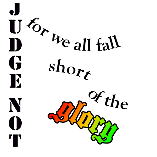
After last week’s excitement, I have fallen a little short of my own expectations this week. I’ve not been near minecraft, didn’t even get started on the Design Safari. I manage one Design Assignment, the creative commons one and then tried the Lyric Typography Poster.. I saw a couple of great results (and this looks like something professional) for this and though it didn’t look too hard. I cranked through iTunes until I remembered one of my favourite song Judge Not, there are a few different reggae songs with this title but the one I like is by Dennis Brown:

The phrase I like is Judge Not, for we all fall short of the glory of Jah. I’ve taken Jah out of the quote as I am not religious. I like the idea of trying and falling short more than Judge not lest you be judged (Matt. 7:1).

I started thinking about this, googling King James font, I saw a reference to calson, so decided to go with Big Calson which seems to be on my mac. I was hoping to get a sort of old looking text and spent a couple of hours failing to get anything like my imagination. I did consider the old english type of font. I was also thinking for some reason about flags and decided on a flag background; red gold and green seemed obvious. Many tutorials and tests later I ended up with this:


This falls very short of the target: Choose one of your favorite lines from a song and illustrate it using only typography. Consider how the font, color, sizes and placement of the typography can reflect or emphasize the meaning of the words.

Nevertheless I have now spent a deal of time playing with photoshop and trying out various tutorials, hopefully this will help.
Here are a few of the tutorials I read through:

So I had another go:
I do not think I have much natural design sense. I have enjoyed and learned from other ds10ers design assignments this week.

My week 4 flickr daily creates:

And a soundcloud one:


Fallout in Fredericksburg

Monday, June 18th, 2012

Metaphors and Symbols in design are a simplistic way to communicate in a “universal” language. When using symbolism, it is not always necessary to use words. For instance, with street signs, one is not required to know how to READ words on the signs, but rather to know what the shapes, colors, and symbols or icons mean. Same applies the other public informational or directional signage, like the photo of the old Fallout Shelter sign I found bolted to the side of a building in historic downtown Fredericksburg, Va.


I have no idea how long that sign has been there, except it looks like it’s aged awhile! I find it interesting that the capacity is cited as 210! Fallout Shelters are designed to protect inhabitants from radioactive debris from a nuclear event. Thus, the sign incorporates the radiation symbol large and bold to identify its location. Maybe that should be my destination during the Zombie Apocalypse!

Week 4 at camp!

Monday, June 18th, 2012

I learned so much this week! We really go into design and I found some tips on how to make my art really pop and say what I want it to say. We learned how the different contrasts and hues work with creating complimenting color pallets. How to properly use typography, words, in your art or in writing in general.  I was also got to adventure on a Safari! Do not fear I am safe. We had to try and find different objects or pictures that represented different aspects of design.

Camp was a little more strict this week in letting us pick our “assignments,” but I still had fun. Oh and good news I am no longer getting attacked my zombies, I am free to be “creative” at camp now.

Until next week,

Ciara

Fancy Word

Monday, June 18th, 2012

Fancy

So the assignment was to select a type face that represents the word you are typing. I thought this was pretty easy. There are many “fancy” swirly, cursive writing fonts on Microsoft Word. So I just picked the one I liked, copy and pasted it to Paint so I could crop it and then uploaded it onto Flickr.


Jackson Pollock…find the face!

Monday, June 18th, 2012

Jackson Pollock

So someone else already used the spray can on paint to make splatter art like Jack Pollock, that was my favorite thing to do on the computer as a kid, so I did something a little different on paint. I tried to create an abstract face using splatter paint in the Paint program. It was fun. I just let my hand swirl around the page with my computer-mouse brush. But, there us a abstract face in there if you can find it! I felt like I could see images within Pollock’s abstract art, so I wanted to make an image in mine.