Archive for the ‘design assignments’ Category


Go to a happier place! (Write-up and Tutorial)

Saturday, July 28th, 2012

Go to a happier place!

Design Assignment 625: Go to a happier place!

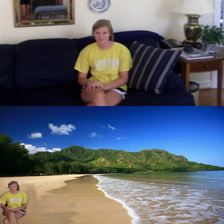
Ever wanted to be somewhere else? Take a photo of yourself in your current location, crop your body out of the photo and paste on an image where you would prefer to be. Put together the two photos for a before and after effect!

For this assignment, which I created, I started off by daydreaming about being at the beach. This sparked my imagination, surprisingly enough. I decided I would have my sister take a picture of me sitting on the couch doing my DS106 homework. Then, I found a photo of a beach on Flickr under a Creative Commons License.

a postc@rd from p@r@dise

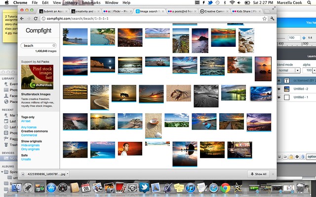
I used my knowledge from an assignment I had previously done, “Support Creative Commons With a Poster.” I searched Flickr for beach photos under a Creative Commons License using the website Compfight (be sure to select the Creative Commons search option).

Screen Shot 2012-07-28 at 2.27.27 PM

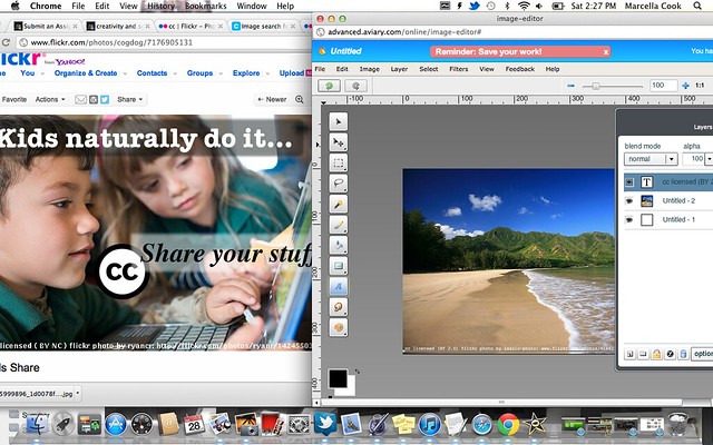
I also learned how to give attribution to the source image from the “Support Creative Commons With a Poster” assignment.

Screen Shot 2012-07-28 at 2.27.09 PM

I used my favorite photo editing site, Aviary. I used the Image Editor. I started off by adding text to the bottom of the photo giving attribution to the source image. You can use the template below for attribution to flickr photos (the italics is where you should insert the specific information for the particular photo):

cc licensed (BY license) flickr photo by flickr username: link to photo on flickr

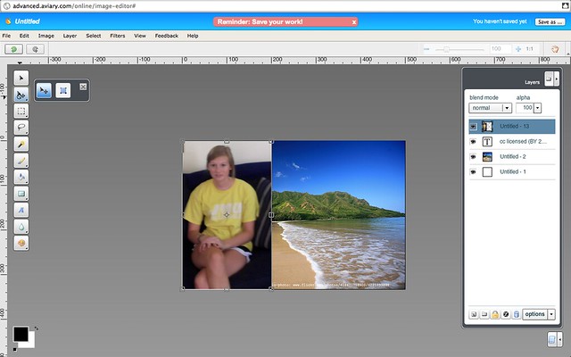
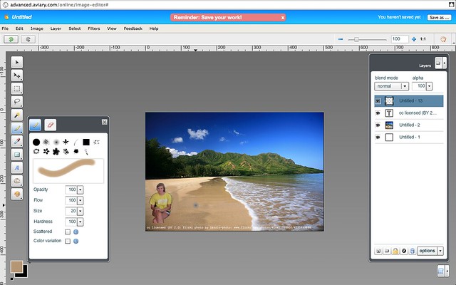
I cropped the original photo of myself on my Mac’s photo editing device (iPhoto) so I was just the focal point. I saved it to my desktop. On Aviary Image Editor, I chose “File” “Import Image” and imported the image. Make sure you select “layer” from the drop-down layer menu on the panel on the right.

Screen Shot 2012-07-28 at 3.06.45 PM

I chose the resize option and made the photo smaller.

Screen Shot 2012-07-28 at 2.54.56 PM

This is where it gets tricky. I chose the Magic Wand tool from the left side bar. I held the “Shift” key and edited out the remainder of the photo of myself (so my couch wouldn’t be in the background). I then “Cut” the selection.

http://www.flickr.com/photos/78979154@N02/

Then I needed to edit out the stripes left over from the pillow on my couch. I chose the dropper tool to match with the sand. Then I chose the paint brush tool and painted over the stripes.

Screen Shot 2012-07-28 at 3.10.30 PM

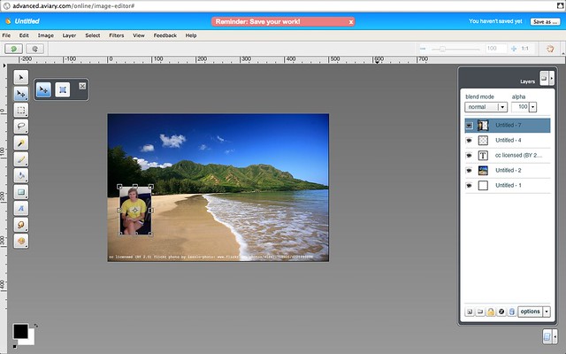
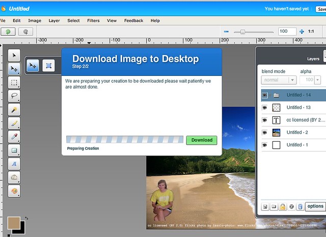
On the right option panel, at the bottom, second from the left, there is a plain folder. I clicked that to group all my layers.

Then, I selected “File” “Save As” and saved the file as a .JPG to my desktop.

Screen Shot 2012-07-28 at 3.17.09 PM

I opened a new Aviary file (from scratch) and imported the original photo of me sitting on my couch to the canvas and resized it as I liked. Below, I imported the edited photo of me on the beach. I saved it to my Aviary account and uploaded to Flickr.

Hope you enjoy this assignment. Good luck!
Zombies, Zombies…Everywhere!

Saturday, July 21st, 2012

One of the requirements for ds106 was to create a new assignment for the DS106 Assignment Repository. I’ve been thinking about the possibilities for the past 9 weeks, keeping in mind that I don’t want to closely duplicate an already existing assignment AND I must be able to do it myself. That was the real challenge…my mind envisions things that my talents fall short on bringing to fruition.

This morning, inspiration struck! Zombie mania is spreading like crazy. With shows like The Walking Dead gaining popularity and news stories of people attacking others in a zombie-like fashion, I thought “what would I look like as a zombie?”

My Photoshop skills are greatly lacking so I started looking for other ways to alter an image of myself and zombify it. After some quick internet researching I found there were many online options available for FREE! Halleluiah! I played around with a few finding the Zombify Yourself online app on the Zombieland website is my favorite. Here’s one possibility of what I might look like as a zombie:

Zombie Me

I was having so much fun I did another of Dave & I

Zombie Couple

See the assignment and other examples in the DS106 Design Assignment Repository: Zombify Yourself

I hope other ds106 participants have as much doing this as I did!


Design Assignment: Hark! A Tapestry!

Friday, July 20th, 2012

Tell a Tale on a Tapestry: Go to Bildwirkerey von Bayeuxbe at , where you will find the “Historic Tale Constrvction Cit”, a web-based app inspired by the Tapestry of Bayeux. Follow the directions to create your own tapestry, then be sure to share it with us!

I found the “Historic Tale Constrvtion Cit” at Bildwirkerey von Bayeux while doing some Tumblr surfing. It’s funny what you can find on the Internet when you’re not even trying.

The Cit you find at the site is actually a reproduction of a defunct web app created by two German students, Karnebogen and Jungbluth, using Flash. The app was apparently an early source on the Internet for memes.

The Cit was rebuilt in 2011 by Johannes Jander using HTML and Javascript. I dub him an Honorary D106 Internaut for his initiative in preserving a cool and unique piece of Internet history that otherwise might have passed some of us younger users by.

Movie Poster for My DS106 Website

Monday, July 2nd, 2012

This design assignment to make a movie poster for your website appealed to me on many levels (not least of which is the many years I spent working in movie theatres and collecting movie posters).

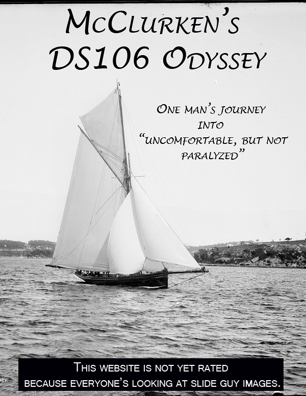
Having titled my site a DS106 Odyssey, I started looking for sailing ships, thinking of the original tale by Homer.  I realized that for the right look I needed an older photograph, something for which it was unlikely to have CC-licensed images available.

So, I turned again to the Flickr Commons, that great collections of images from archives and museums.  This image of a 19th-century yacht came from the Powerhouse Museum in Sydney, Australia.


The subtitle is a reference to my own goals in this course, to push myself out of my comfort zone.


DS106 Odyssey Poster


Thoughts?  Comments?  Suggestions?

Creative Commons Poster

Sunday, July 1st, 2012

I found the assignment to create a CC poster more difficult than I imagined, especially after struggling a bit with the Postcard assignment.

The assignment here was:

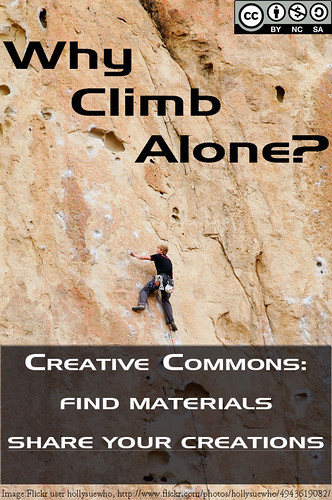
Use creative commons licensed images to design a poster about how groovy Creative Commons is! Use a tool like Compfight to find creative commons licensed images in flickr (be sure to select the right option on the search pane), and then use photo editing software to add your message, call to arms, rallying cry, urgent plea. Include as well a creative commons logo– look to the creative commons itself for ones to use.

Most importantly, in your poster be sure to give attribution credit to the source image.

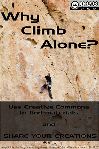
I didn’t have an obvious direction I wanted to go on this project, so just browsing CC-licensed images didn’t get me anywhere.  My sense of Creative Commons is one of easier sharing of creative efforts, but I didn’t know quite how to convey that.  Then I saw an image of a mountain that struck me and I thought of the collaborative work needed for most people to climb Everest and other tall mountains. [I know there are a few solo climbers still, but that's not the norm for most climbers.]  It got at the notion of creative practice being a collaborative effort, of building on the work of others, even if we don’t often think of it that way.  Unfortunately the image I saw was CC-licensed, but derivative works were not permitted (an apparent weakness in the Compfight search engine, unless I just missed that option).

So then I just started using Flickr’s advanced search for CC-images that allowed derivative works of mountain climbers and found this one from Flickr user hollysuewho.

At that point, it was a matter of getting the right Creative Commons logo (hollysuewho’s photo was Attribution, Non-Commercial, and Share Alike, so my derivative work needed to be the same license), and figuring out the text.  I like the top slogan, but the bottom is still to wordy for my liking.  Still, it gets at both aspects of Creative Commons that worth advertising: use the CC-licensed materials that are out there AND share your own works that way.

I had some issues with using Photoshop to shading the bottom part and I’m still not happy with how it looks, but I would spent too much time fiddling with it. So, here it is.  Thoughts?  Recommendations?

Creative Commons Poster


UPDATE: After comments by John and Alan (and conversation with my spouse, @jenorr, I did a new version of the image that I’m much happier with.


CC Poster--Revised text

Postcards–A Legoland/Minecraft Mashup

Sunday, July 1st, 2012

So, after nearly three weeks away for a conference (and panel comment), a new talk for a Civil War Round Table, and a family trip to California, I’ve finally returned to DS106 work.  These means that I’m woefully behind as the rest of the class has moved into audio assignments.  I’ll catch up as I can, first by doing some of the Design Assignments from Week 4.  This one is for Postcards from Magical Places.

The assignment reads (corrected for typos because I can’t help myself):

Design the front and back of a postcard that might be sent from the location of a movie or a work of fiction. Both sides of the cards must be created as graphics.

The front should use graphic design elements that provide a sense of place or use the classic motifs of old postcards (“Greetings from ______”), both pictures and text. The back of the post card should contain a stamp and postmark that fits with the theme of the movie, as well as an addressee and a message that fits the plot as well.

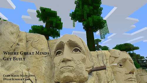
The modification that we had from Alan and Martha was that the image was supposed to come from the DS106 Minecraft server where there is some absolutely amazing stuff created by DS106 participants.  Unfortunately, the server was down when I went to it, so I ended up taking an image from a regular Minecraft instance.  But that was pretty boring, so I added an image I took on a recent trip to Legoland California.  [I took the Minecraft image as the background, and then, using the Quick Selection tool in Photoshop, removed the material in the upper right of the Lego version of Mount Rushmore, allowing the Minecraft background to show. This is all after some resizing of the two images so they matched.]

I then added some text, using a phrase that should be reminiscent on one commonly seen these days to those of us in Fredericksburg, and is an approved font from that institution.  The result was this:


Minecraft postcard--Side 1

For the second side, I created the stamp from the image of Lego Jefferson.* The expensive postcard price is an homage to the founding of UMW (as well as a tease to a relative who always scolds us when we spend more that the needed price on postcard postage).  The postmark is a stylized font in Photoshop and refers to the location of Legoland, as well as UMW.


Minecraft Postcard--Side 2

There are a few other nods, if not homages, in the letter and address.


* I think the thing next to his eye is supposed to be a Q-tip cleaning Washington’s ear, but given the past month at Mr. Jefferson’s University, I’m interpreting it as something wiping away TJ’s tears.


ds106.Design Assignment.Postcards from Magical Places – A Minecraft Island Camp

Sunday, June 17th, 2012

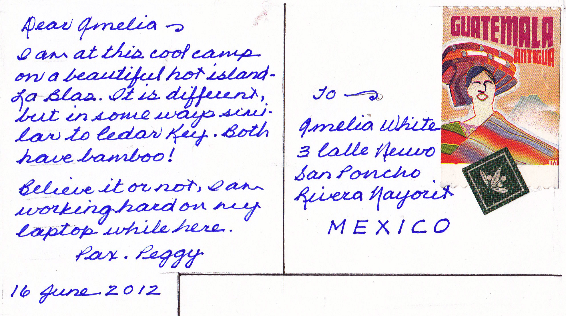
I enjoy this island camp which is similar, in many ways, to my island home. I send a postcard to an artist friend who is presently working in Mexico. This is my postcard to Amelia White.

minecraft-texture-pack-border-craft-borderlands-cell-shading

Picture side of postcard

Written side of postcard

This assignment challenged me but was fun because I used skills with with I am familiar along with exciting, new techniques. First, after learning about Minecraft, I copied the Minecraft environment from the site. I determined my desired postcard size. Then, I made the written side of my postcard on paper, ruling it and using two found stamps. I created a message to my fictitious friend and wrote the message in contrasting ink. I photoshopped a bit. Then, I scanned the written side and matched the sizes in my blog.

Please let me know what you think.

Apocalypse Anyone?

Saturday, June 16th, 2012

Design Assignments 473—Otherworldly Distortion (1 star). Take a picture of a geographical location on earth and try to alter or distort it to make it seem like its from a foreign dimension.

Apocalypse Anyone?

This was a fun and easy assignment. I started with another photo I took yesterday in the mountains of Virginia. With Picasa, I played with different filter effects until I found one with a “foreign dimension” impact. The winner was the “heat map” filter. Cool colors. I think it creates an interesting, colorful image of a post-apocalyptic world!

Triangle Dog

Saturday, June 16th, 2012

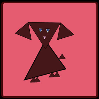
I chose to complete the Triangle Animal Assignment. Of course, I decided to make a dog out of triangles. My favorite animal is really a turtle, dogs are second best, although I wasn’t really sure how to go about making a turtle out of triangles! With the help of the camp packing list, I chose to use the web-based vector editor called Raven (by Aviary). I have found Aviary to be a really cool site and I plan to use it for many assignments in the future. In addition to the image editor I have used for my visual assignments, along with the vector editor I just mentioned, Aviary also offers a swatch editor, an effects editor, and an audio editor, just to name a few. I can’t wait to continue exploring what the site has to offer.

While doing this project on Raven, I mostly used the “Create Spiro Path” selection, then chose the polygon and edited the vertex count to 3 in order to make triangles. I resized them, arranged them the way I wanted, added a little bit of color, and this is what I came up with:

Triangle Dog

Jackson Pollock à la Marcey

Saturday, June 16th, 2012

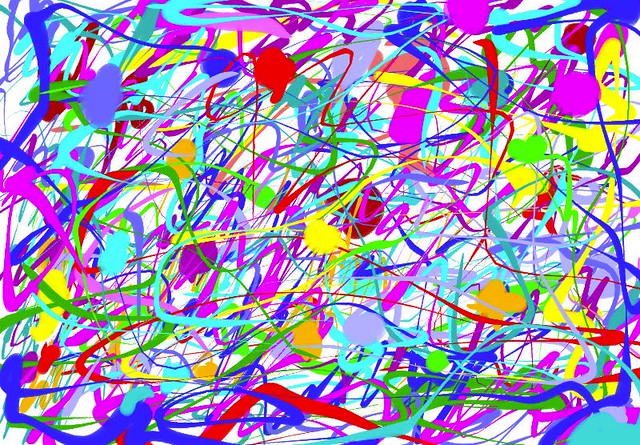
For my first design assignment, I chose to make my own Jackson Pollock painting! I started off by looking Jackson Pollock via Google Images so I could get a better feel for his style. I decided I wanted to use a program like told-school Paint that I used to spend lots of time on back in the day on my huge desktop computer! I completed another Google search for an online version of Paint and I discovered Paint Online. Basically, I just splattered paint around and did my own thing. I experimented with lots of different colors and brush sizes. I had a great time with it, too. I felt like a kid again- no limits! But I also felt like an adult in the sense that no mess came out of it…that’s the best kind of fun!

Make Your Own Jackson Pollock