Archive for the ‘DesignAssignments’ Category


Postcard from Camp Magic MacGuffin

Monday, June 18th, 2012

Wow. The design assignment opportunity this week at Camp Magic MacGuffin has offered a gazillion ideas — I have a major list I could chip away at — and making the time to get to get to them has been a fun challenge. The Postcards from Magical Places Design Assigment 363 was a blast!

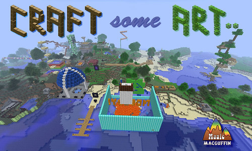
I’ve had this shot of the camp centre for a while now, and liked the idea of riffing on the ds106 “Make Some Art!” battle-cry by substituting the word “Craft” — both as a nod to the creativity evoked by Minecraft, and also the care that the word “craft” seems to embody. So as an invitation to non-campers who might receive the postcard from CMM, that seemed to be a good caption for the card.

"Postcard from Camp Magic MacGuffin (Front)" by aforgrave, on Flickr

“Postcard from Camp Magic MacGuffin (Front)” by aforgrave, on Flickr

Having spent all that time returning transparency (pixel by pixel) to the two block images so that I could use them to “build a tree” for the Monkey Social invitation, I repurposed them to create the two main words in the postcard title. The 3D nature of the lettering suits the Minecraft theme. While I’m not as happy with the text for “some” as I might be, in some ways it is reminiscent of some post card text I’ve seen that really doesn’t mesh with the image beneath. So on that note, it’s staying.  All the bits on the front were assembled in Fireworks in a .PNG, and then flattened to .JPG to post to the web.

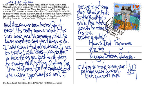
"Postcard from Camp Magic Maguffin (Back)" by aforgrave, on Flickr

“Postcard from Camp Magic Maguffin (Back)” by aforgrave, on Flickr

I had a lot of fun working on the back of the card, which had me editing the CMM logo in Photoshop to remove the colours to produce the postmark outline, creating the border of the stamp, and editing the scanned handwriting (again, more removing pixels to get a nice transparency over the existing postcard back). It seems like every time I need to make something transparent, I need to google how to do it. There must be better ways.

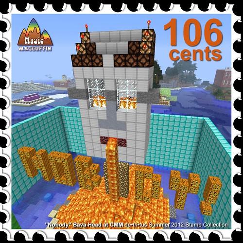
The stamp was especially fun to do. I’m going to do a series of stamps — I have a good number of screen captures of CMM in Minecraft, and a stamp series seems like a nice way to collect them. Given the designation bestowed to the “camp pet” in the week four assignment video, I figured it was best to start the series with that image. Gotta keep him happy.

"CMM Stamp#1 'Nobody Bava Head' "by aforgrave, on Flickr

“CMM Stamp#1 ‘Nobody Bava Head’ “by aforgrave, on Flickr

Were there more space on the postcard, it would be nice for a weekly letter home. As it was, so much has happened this past week, there really isn’t room to even begin.
Fancy Word

Monday, June 18th, 2012

Fancy

So the assignment was to select a type face that represents the word you are typing. I thought this was pretty easy. There are many “fancy” swirly, cursive writing fonts on Microsoft Word. So I just picked the one I liked, copy and pasted it to Paint so I could crop it and then uploaded it onto Flickr.


Jackson Pollock…find the face!

Monday, June 18th, 2012

Jackson Pollock

So someone else already used the spray can on paint to make splatter art like Jack Pollock, that was my favorite thing to do on the computer as a kid, so I did something a little different on paint. I tried to create an abstract face using splatter paint in the Paint program. It was fun. I just let my hand swirl around the page with my computer-mouse brush. But, there us a abstract face in there if you can find it! I felt like I could see images within Pollock’s abstract art, so I wanted to make an image in mine.

Triangle Panda

Monday, June 18th, 2012

panda

This was difficult. My favorite animal is a panda and if I was using circles it would have been way easier. He is all black and white and I created him on paint. I was able to change the size of the triangles and color them in, but like I said I could only use triangles to make a traditionally round creature.

CC Rally Poster!

Monday, June 18th, 2012

CC

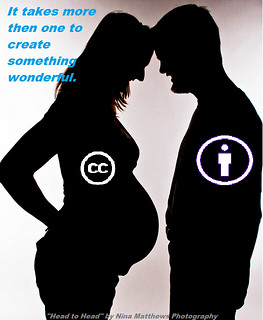
As soon as I saw the image of the kids pop up as the image for the assignment I thought, I am going to use a pregnancy photo. I knew I wanted to portray the message that it takes more then one person to create life. So I used the phrase “It takes more then one person to create something wonderful.” This was to be used metaphorically with the idea that creative commons wants people to be able to share there creations and ideas so that others may use them to well…create something wonderful! I went ahead and added in the symbol of creative commons (CC) and the symbol of the “By owner” to my photo and put in small lettering at the bottom who the photo originally belonged to. The original owner of the photo has a CC of “some rights reserved,” she just wants her name credited with the use of her photo. I then chose blue lettering for my “rally poster cry” so that it would pop out to the viewer, seeing how the rest of the image is in grey, black, or white.

The Most Wanted

Sunday, June 17th, 2012

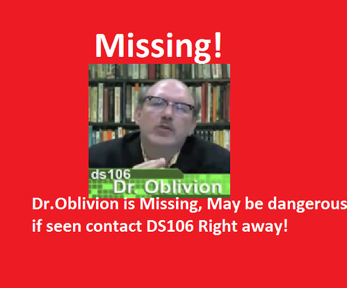
First I got a picture of Dr.Oblivion off of google images, then I used paint to create this poster. I thought this was a cool quick assignment I used red because I think it makes the poster seem more urgent.

Missing Poster

ds106 Design Assignments

Sunday, June 17th, 2012

My goal with participating in ds106 (in whatever way that played out) was to learn something. I’ve only scratched the surface but I’ve learned quite a bit about GIMP and Photoshop today. In addition, without putting in much effort (as I probably should have done) I am looking at design differently, more aware of choices made and how those decisions impact the overall view of an item. Again, lots more to learn but I’ve gotten started.

I had to make some lame workarounds to create my CC poster because I’m not yet proficient enough in GIMP or Photoshop. That said, I’m fairly pleased with how it turned out. Here’s the original picture from Mean and Pinchy on flickr:

Here’s my take on Creative Commons:

The next assignment I attempted was If Movie Posters Told the Truth. I’m less pleased with this work because I know if I had more patience I could fix the ‘bad script’ part to look more a part of the poster. Unfortunately it’s late (for me) and I’m not a patient person in general. 
I picked a movie I can’t stand because that seemed more fun. It required inventing a new word but it captures my sentiment pretty accurately.
Finally, I tackled Iconic You. As simple as this looks, it took me a while because I kept trying to make it do too much. I could not come up with one thing to illustrate me and I wanted to create something that included a lot of the ways I define myself. This design came pretty quickly but I spent a lot of time trying to add more to it. I thought about using the top of the music note to be waves and add something to symbolize biking and running in order to show my participation in triathlons. I thought about adding some little faces to the apple to symbolize my children and husband. After trying some of these out and not liking anything, I got back to the simple. It may not show everything that matters to me, but I like it.

DS106 Week 4 – Design: A Sansing Sprint

Sunday, June 17th, 2012

Inspired by my Slaughterhouse IV bunkmate Chad Sansing, I composed a Design Assignment Sprint. I spent a lot of time in tinkering in Adobe Illustrator and Adobe Photoshop, which always leaves me wishing I could do more than I actually … Continue reading

Alternative Book Covers – Cat’s Cradle

Sunday, June 17th, 2012

For me, DS106 seems to be revolving around Kurt Vonnegut. First, there was that task in Week 2. Then, my bunkhouse was named Slaughterhouse 4. So, I just had to do Design Assignment 366, which was to create an alternative book cover suggesting that the book is about something entirely different. I know I am being mean, but I just couldn’t help it.

Here it is:

Cat's Cradle
Original image used: cc licensed ( BY NC ) flickr photo by Sergiu Bacioiu: http://flickr.com/photos/sergiu_bacioiu/4327564714/

By the way, since this is primarily a TEFL blog, I believe there is a great lesson plan here, especially if the students are all reading the same book. Then they could compare the cover story to the original, or even develop the story from the cover further. Or they could create their own book covers. It would be fun to create the cover and leave out the title. Then they could try to guess what book the cover creator had in mind.


Apocalypse Anyone?

Saturday, June 16th, 2012

Design Assignments 473—Otherworldly Distortion (1 star). Take a picture of a geographical location on earth and try to alter or distort it to make it seem like its from a foreign dimension.

Apocalypse Anyone?

This was a fun and easy assignment. I started with another photo I took yesterday in the mountains of Virginia. With Picasa, I played with different filter effects until I found one with a “foreign dimension” impact. The winner was the “heat map” filter. Cool colors. I think it creates an interesting, colorful image of a post-apocalyptic world!