Archive for the ‘designassignments529’ Category


Falling short

Monday, June 18th, 2012

After last week’s excitement, I have fallen a little short of my own expectations this week. I’ve not been near minecraft, didn’t even get started on the Design Safari. I manage one Design Assignment, the creative commons one and then tried the Lyric Typography Poster.. I saw a couple of great results (and this looks like something professional) for this and though it didn’t look too hard. I cranked through iTunes until I remembered one of my favourite song Judge Not, there are a few different reggae songs with this title but the one I like is by Dennis Brown:

The phrase I like is Judge Not, for we all fall short of the glory of Jah. I’ve taken Jah out of the quote as I am not religious. I like the idea of trying and falling short more than Judge not lest you be judged (Matt. 7:1).

I started thinking about this, googling King James font, I saw a reference to calson, so decided to go with Big Calson which seems to be on my mac. I was hoping to get a sort of old looking text and spent a couple of hours failing to get anything like my imagination. I did consider the old english type of font. I was also thinking for some reason about flags and decided on a flag background; red gold and green seemed obvious. Many tutorials and tests later I ended up with this:
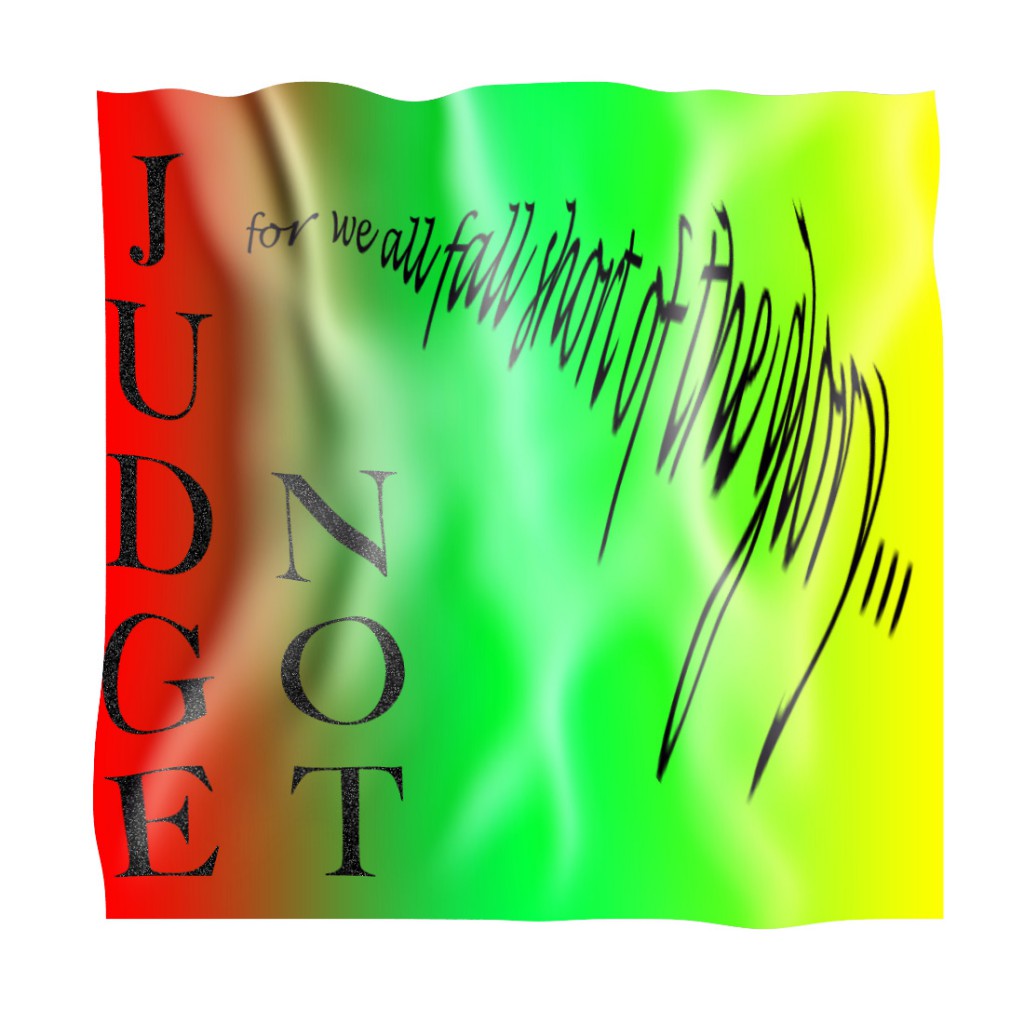

This falls very short of the target: Choose one of your favorite lines from a song and illustrate it using only typography. Consider how the font, color, sizes and placement of the typography can reflect or emphasize the meaning of the words.

Nevertheless I have now spent a deal of time playing with photoshop and trying out various tutorials, hopefully this will help.
Here are a few of the tutorials I read through:

So I had another go:
I do not think I have much natural design sense. I have enjoyed and learned from other ds10ers design assignments this week.

My week 4 flickr daily creates:

And a soundcloud one:
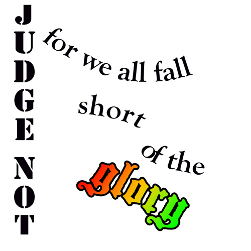
 

Mission: ds106 – lyric typography poster design assignment

Thursday, June 14th, 2012

Inspired by several campers’ lyric typography posters (2 stars), I decided to go back to this assignment. I passed over it during my design sprint because the first few ideas I tried didn’t work – I wanted to do something purely typographical with the background color being the only non-textual adornment. I couldn’t pull it off by myself. I didn’t really get the examples, which looked good, but didn’t always marry the lyrics and designs in ways I could grok.

My subconscious kicked around a few ideas – I wanted to do something with Radiohead; I played our Florence + the Machine CD on today’s drive to Grammy and Poppy’s.

Here’s what I came up with while working entirely in Acorn.

Florence + the Machine

Florence + the Machine

First, I tackled this Florence + the Machine poster. I had originally thought about using inverted carrots to make teeth for the dog days, but then I decided to try coding some impact into the poster. I used a bold Rockwell font to lend weight and vibrancy to happiness and a few other bits of text. I threw in a bracket and a wide-stanced Bank Gothic font for the hit. I used Cracked (always stop at 3 fonts, Chad!) for “bullet” and rotated some forward and backward slashes to suggest a spider-web of stress fractures from a bullet hole in the middle of the “b”. I also left “bullet” in all lower case to contrast it against the other lines of text which are all capital. Finally, I kerned the last line to -12 (I go past the absolute value of 11) so I could have the text wind back on itself and fit the bottom of the page. I also split it into “in the b” and “ack” so I could make it wind back in a less predictable way. I like the gap. I think it helps punctuate a kind of hard return and possibility of escape up or down the page in the recursive loop that the last line creates. Maybe that’s where the happiness-bullet hole is.

I also worked on a Radiohead poster combining the colors and sans-serif-ness of the In Rainbows album typography (I used a bold Euphemia UCAS font) with lyrics from “Fake Plastic Trees.”

I decided to repeat the line about the town getting rid of itself, omitting one word per iteration so that the quote would get rid of itself. I put the text in a box that takes up most of the page, sized the text to fill the box, and let the line breaks take care of themselves to approximate the random aesthetic common to many pieces of Radiohead art and web design. I love the way the last line doubles itself while disappearing itself. The last bar of background is white to complete the vanishing and create some ambiguity about whether or not there is anything there in an invisible, white font.

Here’s the poster:

Radiohead

Radiohead

I’m very glad I found a way back into this assignment. Thanks, ds106 campers! Learning in community!

In gratitude, let me share this wicked pair of multi-layer stencils of Thom Yorke that a student did as a learning project this year.

Thom Yorke stencil art from a learning project

Thom Yorke stencil art from a learning project

Simple Gifts

Thursday, June 14th, 2012

For my next design assignment, I decided to do the Lyric Typography Poster. However, I did go a bit beyond just using text, and added a very basic vector graphic. I was really inspired by the examples at Music Philosophy — Especially when I saw how adding just a very simple graphic could be so effective. 

The lyric I picked was from the traditional Shaker song Simple Gifts. It’s a particularly meaningful song for me because it was one of the songs that was played and sung at our wedding (10 years ago this summer!). The song is really meant to be a simple dance, and the last lines of the song (which I didn’t use) is, “To turn, to turn will be our delight,/ Till by turning, turning we come ‘round right.” I wanted to evoke that sense of movement a bit in the poster. 

It actually is a song that encompasses what I strive to make more of my personal philosophy: looking for the simple, coming back to where we were, finding the gifts in the things we already have. Really, very beautiful, yes? I’m not sure my poster is beautiful enough to capture this sentiment, but I had fun doing it and thinking about this song again. 

Note: The original image came from The Noun Project (a fantastic source of free, CC licensed simple vector graphics) and was created by David Goodger. It is shared with a CC Attribution license.  

Come join the Youth and Beauty Brigade

Thursday, June 14th, 2012

The Decemberists are unparalleled storytellers and the best band that ever lived, so selecting one of their songs to use for a DS106 class project seemed appropriate.  For this assignment I decided to use a lyric from “California One/Youth and Beauty Brigade,” which appears on Castaways and Cutouts.

Here they are performing the song:

Castaways and Cutouts was released in 2002.  It went undiscovered by me until the winter of 2004.  I had just started making friends with some folks in Richmond.  One of them was a young hipster who had better taste in music than I did.

“California One/Youth and Beauty Brigade” remains on my list of favorite Decemberists songs for a few reasons.  The first half of the song is about driving route 1, which runs along the California coastline, and drinking wine.  Who doesn’t like a road trips and wine?  And look at these lyrics:  “Take a long drive with me on California One” and “Take a long dram with me on California wine.”  Clever, Colin Meloy.  Effing Clever.

It’s “Youth and Beauty Brigade” that I really adore.  I’m neither youthful nor beautiful, but boy oh boy do I relate to the misanthropes and misfits that populate The Decemberists’ Youth and Beauty Brigade: bed-wetters*, ambulance chasers, bored bench warmers, castaways, cutouts, irresponsible library users.  Yes!  And that brings me to this:

Lyric Typography Poster

Lyric Typography Poster featuring The Decemberists

Jaysus.  I’m looking at the image now, and thinking that I really built that up with the back story.

I also worked in Photoshop too.  Photoshop is still a challenge for me.  Layers and working within said layers is counterintuitive.  I’m thinking it may have something to do with the fact that I’ve spent decades in word processing software built for the “everyman.”  I’ll figure it out though.  Here’s the Photoshop version:

Cops in cars

Photoshopped version

There’s not enough space at the top, and the font type isn’t all that adventurous or exciting (especially after seeing the stuff at Music Philosophy) or uniform, but screw it.  It’s a draft.

The police car photo is from Robert Kuykendall’s Flickr stream.  I found the image by doing an advanced search in Flickr for Creative Commons-licensed images.


* I am not a bed-wetter, by the way.  I don’t chase ambulances either.  I’m not much for warming benches, because I don’t play sports.  I am notorious for not getting my library books back on time.

… in its’ right place.

Thursday, June 14th, 2012

Here’s my go at the Lyric Typography Poster, which is located here.

In honor of me going to see them this weekend, I choose the Radiohead classic, Everything In Its Right Place. I’m sure many of you listen to them so I’ll spare the description.

Made this in Photoshop. I wanted to use graph paper as a background because I wanted to illustrate obsessive neatness, which is what I believe the song to be about. Modernist graphic design comes to mind when I listen to this song. That came into play when choosing Helvetica (haters gonna hate).

On a slightly different note, listen to this song and gaze at the work of Michael Johansson, I think they blend quite perfectly.

Without further ado:

Ain’t it though?

Tuesday, June 12th, 2012

Day one of week four and I’m getting my grips on the Design Assignments.

I tried the Lyric Typography Poster assignment, which can be found here.

Typography Poster

Waddya think? I chose the lyrics “Ain’t it just like the present to be showing up like this” from Bon Iver’s Blood Bank. A beautiful song by Grammy award winning artist Justin Vernon, if you haven’t heard it yet, listen to it!

Watch this video on YouTube.

If you haven’t heard of Bon Iver, clearly you were living in a hole in February when it angered many pop culture fanatics when the band won Best New Artist. While I love Bon Iver, it angered me too because as I like to remind people just because it is new to you does not make it new.

Anyway, I used Photoshop on my father’s design computer for this project. I started with a blank canvas, typed the lyrics separately into Text Boxes, then moved them, resized them, etc., until I came up with a design that I liked. The clocks I got from openclipart.org… Check it out!