Archive for the ‘ds106’ Category


Domineering Downtown Dwelling

Friday, June 15th, 2012

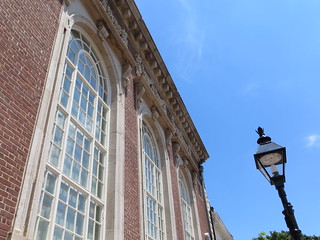
Dominance simply sounds like a controlling, authoritative word. In design, it holds the same meaning. Creating dominance in design makes creative use of size, color, density, value, and white space to create the effect of one object being larger than others, hogging the space, begging for attention.

Domineering Downtown Dwelling

In this image of a building on Princess Anne Street in downtown Fredericksburg, the building and, more specifically the windows in the building, use size and perspective to create the effect of dominance. The building is ruling the lamppost! The post is actually in the foreground. I was standing on the street corner, looking up with the lamppost only an arm’s-length away from me. Perhaps a change of angle to emphasize the lamppost would turn the tables on that building then the lamppost could dominate the building!


Movie Novelization: Freaky Friday

Friday, June 15th, 2012

The Assignment: It’s time for the Design Assignments at Camp Magic MacGuffin. It is in attempting the assignments from this category that I come to face-to-face with my limitations to execute an idea as first envisioned. I’m totally comfortable with this and it motivates to try to pick up one or two new tricks or techniques each time out.

In doing the ds106 I Can Read Movies assignment, the goal is to create a beaten and battered book cover that depicts the novelization of an iconic film. Alan’s recent Andromeda Strain rendition led me to take a stab at Freak Friday (1976 version).

To get a true sense of what is possible with this assignment, there’s no better place to go than the original source: Spacesick.

The Process: I didn’t think it would be possible for me to come up with a cool minimal image such as those on the Spacesick site, so I decided to focus on the typography. For some reason, I’m under the impression that it is best to use a vector editing program when working with fonts. If someone can confirm or refute this, I’d be obliged. So the application I chose was the open source InkScape. As with the GIMP, it is available in Mac, Windows, and Linux version. When working on a Mac, it is also necessary to have the X11 environment installed (I assume this is now standard but am not certain).

So before I opened the application and found a suitable font, I put pencil to paper and fairly quickly came up with the idea to play of the symmetry between the two words – same first and final letter and similar length. The idea for the 4F logo in the center didn’t come until later in the process. With the idea on paper, I decided to find a new font for the project.

For the font, I went to Da Font and browsed through the retro category until I found Locked Window. It was a spontaneous decision which I really can’t explain or justify – it just seemed to be the right font for what I had in mind. Installing newly downloaded fonts is much easier than it used to be on a Mac, I assume the same is true for Windows. The Da Font site has help files that explain the procedure.

Working in Inkscape is a wee bit of a challenge. As I rarely use it, it always takes several rounds of mistakes and undos to figure how to do things. Fortunately, this was a fairly simple task. I’ve not run text vertically before nor have I had occasion to flip it as was done both vertically and horizontally here. Once I’d figured out how to command the application, the design fell into place rather quickly. I was able to use my new facility with flipping text to put the 4F icon in the center together. But next was the question of color.

I’m indebted to a former student for introducing me to the ColourLovers site. ColourLovers is more than a site, it a community of creative image and design people who share resources and ideas. Though most of what’s on offer there is way over my head, I’m grateful for the color palettes that are available. Essentially a color palette is series of colors that have been put together because they work well together. Each of the colors includes hexadecimal and RGB codes. It is even possible to export the entire palette and load it in to your image editor so all of the colors are easily selectable. For Freaky Friday, I went with the Sherbet palette.

Once I was satisfied with the typographic representation, I exported it as a PNG file. Prior to that, I had downloaded one of the covers from the Spacesick site and opened it in GIMP. The Freaky Friday PNG was then opened as new layer. The Maroon background, from the Sherbet palette, was painted as a layer over the original cover.

I decided to keep the original portion of the cover because I didn’t want to get that involved with building the thing from scratch. Also I didn’t have the time, energy or know how to give the cover the worn look that is so important.

In the end, I feel that I’ve moved the ball midway down the field and decided to punt on 4th and 2 on opponent’s 47 yard line. I should have gone for it, but didn’t

The Story: This is where I would like to explain the deeper significance for the film I selected for the project. Sadly, I don’t really have much of a story. It was the words of the title that led me to go with it. I do remember seeing the 1976 version of the film with Jodie Foster and Barbara Harris changing roles as daughter and mother for a day. I think I would love to see it again now because I am more and more drawn to the mid-70s aesthetic.

As for the 2003 version with Julia Roberts and Lindsay Lohan, I have nothing to say. I didn’t see it. Can anyone recommend it?
Week 4 – The Creative Commons Poster

Thursday, June 14th, 2012

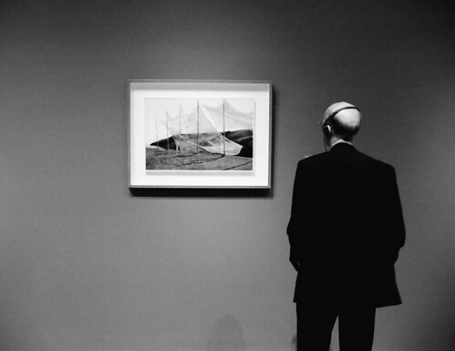
cc licensed ( BY NC SA )  flickr photo shared by WadeB

We are very busy this week at Camp McGuffin, with design assignments, the Design Safari, the research on Creative Commons and all the readings we need to do.

I am also really, really busy at work, so I’ll keep this post short.

The picture you see above is the one I chose for my Creative Commons Poster. In this assignment, our task was to use a Creative Commons licensed image to design a poster about how cool Creative Commons is.

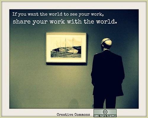
I started with the image above and, using Pic Monkey, I created this:

Creative Commons Poster 2

I tried to make that outer frame similar to the inner one. I hope the message is clear – this is what I feel Creative Commons can do for you if you CC your images or lesson plans. If they appear on other people’s blogs and Facebook profiles and the attribution leads back to you, more people will see your work. Isn’t that what the internet is all about?

Thank you, Creative Commons, for being there for all of us. And big thanks to everybody who decides to share their work with others through a CC licence.


Mission: ds106 – lyric typography poster design assignment

Thursday, June 14th, 2012

Inspired by several campers’ lyric typography posters (2 stars), I decided to go back to this assignment. I passed over it during my design sprint because the first few ideas I tried didn’t work – I wanted to do something purely typographical with the background color being the only non-textual adornment. I couldn’t pull it off by myself. I didn’t really get the examples, which looked good, but didn’t always marry the lyrics and designs in ways I could grok.

My subconscious kicked around a few ideas – I wanted to do something with Radiohead; I played our Florence + the Machine CD on today’s drive to Grammy and Poppy’s.

Here’s what I came up with while working entirely in Acorn.

Florence + the Machine

Florence + the Machine

First, I tackled this Florence + the Machine poster. I had originally thought about using inverted carrots to make teeth for the dog days, but then I decided to try coding some impact into the poster. I used a bold Rockwell font to lend weight and vibrancy to happiness and a few other bits of text. I threw in a bracket and a wide-stanced Bank Gothic font for the hit. I used Cracked (always stop at 3 fonts, Chad!) for “bullet” and rotated some forward and backward slashes to suggest a spider-web of stress fractures from a bullet hole in the middle of the “b”. I also left “bullet” in all lower case to contrast it against the other lines of text which are all capital. Finally, I kerned the last line to -12 (I go past the absolute value of 11) so I could have the text wind back on itself and fit the bottom of the page. I also split it into “in the b” and “ack” so I could make it wind back in a less predictable way. I like the gap. I think it helps punctuate a kind of hard return and possibility of escape up or down the page in the recursive loop that the last line creates. Maybe that’s where the happiness-bullet hole is.

I also worked on a Radiohead poster combining the colors and sans-serif-ness of the In Rainbows album typography (I used a bold Euphemia UCAS font) with lyrics from “Fake Plastic Trees.”

I decided to repeat the line about the town getting rid of itself, omitting one word per iteration so that the quote would get rid of itself. I put the text in a box that takes up most of the page, sized the text to fill the box, and let the line breaks take care of themselves to approximate the random aesthetic common to many pieces of Radiohead art and web design. I love the way the last line doubles itself while disappearing itself. The last bar of background is white to complete the vanishing and create some ambiguity about whether or not there is anything there in an invisible, white font.

Here’s the poster:

Radiohead

Radiohead

I’m very glad I found a way back into this assignment. Thanks, ds106 campers! Learning in community!

In gratitude, let me share this wicked pair of multi-layer stencils of Thom Yorke that a student did as a learning project this year.

Thom Yorke stencil art from a learning project

Thom Yorke stencil art from a learning project

To Dwell on Dreams

Thursday, June 14th, 2012

I can openly acknowledge my love affair with the Harry Potter series, and both books and movies alike, I can’t get enough. As I worked on this latest design assignment I was watching a special on the Harry Potter movies, which moved me emotionally because of the story itself, as well as reminiscing on the frustration that I never received my owl.

I chose the Minimalize Your Philosophy assignment which I saw for the first time on Chad’s blog. I loved the assignment for the simplicity and another opportunity to play around with typography. I’ve got a book of favorite quotes longer than the HP series (because the entire series counts, but regardless), so this assignment let me open it up and pick one.

But! This quote, reminded me that despite not being magical, It does not do to dwell on dreams and forget to live.

Dumbledore

I played around with the colors in this for a while, but I eventually chose a pale yellow and blue because they felt dream-like. I needed something in the blue space, so I put three yellow dots and then I changed the opacity on each to increase, as if the clarity of the speaker is also increasing. I wanted the “forget to live” to stand out, because it is the main premise of the quote.

I feel like I try to live by this quote. It isn’t the most spectacular like Shoot for the stars or If you can dream it you can achieve it. To me, it isn’t about what could be, or what we shoot for in our lives, because if we, for whatever reason, aren’t able to reach our ultimate goals of doctors and lawyers, so long as I can look back and have had the time of my life getting where ever it is I eventually end up, that’ll be OK too. Don’t get me wrong, it’s good to have dreams! But don’t let the obsession of the goal obscure the path you take.


A shining example of parenting

Thursday, June 14th, 2012

Inspired by Groom’s animated magazine cover, I decided to try my own. I thought of those creepy Jack Nicholson GIFs from The Shining, and how they really belong on the cover of Parenting magazine.

So I did a search for Shining GIFs to find the right one, then did an image search for Parenting magazine to find a good one to work with. I picked this particular issue for the pixel dimensions. (If you hover over one of the search result thumbnails, you’ll see the size. This one was something like 1600 pixels tall. Most of them were 200-400, which wouldn’t give very good results.) It was a nice bonus that it had an article about tantrums. I tried using Select-Color Range to pull out the type, but wasn’t too happy with the results.

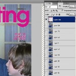
Instead, I used the rectangular selection tool to replace most of Kourtney with the background color from the cover, and then used the paintbrush tool to clear up the parts where her sweater gets behind the type. I duplicated the second “n” to fix the part of the title covered by her hair, and had to do a little more manual work to fix the “e”. It was a little tedious, but not too much.

Then I used Select-Color Range to grab the background color, played with the fuzziness a little, and inverted the selection. A flash of insight told me to change the Image Size of the GIF to match the height of the cover before trying to put the two together.

I pasted it in as the top layer, and the animation plays underneath. I didn’t like the way the GIF aligned with the type, so I undid my pasting and cropped off some of the right side to bring Jack’s head more towards the center. Repasted the type layer and cropped the whole image to magazine proportions, then reduced the image size to make the resulting GIF under 1 MB.

Zazzy Does Minecraft

Thursday, June 14th, 2012

Don’t go in the sky.

Click here to view the embedded video.

Come join the Youth and Beauty Brigade

Thursday, June 14th, 2012

The Decemberists are unparalleled storytellers and the best band that ever lived, so selecting one of their songs to use for a DS106 class project seemed appropriate.  For this assignment I decided to use a lyric from “California One/Youth and Beauty Brigade,” which appears on Castaways and Cutouts.

Here they are performing the song:

Castaways and Cutouts was released in 2002.  It went undiscovered by me until the winter of 2004.  I had just started making friends with some folks in Richmond.  One of them was a young hipster who had better taste in music than I did.

“California One/Youth and Beauty Brigade” remains on my list of favorite Decemberists songs for a few reasons.  The first half of the song is about driving route 1, which runs along the California coastline, and drinking wine.  Who doesn’t like a road trips and wine?  And look at these lyrics:  “Take a long drive with me on California One” and “Take a long dram with me on California wine.”  Clever, Colin Meloy.  Effing Clever.

It’s “Youth and Beauty Brigade” that I really adore.  I’m neither youthful nor beautiful, but boy oh boy do I relate to the misanthropes and misfits that populate The Decemberists’ Youth and Beauty Brigade: bed-wetters*, ambulance chasers, bored bench warmers, castaways, cutouts, irresponsible library users.  Yes!  And that brings me to this:

Lyric Typography Poster

Lyric Typography Poster featuring The Decemberists

Jaysus.  I’m looking at the image now, and thinking that I really built that up with the back story.

I also worked in Photoshop too.  Photoshop is still a challenge for me.  Layers and working within said layers is counterintuitive.  I’m thinking it may have something to do with the fact that I’ve spent decades in word processing software built for the “everyman.”  I’ll figure it out though.  Here’s the Photoshop version:

Cops in cars

Photoshopped version

There’s not enough space at the top, and the font type isn’t all that adventurous or exciting (especially after seeing the stuff at Music Philosophy) or uniform, but screw it.  It’s a draft.

The police car photo is from Robert Kuykendall’s Flickr stream.  I found the image by doing an advanced search in Flickr for Creative Commons-licensed images.


* I am not a bed-wetter, by the way.  I don’t chase ambulances either.  I’m not much for warming benches, because I don’t play sports.  I am notorious for not getting my library books back on time.

Right out of Piedmont

Thursday, June 14th, 2012


cc licensed ( BY ) flickr photo shared by cogdogblog

With activity ramping up for me at the Northern Voice conference this week, my window for MADI (Making Art Damn It) is closing, hence here I sit working an hour on a faux book cover for the I Can Read Movies assiognment:

Create a film-based book cover using
the aesthetic framed by Spacesic

See the original images

I’d seen people do this one before, but was a first for me. I tried recalling movies I was drawn to as a kid, and the original Andromeda Strain was one I watched a few times, maybe it was the sci-fi escape the suburbs thing, maybe it was the allure of the southwest as a foreign land for a kid on the east coast, maybe it was the mad science angle.

The one thing that I did recall, and could not find too many elements was the notion that there were these five levels of the underground Wildfire facility, and things got worse as you went down (was this a precursor to War Games use of DEFCON levels?).

What I did find was one graphic image of the structure at the University of Michigan Science Filmsite

And the Wildfire logo (though this looks like from the more recent one but it harkens back to some of the book covers

I used as a base the spacesic image for The Labrything, filling the cover in with black, and in GIMP using the noise filters to .. make noise, and mushed things around with the smudge tool.

For the images, a=I frankly lost track of what I did! I used some layer modes, and I think the cartoon filter on the model. I wavered on just o=using one of the images, but could not decide, so I layered them and made the wildfire logo faded.

Whats it mean? We ought to be careful of things that fall from space and how the government handles them… especially if we live in Piedmont New Mexico.

The Slippery Slider Gourmet – Tas T. Buds

Thursday, June 14th, 2012

The Slippery Slider Gourmet -Tas T. Buds (without Tas T. Buds, life would have less flavor and enjoyment) was last seen cleansing his palate in his favorite fashion (refer to the photo above). Tas T. Buds is someone who is a connoisseur of good food and drink. He can usually be found at gourmet restaurants (one’s that are considered to serve the highest quality food) such as the local beer halls, pizza joints, pubs and fast food courts. In between culinary debacles he can be found writing his magazine column “The Slippery Slider Gourmet” also referred to as “The Slide Guy Loves Food”. Currently he is “in the pink” journalistically speaking (which is better than being “in the red”).
This Slide Guy loves to slide down things!
Visual Assignment 595 for ds106.