Archive for the ‘openonline’ Category
Sunday, June 17th, 2012
I enjoy this island camp which is similar, in many ways, to my island home. I send a postcard to an artist friend who is presently working in Mexico. This is my postcard to Amelia White.

Picture side of postcard

Written side of postcard
This assignment challenged me but was fun because I used skills with with I am familiar along with exciting, new techniques. First, after learning about Minecraft, I copied the Minecraft environment from the site. I determined my desired postcard size. Then, I made the written side of my postcard on paper, ruling it and using two found stamps. I created a message to my fictitious friend and wrote the message in contrasting ink. I photoshopped a bit. Then, I scanned the written side and matched the sizes in my blog.
Please let me know what you think.
Posted in bunkx, design assignments, ds106, magicmacguffin, openonline, postcards from magical places | Comments Off on ds106.Design Assignment.Postcards from Magical Places – A Minecraft Island Camp
Sunday, June 17th, 2012
My goal with participating in ds106 (in whatever way that played out) was to learn something. I’ve only scratched the surface but I’ve learned quite a bit about GIMP and Photoshop today. In addition, without putting in much effort (as I probably should have done) I am looking at design differently, more aware of choices made and how those decisions impact the overall view of an item. Again, lots more to learn but I’ve gotten started.
I had to make some lame workarounds to create my CC poster because I’m not yet proficient enough in GIMP or Photoshop. That said, I’m fairly pleased with how it turned out. Here’s the original picture from Mean and Pinchy on flickr:
Here’s my take on Creative Commons:
The next assignment I attempted was
If Movie Posters Told the Truth. I’m less pleased with this work because I know if I had more patience I could fix the ‘bad script’ part to look more a part of the poster. Unfortunately it’s late (for me) and I’m not a patient person in general.
I picked a movie I can’t stand because that seemed more fun. It required inventing a new word but it captures my sentiment pretty accurately.
Finally, I tackled
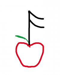
Iconic You. As simple as this looks, it took me a while because I kept trying to make it do too much. I could not come up with one thing to illustrate me and I wanted to create something that included a lot of
the ways I define myself. This design came pretty quickly but I spent a lot of time trying to add more to it. I thought about using the top of the music note to be waves and add something to symbolize biking and running in order to show my participation in triathlons. I thought about adding some little faces to the apple to symbolize my children and husband. After trying some of these out and not liking anything, I got back to the simple. It may not show everything that matters to me, but I like it.
Posted in bunk4, DesignAssignments, DesignAssignments329, DesignAssignments54, DesignAssignments594, ds106, magicmacguffin, openonline | Comments Off on ds106 Design Assignments
Sunday, June 17th, 2012

“Turn to the right.”
Behold, my first animated gif! This is from the opening scene of Raising Arizona when H.I. is getting booked by Ed. I love the Cohen brothers’ films, and this is one of their best. This is my entry in the DS106 visual assignment “Say It Like Peanut Butter.” Click the image to see a slightly larger version.
I followed various tutorials to get to this done. Jim Groom wrote a good one that gave me the overall process: http://ds106.us/wiki/index.php?title=Creating_Animated_GIFs_with_MPEG_Streamclip_and_GIMP
The first steps were to capture the video from a DVD – I used Handbrake version 0.9.6 to grab the section of the movie I wanted. Then I followed Jim’s instructions for using MPEG Streamclip to trim and export the image sequence that you then import into GIMP.
Since I have version 2.8 of the GIMP for the Mac I needed to look at another tutorial to get some of the finer details down – mainly, that when exporting the file to create the gif, you need to manually enter the .gif extension for the file name to get to the animated gif settings boxes to open. This tutorial on YouTube helped: http://youtu.be/HYrzt4hJNJs
TIP! – I found that if I optimize for .gif before I export, the file size shrunk by about half. It is good practice to conserve the bandwidth necessary for others to download or view your images if you can. To do this yourself in GIMP, once you are done and ready to export, click the Filters menu, then Animation/Optimize for GIF. Then go through the regular export process with the optimized images that open in a new window.
Maybe I need to create another now that I know how – just to reinforce the process. Or, a hundred more, to really reinforce the process?
Posted in animated, bunk2, ds106, GIF, magicmacguffin, openonline, VisualAssignments, VisualAssignments2 | Comments Off on “Turn to the right.”
Behold, my first animated gif! …
Sunday, June 17th, 2012
Inspired by my Slaughterhouse IV bunkmate Chad Sansing, I composed a Design Assignment Sprint. I spent a lot of time in tinkering in Adobe Illustrator and Adobe Photoshop, which always leaves me wishing I could do more than I actually … Continue reading →
Posted in bunk4, CampMagicMacGuffin, Chad Sansing, DesignAssignments, DesignTutorials43, DesignTutorials54, DesignTutorials57, digital storytelling, doctor who, ds106, magicmacguffin, openonline, Slaughterhouse IV | Comments Off on DS106 Week 4 – Design: A Sansing Sprint
Sunday, June 17th, 2012
For me, DS106 seems to be revolving around Kurt Vonnegut. First, there was that task in Week 2. Then, my bunkhouse was named Slaughterhouse 4. So, I just had to do Design Assignment 366, which was to create an alternative book cover suggesting that the book is about something entirely different. I know I am being mean, but I just couldn’t help it.
Here it is:

Original image used: cc licensed ( BY NC ) flickr photo by Sergiu Bacioiu: http://flickr.com/photos/sergiu_bacioiu/4327564714/
By the way, since this is primarily a TEFL blog, I believe there is a great lesson plan here, especially if the students are all reading the same book. Then they could compare the cover story to the original, or even develop the story from the cover further. Or they could create their own book covers. It would be fun to create the cover and leave out the title. Then they could try to guess what book the cover creator had in mind.

Tags: DesignAssignments,, DesignAssignments366, DS106,
Posted in bunk4, DesignAssignments, DesignAssignments366, ds106, magicmacguffin, openonline | Comments Off on Alternative Book Covers – Cat’s Cradle
Saturday, June 16th, 2012
School’s out for the summer.* I’ve dedicated at least part of today to ds106 work, finally. I’m working on a Creative Commons poster, but I’m stuck trying to put the CC icon on there. I haven’t given up yet but I did decide to take a break.
Instead I did the One Story/Four Icons assignment. I’ve enjoyed seeing the work of others on this assignment and it seemed doable. I may try some other movies soon as well. The Noun Project made this pretty simple.
*The kids are done but I still have three days next week of meetings and packing up.
Posted in bunk4, DesignAssignments, DesignAssignments358, ds106, magicmacguffin, openonline | Comments Off on Getting my ds106 Game On (Maybe)
Saturday, June 16th, 2012

Track Listing (artist – song):
- Martha Bee & The Buzz – Slide Guy
- Timmmmy Boyd – The ShopVac Shake
- The Bavettes – No, No, Nobody
- Professor Noiz and Doktor Gee – Nice Attitude
- Stella Meme & The Streetcars – Open Source by Starlight
- Ling Ting and the Tongs – Charlie Chan Can Can
- Rebekkah Oblivion – Leopard Skin Pillbox for Dad
- Chauncey Gardner Campbell – Take a Chance on Me
- DJ Dr. Jones and his Sonic Lamb Chops – Gimme Some Vee
- The Cog Dawgs – Chiba-bound and Downes
- Misha, Andy and a Pair of Bens – Oh Papa in Law (Barbershop Quartet Remix)
- LisaM – Lecture Me Later
- The David Kernohan Experience - Apocalypse Follows
- James Groom – Alexander’s Ragtime Band
The Assignment: The objective of the Turn It Up Man assignment is to create an original album cover for a compilation album and to list the album’s songs. I believe it’s all supposed to be made up or fake. At least that’s the thought that guided me while doing the assignment.
The Process: A single frame of a clip from The World’s Greatest Sinner video was the starting point for this album cover. The foreground bit of the Timothy Carey character playing guitar was isolated and exported from GIMP to Inkscape. As I was just tweaking and experimenting with the software, I can’t well explain what I did. The finished result was imported back in to GIMP where it now appears nearly like a hand-drawn sketch.
The lady playing saxophone was isolated as a layer mask and pasted as new layer above the background layer. The background layer had a few focus tricks and color adjustments done to make it all blurry. This is why the “hand-drawn” crouched Carey and the Saxophone lady standout the way they do.
The album title and the medallion with text were both done in Inkscape and imported to GIMP as a PNG file. The blurp of text on the left was done in GIMP. I’m still not sure what the advantage of doing the text in vector form is.
The Story: The title Let’s Spazz quickly came to mind after I discovered this cool new assignment yesterday. I came up with song and names of artists while riding the train in to work yesterday. The idea to use Timothy Carey’s epic rock & roll scene for the album cover came very early in the process as well.
I wish I could do a better job of documenting this one. It took a lot of time and energy. I’m fairly satisfied with how the finished product approximates the original concept. The chance to use all these different tools is certainly fun and makes it feel as though I’m gaining better facility with them.
Posted in DesignAssignments, DesignAssignments599, ds106, magicmacguffin, openonline | Comments Off on Design Assignment: Let’s Spazz
Saturday, June 16th, 2012
Martha Burtis tweeted this bag of gold a day or two again from the great John Cage. I am posting it here for posterity, it very much describes the way in which we have tried to approach ds106, and I think I will be writing this into any and all future syllabi I create from here on out.

Posted in bunkx, ds106, John Cage, magicmacguffin, openonline | Comments Off on John Cage’s 10 Rules for Students and Teachers
Saturday, June 16th, 2012

Bear with us, we will be moving to the next level of difficulty shortly. Hopefully you are feeling appropriately confident, but keep in mind the next three will separate the parachute pants wearers from the stonewashed jeans junkies.
Icon Credits (all from the Noun Project): Links for downhill skiing, hamburger, BMX, and deer.
Posted in bunkx, DesignAssignments, DesignAssignments358, digital storytelling, ds106, magicmacguffin, namethat80smovie, openonline | Comments Off on Name that 80s Movie #3