Archive for the ‘openonline’ Category


Create Your Own Smartphone App

Thursday, June 14th, 2012

Create Your Own Smartphone App — MISSION: DS106

Although it seems like smartphones can do anything these days, every iPhone, Android, or BlackBerry owner can think of one thing they wish they’re phone could do. Well here’s your chance. Come up with your dream application and then create a picture that encompasses what the App would do. It could be something feasible or something completely out of this world. Maybe someone will even be daring enough to try to make your idea into a real app and make millions! Have fun with it.
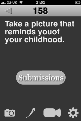
A week or two ago I made a simple Remember to Create Daily web app for iphones. If I was a real developer I’d take this a bit further and make a TDC app that could submit to Flickr, youtube and soundcloud. It would let you pick pictures and photos from your camera roll and record audio directly.

The app would post and tag the media to the appropriate service. It would optionally post to your own WordPress or posterous (and anything else with an API). In doing this it might be that the DS106 organisers would encourage the use of a ds106 tag for things participants want in the main DS106 stream, this might not include the daily stuff.

Most of the inspiration for this comes from the MakeWaves app, this is one for school pupils. It is the only blogging app that allows you to post audio as well as the more usually supported images and video. I reviewed Makewaves on my main blog: Making Waves

I though I was going to bang out a series of screens for this assignment, the audio capture, the settings screen etc. As I started I realised that this would take a great deal of thought and many days. I just stuck to the first screen. I grabbed the icons from the Noun Project. These downloaded as svg files. I had to use Gimp to open these, I then copied them and pasted into Fireworks 8. Even this one screen could do with a lot more thought. The spacing and positioning of elements, choice of icon and workflows all would need careful consideration.

My other ideal app would be a journey teller, this would combine the above with a gps tracker and create a series of ‘post’ which would be placed on a map when published, (or viewed with maps in the post) I’ve messed about with such things before: Boos on a map and A Mapped Walk for example. But it is a fairly long drawn out process. I’d love to do this on the fly without having to do any work on returning home, again I’d like image, video and audio support. The app would have to be able to store the information when there was a poor or no signal.

Two DS106 design assignments

Thursday, June 14th, 2012

Figured it was time I got some DS106 work up here, convincing myself and others that I’m not just at Camp Magic MacGuffin to play about building a British Embassy in Minecraft. Although fundamentally that is a large part of it…

First up: Lyric Typographic Poster (design assignment 529). I knew it had to be Eels, and I chose the opening lines from “Friendly Ghost” on Souljacker. People peg the Eels as a depressing band, but I think not.  The background texture is one of a load I downloaded for something else ages ago.
Lyrics

Next: Design an Invoice (design assignment 58) – described as “Create an invoice for a transaction that has happened in a film, TV series, etc”. I chose an invoice from Local Hero, one of those utterly wonderful early 80s Bill Forsyth films and quite possibly my favourite film of all time, ever*. It’s something I find myself coming back to again and again, especially at times when life seems less delightful. I’ve added some handwritten notes to preserve two lines of dialogue that need to be preserved, and I had to hand-create the logo in PowerPoint so have uploaded it as a PNG in case anyone else in the world needs to print out a Knox Industries logo and answer the phone with “Thank you for calling Knox Oil and Gas“.

Knox invoice.pdf
Download this file
Knox_industries
Anyway, happy ds106 everyone. #4life

* seriously, watch it some time. Here’s the first bit on youtube.


Permalink

| Leave a comment  »

Mission: ds106 – lyric typography poster design assignment

Thursday, June 14th, 2012

Inspired by several campers’ lyric typography posters (2 stars), I decided to go back to this assignment. I passed over it during my design sprint because the first few ideas I tried didn’t work – I wanted to do something purely typographical with the background color being the only non-textual adornment. I couldn’t pull it off by myself. I didn’t really get the examples, which looked good, but didn’t always marry the lyrics and designs in ways I could grok.

My subconscious kicked around a few ideas – I wanted to do something with Radiohead; I played our Florence + the Machine CD on today’s drive to Grammy and Poppy’s.

Here’s what I came up with while working entirely in Acorn.

Florence + the Machine

Florence + the Machine

First, I tackled this Florence + the Machine poster. I had originally thought about using inverted carrots to make teeth for the dog days, but then I decided to try coding some impact into the poster. I used a bold Rockwell font to lend weight and vibrancy to happiness and a few other bits of text. I threw in a bracket and a wide-stanced Bank Gothic font for the hit. I used Cracked (always stop at 3 fonts, Chad!) for “bullet” and rotated some forward and backward slashes to suggest a spider-web of stress fractures from a bullet hole in the middle of the “b”. I also left “bullet” in all lower case to contrast it against the other lines of text which are all capital. Finally, I kerned the last line to -12 (I go past the absolute value of 11) so I could have the text wind back on itself and fit the bottom of the page. I also split it into “in the b” and “ack” so I could make it wind back in a less predictable way. I like the gap. I think it helps punctuate a kind of hard return and possibility of escape up or down the page in the recursive loop that the last line creates. Maybe that’s where the happiness-bullet hole is.

I also worked on a Radiohead poster combining the colors and sans-serif-ness of the In Rainbows album typography (I used a bold Euphemia UCAS font) with lyrics from “Fake Plastic Trees.”

I decided to repeat the line about the town getting rid of itself, omitting one word per iteration so that the quote would get rid of itself. I put the text in a box that takes up most of the page, sized the text to fill the box, and let the line breaks take care of themselves to approximate the random aesthetic common to many pieces of Radiohead art and web design. I love the way the last line doubles itself while disappearing itself. The last bar of background is white to complete the vanishing and create some ambiguity about whether or not there is anything there in an invisible, white font.

Here’s the poster:

Radiohead

Radiohead

I’m very glad I found a way back into this assignment. Thanks, ds106 campers! Learning in community!

In gratitude, let me share this wicked pair of multi-layer stencils of Thom Yorke that a student did as a learning project this year.

Thom Yorke stencil art from a learning project

Thom Yorke stencil art from a learning project

A shining example of parenting

Thursday, June 14th, 2012

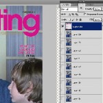
Inspired by Groom’s animated magazine cover, I decided to try my own. I thought of those creepy Jack Nicholson GIFs from The Shining, and how they really belong on the cover of Parenting magazine.

So I did a search for Shining GIFs to find the right one, then did an image search for Parenting magazine to find a good one to work with. I picked this particular issue for the pixel dimensions. (If you hover over one of the search result thumbnails, you’ll see the size. This one was something like 1600 pixels tall. Most of them were 200-400, which wouldn’t give very good results.) It was a nice bonus that it had an article about tantrums. I tried using Select-Color Range to pull out the type, but wasn’t too happy with the results.

Instead, I used the rectangular selection tool to replace most of Kourtney with the background color from the cover, and then used the paintbrush tool to clear up the parts where her sweater gets behind the type. I duplicated the second “n” to fix the part of the title covered by her hair, and had to do a little more manual work to fix the “e”. It was a little tedious, but not too much.

Then I used Select-Color Range to grab the background color, played with the fuzziness a little, and inverted the selection. A flash of insight told me to change the Image Size of the GIF to match the height of the cover before trying to put the two together.

I pasted it in as the top layer, and the animation plays underneath. I didn’t like the way the GIF aligned with the type, so I undid my pasting and cropped off some of the right side to bring Jack’s head more towards the center. Repasted the type layer and cropped the whole image to magazine proportions, then reduced the image size to make the resulting GIF under 1 MB.

Zazzy Does Minecraft

Thursday, June 14th, 2012

Don’t go in the sky.

Click here to view the embedded video.

Come join the Youth and Beauty Brigade

Thursday, June 14th, 2012

The Decemberists are unparalleled storytellers and the best band that ever lived, so selecting one of their songs to use for a DS106 class project seemed appropriate.  For this assignment I decided to use a lyric from “California One/Youth and Beauty Brigade,” which appears on Castaways and Cutouts.

Here they are performing the song:

Castaways and Cutouts was released in 2002.  It went undiscovered by me until the winter of 2004.  I had just started making friends with some folks in Richmond.  One of them was a young hipster who had better taste in music than I did.

“California One/Youth and Beauty Brigade” remains on my list of favorite Decemberists songs for a few reasons.  The first half of the song is about driving route 1, which runs along the California coastline, and drinking wine.  Who doesn’t like a road trips and wine?  And look at these lyrics:  “Take a long drive with me on California One” and “Take a long dram with me on California wine.”  Clever, Colin Meloy.  Effing Clever.

It’s “Youth and Beauty Brigade” that I really adore.  I’m neither youthful nor beautiful, but boy oh boy do I relate to the misanthropes and misfits that populate The Decemberists’ Youth and Beauty Brigade: bed-wetters*, ambulance chasers, bored bench warmers, castaways, cutouts, irresponsible library users.  Yes!  And that brings me to this:

Lyric Typography Poster

Lyric Typography Poster featuring The Decemberists

Jaysus.  I’m looking at the image now, and thinking that I really built that up with the back story.

I also worked in Photoshop too.  Photoshop is still a challenge for me.  Layers and working within said layers is counterintuitive.  I’m thinking it may have something to do with the fact that I’ve spent decades in word processing software built for the “everyman.”  I’ll figure it out though.  Here’s the Photoshop version:

Cops in cars

Photoshopped version

There’s not enough space at the top, and the font type isn’t all that adventurous or exciting (especially after seeing the stuff at Music Philosophy) or uniform, but screw it.  It’s a draft.

The police car photo is from Robert Kuykendall’s Flickr stream.  I found the image by doing an advanced search in Flickr for Creative Commons-licensed images.


* I am not a bed-wetter, by the way.  I don’t chase ambulances either.  I’m not much for warming benches, because I don’t play sports.  I am notorious for not getting my library books back on time.

The Slippery Slider Gourmet – Tas T. Buds

Thursday, June 14th, 2012

The Slippery Slider Gourmet -Tas T. Buds (without Tas T. Buds, life would have less flavor and enjoyment) was last seen cleansing his palate in his favorite fashion (refer to the photo above). Tas T. Buds is someone who is a connoisseur of good food and drink. He can usually be found at gourmet restaurants (one’s that are considered to serve the highest quality food) such as the local beer halls, pizza joints, pubs and fast food courts. In between culinary debacles he can be found writing his magazine column “The Slippery Slider Gourmet” also referred to as “The Slide Guy Loves Food”. Currently he is “in the pink” journalistically speaking (which is better than being “in the red”).
This Slide Guy loves to slide down things!
Visual Assignment 595 for ds106.

… in its’ right place.

Thursday, June 14th, 2012

Here’s my go at the Lyric Typography Poster, which is located here.

In honor of me going to see them this weekend, I choose the Radiohead classic, Everything In Its Right Place. I’m sure many of you listen to them so I’ll spare the description.

Made this in Photoshop. I wanted to use graph paper as a background because I wanted to illustrate obsessive neatness, which is what I believe the song to be about. Modernist graphic design comes to mind when I listen to this song. That came into play when choosing Helvetica (haters gonna hate).

On a slightly different note, listen to this song and gaze at the work of Michael Johansson, I think they blend quite perfectly.

Without further ado:

Media Mediate Relationships

Thursday, June 14th, 2012

Classes are done and reports are written so I finally have some time to do some ds106 work. Yeah!

A few weeks ago, we were asked to watch a video of Michael Wesch speaking at UMW Faculty Academy. After some difficulties (see previous post) I was able to see the whole thing. In listening to him I garnered a few ideas that I would like to include in an upcoming workshop that I am planning for teachers.

I had already planned to start the day with participants reflecting on their personal beliefs regarding teaching and learning by determining how much they agree with some educational theorists (or not!) Our IB programme is decidedly constructivist and inquiry-based so I thought that I would define constructivism and then engage the participants in the type of inquiry that I am hoping they will at some point facilitate for their students. Inspired by Lane Clark, at the moment, I am planning to base the remainder of the day’s activities on:

  • exploring resources about inquiry
  • determining what they could do with this information to make a difference for themselves or others
  • determining what they still need to learn/ find out
  • reflecting on the skills they used in the process
  • sharing their ideas with others
  • selecting their communication tool
  • creating their product
  • celebrating their work

As a teacher, teaching in this way is incredibly challenging and I want to acknowledge that with my participants. The rewards are numerous but it is not easy because, according to Michael Wesch:

  • kids don’t believe this is what school should be
  • as a teacher you need to start over every year
  • Tip: “just love your audience and they’ll love you back” – this allows you to  you focus on what they need

I thought that I would illustrate one of the video’s messages using a meme. I know that it’s not funny but the picture seemed appropriate for the text – even though I believe the text can also be purely positive and not necessarily negative.

I created this using quickmeme.com Just click on “make a meme“, select a photo and replace the captions. For those of you making animated gifs, you can also upload those.

The Social Downes

Wednesday, June 13th, 2012

I started remaking this poster as bava art, but then I realized that nobody fits this poster better than the great Stephen Downes. Nobody more prolific, nobody more willing to speak his mind, and nobody less afraid to piss other people off! NOBODY!

All that said, nobody could be further away from the Facebook idea of corporate control and lock-in, which I guess is the joke.  I’m gonna file this under the “If movie posters told the truth” design assignment, but that isn’t exactly what this is. Anyway, this was too much fun to make.