Archive for the ‘umwsum12’ Category


Making Pictures Better

Sunday, June 10th, 2012

Week 3 has went extremely well. Learned a lot of new things about becoming a better photographer and how to make simple changes to make a better picture. Let me share with you some of things I learned.

One thing I learned was you can make a picture better by getting into silly positions. That then allows for the viewer to view everyday things at a different angel. I took a picture like this last year on my vacation in Orlando, Fl. I was leaning in the backseat of my mom’s truck and took this picture as we entered the theme park. Normally, people would see this at a straight angel and very beautiful, but not this time. This picture is out of focus and tilted.


Another thing I learned was take your camera with you everywhere you go.  For example, this week I was baking cup cakes for no particular reason. At 1:06 p.m I had finished my cupcakes and decided to take a picture of them. There absolutely nothing special about these cupcakes, but it was just a random picture that I liked.  And now I can always look back on that specific date and time and say, “I remember I baked cupcakes on that day.”


I also learned to capture the emotion of the place in which you take the picture and how the color of the photo can also show the emotion. Again, I had a picture from Disney World, and in the picture you can sense the excitement in the photo. In the backgroung of this photo you can see people off to the right smiling and a man with a backpack on,(my mother in the orange on the other hand, looks pissed), and you can tell they are ready to enjoy and explore the park. Also the banner in the picture say, “Let the Memories Begin.” So along with the banner, the excited people, and the man packed and ready, you can clearly tell that people are excited and curious to see what the park has to offer.

The color in the photo is very unique as well. The sky is very blue and the clouds are very white, which symbolizes a beautiful day. The garden made into Mickey’s head is also amazing. The colors that they park chose to us made the image of Mickey stand out and that lead to more excitement to take picture in front of it.


The last thing that I am going to talk about is how to take advantages of tools that you have and how to make a photo yours. It’s so simple to take a picture and just be like “oh this is cute.” NO! That is not enough, make the picture yours. Change it up and make it more exciting. You can easily do that by again, taking advantages of tools you have. For example, I just took a simple picture of me. And I said to myself, “This is cute, but I want to make it different.” So that I did, I went into a photo editor I have called PICSART and clicked “monochrome” and my picture went from regular to spectacular.

I’ve learned so much more about how to become a better photographer, but I used my daily creates to show that. Hopefully I will have other chances to show off my new photo taking skills. For example, getting a high tech camera where I can change lenses, or being able to travel and take street shots, or being able to catch more eventful things by being patient. I’ve learned some wonderful techniques about how to become better and I plan to use these techniques often.


Hoops

Sunday, June 10th, 2012

I took a picture of our old basketball hoop that we were getting rid of and manipulated the warmth and saturation of the colors. This was the result. Instead of looking like the normal beginning of fall when the picture was actually taken; it looks like late autumn and no one has raked the pine needles. Everything looks sickly, which in this case, seems appropriate because I liked this hoop.

The Average of Lily

Saturday, June 9th, 2012

Visual Assignment 13— Averaging Concepts using Flickr (3 stars).  This is a really cool way to make an abstract piece of art. The instructions for this assignment called for using the first 50 images produced on a Flickr search to create an “average” image. The end product reminds me of an abstract watercolor painting!

The Average of Lily

I chose to make the subject of this project: Lilies. I love lilies! They are my favorite flower. In addition to growing them in my gardens, I have pictures of them hanging in my home and tattooed on my body. Not only are they beautiful and fragrant, but their symbolism is powerful to me. Remembering Greek mythology, the ancient Greek gods were not known for their monogamous relationships. Zeus, the king of the gods and the god of thunder, was no exception. Although the Greek hero Hercules was a son of Zeus, his mother was not Hera, the goddess of marriage and children, and the wife of Zeus. A mortal woman gave birth to Hercules. Zeus drugged Hera and took Hercules to nurse from her while Hera was sleeping. When Hera woke up, she saw the baby and pulled Hercules off of her. Some milk spurted from her breast, forming the Milky Way. A few drops landed on earth, resulting in the first lilies.

For centuries, lilies have been associated with innocence and purity. Lilies also represent female sexuality. In addition, an orange lily represents hatred and tiger lilies indicate pride and wealth while the pink stargazer lily is a symbol of prosperity. But I digress, and return back to the true subject at hand, the lily images.

I started by using Bulkr, a Flickr app, the search and select the first 50 photos that came up on a search for “lily”. After downloading the images to my computer, I discovered nearly half of them were missing, having a “no longer available” placeholder instead. Bummer. :(

So I selected and downloaded the next 50 photos is the search but now I had too many. I deleted all the placeholders. Still too many images. So I decide to take a little creative liberty with this assignment, and deleted the photos that contained people, dogs, or other random images that did not focus on the lily flower. When I finally narrowed the images down to a total of 50, I opened Picasa and created a collage.

Then, to “average” or the images, I edited the collage from the “Picture Pile” setting to “Multiple Exposure” in the drop down menu to superimpose the 50 images one on top of the other.

The results looked like this:

Pretty neat way to create an abstract piece of artwork from a collection of images. This image provokes a sensation of peace and joy to me, with its pink and green tones and its watercolor painting design.

Innocence and purity? I think I’d need to see a whiter, lighter blend to create that effect.

Female sexuality? Yeah, I can see that.

What do you think?


Seasonally Friendly?

Saturday, June 9th, 2012

Visual Assignment 129—Cropped Signs (2 stars). I’m finding these assignments a lot of fun. They really challenge you to look at things differently, creatively. The thinking about it, trolling for an appropriate sign and planning the execution was a little time consuming, but I was thinking about it all day, all week, looking around as a went about my days. At work, driving to and from work, every place I visited, every sign I saw, I was contemplating if it was crop worthy for this assignment. I knew this would be fun if I could just find the right subject sign. But I was challenging myself to just be able to take the shot, isolating the right words, without editing the photo later.

Today, I decided to take a walk around historic downtown Fredericksburg to take photos. For visual assignments, for daily creates, for fun. Along the way, I took notice of all sorts of signs, evaluating them skeptically for potential for this assignment. Store signs, road signs, advertisements, etc. It was hot and busy, and my camera was dying. I gave up. I got back into my car and made my way back through downtown to head home. Then it caught my eye! It was on the edge of an alleyway. After finding a place to park and walking several blocks back to the scene, I got the perfect shot! No editing, just using the megazoom on my new Canon PowerShot SX260. I love it!

Seasonally Friendly

Here is the whole sign for The Back Yard at J. Brian’s Tap Room at 200 Hanover Street, Fredericksburg, Va.

The Back Yard

I doubt the owner’s would approve of my creative cropping of their signage as the new meaning, while funny, is not very hospitable. :)

Now I can’t stop looking at signs in a new way…creatively, and a little twisted maybe, but fun nonetheless.


Having fun with Visual Media

Friday, June 8th, 2012

This week we had to work on “Visual Assignments” dealing with photography, editing images, and just having fun! All campers had to at least earn 10 stars in order to get a good ol’ pat on the back and completion for the week.


The first visual assignment I worked on is called “Splash The Color.”


The Magic School Bus

Can be found at my Flickr account:


http://www.flickr.com/photos/79114434@N05/7351847794/in/photostream


I used an application called “Color Splash” that allows you to manipulate the colors in an image. I decided I wanted the bus to be filled in with the color and the rest to be black and white. I wanted the focus of the image to be about the bus. The story behind this bus comes from a trip to Hawaii I went on two years ago. I was driving with my family through some scenic routes and stumbled upon an abandoned bus on the top of a cliff. At the base was the Pacific Ocean. Still to this day it is a mystery on why the bus was left at this cliff, but it makes for a great touristy photograph!


The second visual assignment I worked on is called “Picasso Yourself”


4 Eyes is better then none!

Found on my Flickr account

http://www.flickr.com/photos/79114434@N05/7166722773/


I used photo shop to distort the image of myself. I first used a tool called “Lasso Tool” and drew around the part of my face that I wanted to copy onto other parts of my face. Then I used the “Rectangular Marquee Tool” this gave me the option of where I wanted to place the copied parts of my face, and where I wanted to put them.


The third visual assignment I worked on is called “9 Lives”


9 pictures that symbolize my infanthood to “adult”hood

Found on my Flickr account

http://www.flickr.com/photos/79114434@N05/7351924088/in/photostream


I used PowerPoint and Preview in order to create “9 Lives” I dragged each image into the power point then opened a “word box” to put in captions for each image. I then saved the PowerPoint and turned into a PDF. This was a bit of trial and error. The PDF was simply too large to upload onto my Flickr account, so I turned to Preview. Preview allowed me to make the image much smaller, by turning it into a JPEG. After bringing the size down, I uploaded it onto my Flickr account. J


The fourth visual assignment I worked on is called “Complete Family Photo”


Since our family, like all others, can be slightly dysfunctional, I have photo shopped together one huge group photo!


Photoshop is the outlet I used in order to complete this visual assignment. I used a photograph I took in Hawaii about 2 years ago and made it my background image. Then I gathered multiple images of myself, grandma, parents, brother, and of course the dogs and uploaded them into Photoshop. I cropped down each image to make them small enough to fit on the background image. Then I used my Lasso Tool to select the photograph to copy&paste onto the background picture. I used the Rectangular Marquee Tool to reserve a spot on the background image to paste in the foreground image. I then made the entire “Family Photo” into a JPEG and uploaded it to my Flickr account!


Found on my Flickr account:

http://www.flickr.com/photos/79114434@N05/7352054510/in/photostream


The fifth visual assignment I worked on is called “ Is that a ghost?”


I uploaded an image onto Photoshop that had a pretty simple background in order to make room for a ghostly foreground. I then took another image of myself and used the lasso tool to crop out the body specifically. I used the Rectangular Marquee Tool to place the “ghost” image twice on the background. I wanted to give it the feel of a ghost walking along the beach. To make it translucent I went to the layering of Photoshop in the lower right hand corner and adjusted the “fullness” of the foreground image. Then of course I uploaded the finished product to Flickr!


Found on my Flickr account:

http://www.flickr.com/photos/79114434@N05/7352476630/in/photostream


The sixth visual assignment I worked on is called “Draw it”

I used an image of my puppy Leo cuddling with a small mouse


This task was not as tricky as some of the others. Thanks to the wonderful diversity in Photoshop, I uploaded a picture of my puppy and used an artistic filter on it. I used a crosshatch filter, and played with the shadow/highlights of the image. I then uploaded it to Flickr.


Found on my Flickr account:

http://www.flickr.com/photos/79114434@N05/7167300437/in/photostream


If you’ve got them…

Friday, June 8th, 2012

Okay, true confessions time: I have a celebrity crush on Sam Elliott. Despite the fact he’s more than 30 years my senior AND older than my dad, I find something about him sexy as hell. No Sean Connery for me. Sam Elliott all the way. If I only had him by the balls…! Just kidding. Maybe.

If you've got 'em...

When I came across an assignment that involved using a celebrity (or three), I couldn’t resist my Mr. Elliott fixation. What, or more accurately who, do I think of when I think of him? Well, Sam Elliott is famous for his western movies…and so is John Wayne.

John Wayne starred in 142 movies and said a lot of stuff. I started googling John Wayne quotes to find one I recognized or liked or could work with. Something fun. And sexy. To go with the sexy Sam Elliott.

Now we have a western movie star theme going. And I need one more strong, male, western man to participate in this activity with us. And in walks in none other than the one and only Clint Eastwood.

One picture of Sam, a quote from John, and the use of Clint’s name…tweek a little in Picasa and, yep, I have compiled three rough, gruff, sexy, older western heroes into one hot shot. And I muse…will my boyfriend raise his eyebrows at me when this image becomes my wallpaper? Maybe!

Look Ma’, First GIF!

Friday, June 8th, 2012

I did my first GIF today as part of an Visual Assignment for this week. This assignment was worth three stars and it was pretty fun. It was called Say It Like the Peanut Butter and you can find it here.

This is a clip from the movie Contagion, which I saw for the first time last night. Though Gwyneth Paltrow wasn’t in the majority of the movie, I thought the time she was in it was hilarious because I got to see some of the best “sick” faces I’ve ever seen. I couldn’t get over the above clip, where she’s sick and the doctors are trying to examine her and she can’t stop making the most unattractive face ever.

I made this clip by taking three screen shots from the actual DVD, saving them as JPEGs and converting them into a GIF in Photoshop. I’ll add more detail to a GIF I add later once I figure out how I actually did it. Mostly I clicked around and I would have you greyscaling it a few times, inverting, accidentally deleting the file, etc.

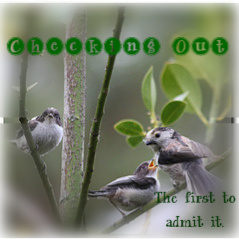
The First to Admit It (Checking Out)

Thursday, June 7th, 2012

Checking Out Album Art
Visual Assignment 44—Album Cover (2 stars). This was a fun and fairly simple project that I could do on my lunch hour at work. It also gave me a good opportunity to try a few free web-based photo editors. For this project, I used FotoFlexer (www.fotoflexer.com)

In keeping with the instructions of the assignment, here’s how I ended up with a voyeuristic bird on the album cover of a curiously named band:

Followed the link http://en.wikipedia.org/wiki/Special:Random The title of the article that that this link generates now becomes the name of my band. Thus, my band became “Checking Out”. 

The title of the album is generated by using the last 4-5 words of the last quote of this page: http://www.quotationspage.com/random.php3. 

Checking Out’s debut album is now called “The First to Admit It”.

The cover art is based off a randomly generated Flickr photo. The 3rd image that shows up here: http://www.flickr.com/explore/interesting/7days is the foundation for “The First to Admit It” album cover.


Here’s a closer look at the original:

Credit to lucia bianchi for the photography: http://www.flickr.com/photos/lubi66/7344834132/

I used FotoFlexer to assemble the random elements to create the complete album cover. Specifically, I applied a filter and adjusted it to soften the image and blur the edges to frame the birds. Then I added and manipulated the text until I found a compilation that I like and viola! Checking Out’s very first album art is ready for release…complete with a dirty bird watching the birdie couple like a green-eyed stalker!

Troll Quotes

Tuesday, June 5th, 2012

For this assignment, I found an image of a (fairly) well known figure, Coco Chanel. Then, I added a quote by Marilyn Monroe, one that I find mildly amusing, and attributed the quote to Audrey Hepburn. I knew I wanted to use these three women. Marilyn Monroe has a pretty distinct image, so I decided not to use a photo of her or attribute the quote to her. Coco Chanel is not recognized as easily as Audrey Hepburn may be. They both have a pale complexion and shorter, dark hair. I figured the two would be easiest to interchange. Therefore, “nothing about [my] image is correct, and [I'm] trolling fans of all three characters at once!”

I used the text feature on the PicMonkey website. Because of the variety of dark and light, it was hard to find a text color/font that would be bold enough to show. I went to the Effects editor and chose “Soften” and moved the sliding cursor under “Fade,” so the picture would not be as dominating over the text. Then, I chose the font, “Marcelle Script” in white. It is bold and sort of rustic looking. I also liked the name! If only there was an “a” on the end instead of an “e”! (My name is Marcella ;) )

Optical Illusion

Tuesday, June 5th, 2012

This is an old picture I had that was great for the optical illusion visual assignment. My friend and I were finding ways to make optical illusions one night because we were just bored and thought we’d make funny pictures. I decided that I wanted to cut her head off with some scissors & it really looks like I’m chopping off her head.

I actually used no real photo editing or anything for this photo. I just put the scissors in front of my camera and moved back like 15 feet from here and put the scissors in front of the camera near her head. Shockingly, it came out perfectly and she was clueless to the fact she was about to be headless.