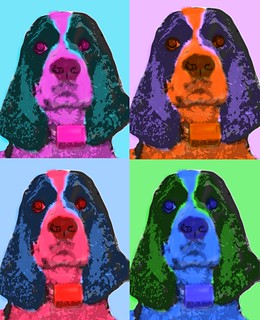
For this second visual assignment, I “Warholed Something” using the photo editing site called Aviary, mentioned on our camp packing list. Aviary actually provided a tutorial on “Warholizing” an image using their photo editing tools. I chose a picture of my dog, Tux, to “Warhol.” I followed the instructions step-by-step in the tutorial and I think I was fairly successful!
Archive for the ‘visualassignments560’ Category
Warhol Something
Friday, June 15th, 2012Four Square, Warhol-Style
Wednesday, June 13th, 2012![]() Assignment (Visual) 560: Warhol Something.
Assignment (Visual) 560: Warhol Something.
It’s fun to think what Warhol may have done with digital and social networking tools. I can see a mash-up of Four Square and his famous Warhol effect with maybe each square placing the image in a different location.
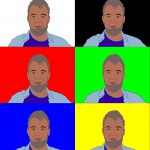
Nothing so interesting with my first Warhol effect. I did use GIMP to create my first and then tried a “toy” on the BigHugeLabs site to generate the poster. I learned from the machine-generated Warholizer that a more abstract effect is more appealing — and takes 20 years off!
Andy Warhol
Tuesday, June 12th, 2012I took this photo with Photobooth on my computer and added the pop art effect. Quick, easy, and simple! Finding the subject worthy of being Warhol-ed though was a different matter. There were so many things I could choose from, including myself.
This is my mother’s grandfather clock that has been in my life forever. I grew up with the sound of it chiming. Too the point, where I know the the rhythm of the chime anywhere. It seemed worthy of becoming pop art. It stands at an angle in a corner and with every step or shift of weight on the floor it will let you know it happens to be there.
This photo combines classic and funky. And any photo of a clock makes the viewer think about time. We think about the amount of time we have, in a day or in a lifetime. I normally think about the speed of time and how fickle it can be. Why must it crawl in a boring situation? Why does it speed through when I am having fun? And why, oh why, must it stop when I have to give a presentation in front of people?
Slow Life Down with Photobooth
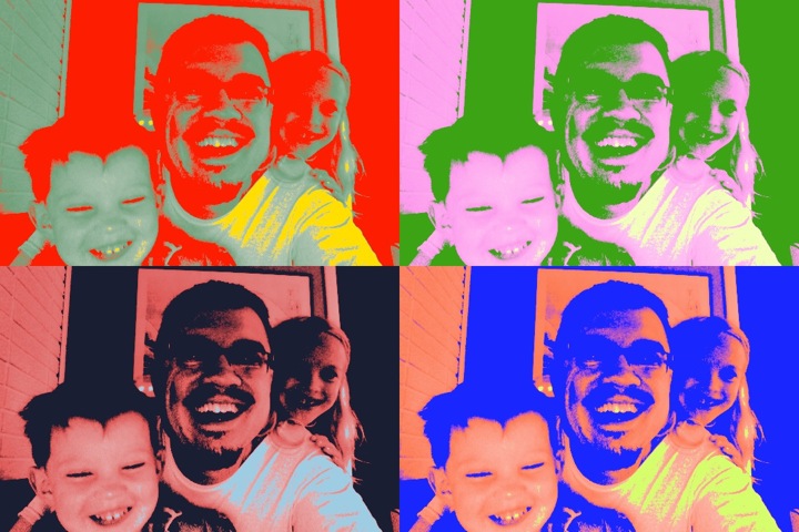
Saturday, June 9th, 2012It’s the weekend, time for a few errands, grocery shopping, mending a bit of that landscape edging you promised your wife you’d get to a month ago, and spending some time with the kids. Truth be told, our weekends are usually all sorts of busy here in the Rimes’ household, and I’m sure any other family with younger children will agree, it’s far too easy to find yourself working harder on a Saturday than you might have during the week. We’d like to think of Saturday and Sunday as “lazy” days in which we can relax with our family and friends, and just enjoy the brief time we have before heading “back to the edu-coal mines” on Monday. Reality though, typically means that we plan more activities and structure instead of playtime on those two precious days (at least it feels that way in our house many weekends).
So I thought I’d kill two birds with one stone by capturing a silly moment, and completing a ds106 assignment (yes, even ds106 can feel like one of those weekend chores if you’re trying to “play good” and complete the right number of assignments).
But that’s beside the point! How in the world is this applicable to the classroom? Quite often I see teachers in my district using Photobooth for one of two projects; either photos of everyone at the beginning of the year to go up on walls or special bulletin boards, or “special effects” photos for big projects. It’s a shame that they don’t have access to the Macbooks more often (each elementary only has 2 MacBook carts, the MS and HS 3 carts apiece), because Photobooth would make an excellent visual journaling tool for capturing daily learning experiences, moods, and just the general well-being of learning going on in a classroom. Photobooth does stills and video, so you could switch it up from day to day, maybe even taking subsequent shots to stitch together as an animated gif, or create a series of video reflections from a bunch of students after a rather large project.
Today, I just used it to capture the kids and me being silly around the breakfast table. The “Warhol Effect” was appropriate, and rather than print it out, post it on a nice bulletin board to make the hallways or classroom walls “more presentable” like I see at school, I’m just going to post it here in a quick “this is what’s going through my head right now” manner. No doubt the kids and I will stumble across it in a few years time (I’ve dumped it into my iPhoto album as well) and have a nice memory of this morning.
Mission: ds106 – visual assignment sprint
Wednesday, June 6th, 2012I found some time over the past two days to sprint through a handful of Mission: DS106 visual assignments. My notes are spread over a few devices (including my favorite red-covered Moleskine), but I’ll try to get my thoughts in order and give a full accounting of each assignment. I’ll present them in asynchronous order by complexity, from what felt like the least complex task to the most complex one.
For these activities, I used a MacBook running OSX 10.6.8 on a 2.26 GHz Intel Core Duo 2 with 2 GB of memory. Chrome is my current browser of choice. When I talk about drawing or coloring something, I mean “drawing or coloring something with a Wacom Bamboo tablet.” (These are like my global variables, thus called.)
Stories Written in a Window – 3 stars
I wrote Still Alive and Climbing the Walls in iTunes. I tried to pick songs that reflected what I have on this computer (which carries only a bit of my poor, neglected-on-an-external-hard-drive music collection). I also tried to include a few songs by friends and friends of friends that I hope folks will go out and find and/or hear on DS106 Radio.
Most of what I listen to is pop of one kind or another, so I wrote a love story. Here it is:
Replay Value – 3 stars
I call this one The Love Triangle. Though the assignment is worth 3 stars, I’ll only claim one here. I’m not entirely satisfied with the result, but something about it’s glaring artificiality defies any further editorial meddling from me.
For this piece, I imagined Steve, Pip Boy, and Journey’s Protagonist meeting in a desert (alas, alack, and rue the day, I couldn’t find any cc-licensed pictures of Lucky Wander Boy).
On Flickr, I found cc-licensed pictures of each of these characters being cos-played. Here are Steve, Pip-Boy, and the
“>Protagonist.
I used Acorn (my trial is almost up, so I am sad) to ditch the backgrounds by using the magic wand to outline and then cut the characters out of the pictures. I then saved just the characters as .pngs with transparent backgrounds.
Then I brought everybody into ComicLife against a desert-climate Minecraft screenshot I took from the DS106 server as viewed from my own computer. I used ComicLife to compose the piece because I wanted to add a witty caption or bit of dialogue. However, after seeing the look in Steve’s eyes, I decided to keep quiet.
Since Steve is armed, I put the characters into a triangle and imagined them embroiled in some kind of emotional struggle with one another – how does one adapt to finding other people where there should be none? What emotional habits kick in once we enter community?
Comic Book Effect – 1 star
I used Photo Booth to grab a silly picture of myself and then headed over to Acorn to throw a half-tone dot effect over it. Once I achieved half-tonality, I opened up ComicLife and set up a half-Dark-Knight-Returns, half-Scott-McCloud, half splash-page layout to show myself sitting the Marvel Way. I look just like my dad looks when he plays video games, but he sometimes sticks out his tongue. Like Jordan. My dad is the man.
Draw it. – 2 stars
I remain drawn to the portrait I used for my Daily Create trace drawing. The amount of detail in the photograph captivates me – it speaks to the part of my brain that has been filling up bookscovers and meeting agendas with cartoon eyes, cross-hatching, flames, flowers, spirals, and stick-figure legs since 1990. I went back to the same portrait for this exercise and the next.
I wanted to find a combination of filters that made the portrait look like a pencil drawing while preserving the volume of the subject’s beard. I clicked through a number of combinations in Photoshop Elements 9, and eventually settled on the pencil cross-hatch effect combined with fully desaturated colors and dust and scratched noise to soften the cross hatching and add volume back to the beard.
Warhol Something – 3 stars
This was the first visual activity I tackled. I found myself using several different programs to get it done. Each program had bits that seemed intuitive to me, and each had bits that seemed obtuse, so I bounced back and forth between them at my whim.
I went back to my portrait and pasted it into SketchBook Pro. I added a layer and colored in different areas with colors that appealed to me in vaguely Warholian ways.
Then I went to Acorn and used the magic wand to prune a copy of the original image so that I would up with a layer of details I could paste over the colored image in SketchBook Pro in hope of creating a silk-screen effect.
I dig it.
An Album Cover – 2 stars
My random Wikipedia search turned up Konrad I, Duke of Glogow. I rolled through his dad’s page and found the Piast Dynasty and its arms.
From there I did a cc-license search for Piast on Flickr and found a sculpture of the arms.
At that point I decided to try something inspired by the work of Rose Chase, a high school drama club pal, who designs for the Lower Dens, a Baltimore-based band.
I am no Rose Chase, but I went into Photoshop Elements 9 and equalized the images of the Piast arms. Next I put a blue photo filter on the image, blurred it five times, and desaturated the colors. To create the band of arms, I threw a 4-panel kaleidoscope effect on the arms, separated out the lower elements, and stitched them back on to the side of the upper elements. I drew, shadowed, and copied a few gold chevrons to represent one of the Piast colors and Konrad’s military victories. Finally, I dropped in the band and album names, adjusting the kerning on “Konrad1″ and the line spacing on “The Duke of Glogow.” I picked Trebuchet MS – a favorite sans-serif font of mine – and pink so that the lettering would conserve some interior weight and pop a bit.
Get ready for the drop:
Picturing Prufrock – 3 stars
I love comic books covers by Brian Bolland and Jim Steranko, and I staggered after them here.
First, I printed and read the poem, marking up lines that spoke to me. Then I started sketching street signs in my Moleskine. Pretty quickly, I decided on iterating a picture of a faceless man whittling a mask while seated on a pile of discarded faces. I gave him some shirt-sleeves because why not?
I went into SketchBook Pro and did a blue-line drawing, which is something I picked up from traditional comic book pencilling – artists sometimes layout a page in blue pencil (which doesn’t photocopy) before drawing “finished” pencils on the page for photographing and inking.
On top of the blue-line sketch I drew a black-line picture of the man and his faces.
After that, I opened Acorn to get rid of the background and keep the figure and faces.
I added a nerve filtered to translucency in a layer behind the figure, and behind that I added a circular patten, coloring every other ring yellow as the fog curling around the house (sorry – couldn’t help it). I also inserted a text layer in a modern font with the lines that inspired the work.
I saved the image and exported it as a .jpg. I brought the .jpg into comic life and added the marquee lettering, which I wanted to be a bit jarring – this would be a Vertigo title, no? I used our bunkhouse logo for the publisher’s imprint and priced the comic according to my ever-loving whim. Finally, I added a lovely portrait called “The Love Song of J. Alfred Prufrock” and pushed it to the back of the image to take care of some of the negative space underneath the circles. I liked using a huge face that someone shot to represent the poem because it fit with what interested me about the poem this time around – the creative donning and murderous abandonment of different faces and identities.
Here is the cover as it stands around, maudlin and modern:
I’m still processing all the work, but I felt delighted and surprised throughout by how some pieces defied my expectations of myself and came out much better – or even much worse – than I imagined. I would like to practice enough visual arts this summer to get a better feel for the kinds of tools and design approaches that can consistently get me into a flow state in pursuit of work that delights me. And I want to connect it all to what I’m learning about coding while noodling about in the shallowest kiddie pools of HTML, CSS, Javascript, and game design.
Warhol Me
Tuesday, June 5th, 2012This is my first assignment for this session of DS106 Warhol Something
Take a photograph, or use an existing one, and create a piece of pop art. You can use something ordinary, like Warhol’s Campbell’s Soup can, or do a portrait, like Warhol’s Marilyn Monroe. This can be done in Photoshop, Gimp, or whatever photo editing software you have available.
I’ve done something of this sort before, tracing photos with drawing software (the face trace below from 2007) and even did a wee tutorial using the smartboard software to do the same thing, great fun for kids tracing a giant face.
It is even easier to do with photo booth, I am sure there is even an iPhone app that would do the job. But on of ther aims of my ds106ing is to lose the photoshop fear, so I loaded up the recommend Andy-Warhol-Up Your Photographs with this Photoshop Tutorial and followed along. The tut does what it says on the tin. I could have spent a lot longer tweeking the modes of the layers and messing about with colours, but this is enough for one day. (I’ve been ds106ing a lot over the last few days, mainly due to having a couple of days holiday
Comrade Avatar
Tuesday, May 22nd, 2012Leelzebub continues to set the pace with her recent outpouring of fun and inspiring ds106 assignments. I learned more about using photoshop in the 90 plus minutes it took me to do the Warhol This assignment than I ever did watching those YouTube tutorials that the youngsters like to make nowadays. And that’s one of the great and wacky things about doing these things.
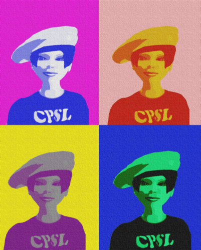
What at the beginning looked like a quick and easy warm up assignment for Camp Magic MacGuffin (it begins tomorrow, BTW), turned into a serious challenge. It again forced me to confront the digital skill set I am least comfortable with: image editing. I haven’t a clue about color, perspective and all that jazz. I’ll certainly look at Warhol’s soup cans with greater appreciation after my struggle to follow this helpful tutorial in trying to make something out of this old Second Life snapshot I found in my inventory recently.
And I suppose this virtual friend from a long time ago is where the story in this assignment is. She and I met at the headquarters building of the now defunct Communist Party of Second Life. The group had formed in playful opposition to the then rampant commercialization taking place in SL. Lots of PR and marketing firms were trying to get their clients to invest big in the virtual world. It was supposed to be the next big thing.
Though it was just a few years ago that I dabbled in such politics and activism, I’d completely forgotten about it until I found the photos of this character whose name I cannot for the life of me recall. There’s even the possibility that the avatar was me. How’s that for weird?
And suddenly there are dozens of potential story lines fighting for my attention. They’re just begging me to run with them for a little while to see what happens. There’s been a lot of these unexpected imaginative flights of fancy these days. The text files needing to be revised and revisited are piling up like Oreo cookie crumbs on a Tardis (new series) bed.
But I haven’t time for such frivolity. I need to get my bags packed for CMM. Leelzebub is miles ahead and I’m stuck on Corona Cay with my domestic Daleks. They don’t even exterminate intruders while I’m away. Things are getting serious here – very serious.
Visual Assignment: Pippin a la Warhol
Thursday, May 17th, 2012Warhol Something: Andy Warhol was an iconic pop art mastermind. Now you can be one too! Take a photograph, or use an existing one, and create a piece of pop art.
Click here to see this image on Flickr.
I’d wanted to do this assignment for a while, and since graduating, I’ve had a bit of time on my hands. I began with a photo I’d taken about a year ago of my boyfriend’s dog, Pippin, and followed the very useful tutorial provided by the assignment’s creator. The process was more complicated than I thought, and I had to bite down the urge to go off on my own. I’m glad I chose to stick with the directions, because I learned several new things, like creating sets/groups, texturizing, and the “load selection” ability, which wowed me.
I’m happy with the way it turned out, and I may even print it off at Kinko’s!
One thing the tutorial suggested that I couldn’t do was attached a signature. I may end up pulling out ye olde clunky scanner and digitizing my John Hancock, since I thought that was a neat idea. I might as well “own” my creations. I’ve been really surprised by my skill for this stuff.
