Archive for the ‘magicmacguffin’ Category


Alternative Book Covers – Cat’s Cradle

Sunday, June 17th, 2012

For me, DS106 seems to be revolving around Kurt Vonnegut. First, there was that task in Week 2. Then, my bunkhouse was named Slaughterhouse 4. So, I just had to do Design Assignment 366, which was to create an alternative book cover suggesting that the book is about something entirely different. I know I am being mean, but I just couldn’t help it.

Here it is:

Cat's Cradle
Original image used: cc licensed ( BY NC ) flickr photo by Sergiu Bacioiu: http://flickr.com/photos/sergiu_bacioiu/4327564714/

By the way, since this is primarily a TEFL blog, I believe there is a great lesson plan here, especially if the students are all reading the same book. Then they could compare the cover story to the original, or even develop the story from the cover further. Or they could create their own book covers. It would be fun to create the cover and leave out the title. Then they could try to guess what book the cover creator had in mind.


Everyday Safari

Saturday, June 16th, 2012

I found the different elements of design interesting. Some where obvious, but others elements I wouldn’t have thought of when it comes to design and how many different designs surround us every single day. Here are a few that I found on my Safari this week.

Color

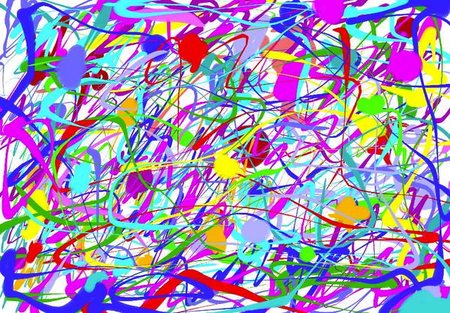
This is a watercolor drawing that my step-sister did years ago. In a way, the drawing is a manual color splash. The way she uses color is definitely effective because it draws you to a single leaf, forcing you to look at what she wants you to see.

Symbols

Such a simple symbol, yet it is so well-known that it can mean many things. This symbol represents a business, an industry, products, ideas, and people. When I see this tiny image, I think, Apple… technology… iPhone… iPod… iTunes… Macbook… Macintosh.. .knowledge… speed… performance… style… Steve Jobs… the future… All that in just an image. Because it is internationally known, this symbol is very powerful and effective at representing ideals. Not only the ideals of the decision makers of Apple Inc., but also the ideals of those who own Apple products.

Minimalism

This is a perfect use of space as well as an elegant design. It is simple and nothing extraneous is featured. There are no embellishments or textures which creates a sleek look and makes the keys stand out. This design is so striking because it is so uncomplicated. It serves its function without any unnecessary additions, while simultaneously showing the world that sleek and simple is elegance.

Function

Here are several different designs for doorknobs. Yet, none of them are being used their design intended. They were designed to be turned and used for opening doors. However, these have been recycled into coat hooks. The design has not changed, yet the function and the message they send are different. The message, as they were designed, was this family has money, style, and class. Now, the message means this family is creative, thrifty, and busy.
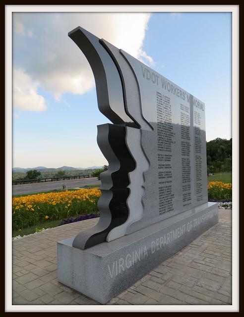
Balance

This design shows us the element of balance, specifically, symmetrical balance. As a whole, the balance creates a pattern that makes the piece look stylish. It also pulls attention to the ends and the center of the board. Taken in parts, it shows us how balance creates our thoughts on physical structure.

Proportion

Someone obviously made a mistake in the proportions of this design. There is only a quarter inch of space between the door and the stairs when the door swings open. There was no thought put into the dimensions of the design. The relationship between the door and stairs was not considered in the real world, when someone needs to stand at the bottom of the stairs and then open the door. This picture shows us how important proportions truly are to design.


Apocalypse Anyone?

Saturday, June 16th, 2012

Design Assignments 473—Otherworldly Distortion (1 star). Take a picture of a geographical location on earth and try to alter or distort it to make it seem like its from a foreign dimension.

Apocalypse Anyone?

This was a fun and easy assignment. I started with another photo I took yesterday in the mountains of Virginia. With Picasa, I played with different filter effects until I found one with a “foreign dimension” impact. The winner was the “heat map” filter. Cool colors. I think it creates an interesting, colorful image of a post-apocalyptic world!

Getting my ds106 Game On (Maybe)

Saturday, June 16th, 2012

School’s out for the summer.* I’ve dedicated at least part of today to ds106 work, finally. I’m working on a Creative Commons poster, but I’m stuck trying to put the CC icon on there. I haven’t given up yet but I did decide to take a break.

Instead I did the One Story/Four Icons assignment. I’ve enjoyed seeing the work of others on this assignment and it seemed doable. I may try some other movies soon as well. The Noun Project made this pretty simple.


*The kids are done but I still have three days next week of meetings and packing up.

Triangle Dog

Saturday, June 16th, 2012

I chose to complete the Triangle Animal Assignment. Of course, I decided to make a dog out of triangles. My favorite animal is really a turtle, dogs are second best, although I wasn’t really sure how to go about making a turtle out of triangles! With the help of the camp packing list, I chose to use the web-based vector editor called Raven (by Aviary). I have found Aviary to be a really cool site and I plan to use it for many assignments in the future. In addition to the image editor I have used for my visual assignments, along with the vector editor I just mentioned, Aviary also offers a swatch editor, an effects editor, and an audio editor, just to name a few. I can’t wait to continue exploring what the site has to offer.

While doing this project on Raven, I mostly used the “Create Spiro Path” selection, then chose the polygon and edited the vertex count to 3 in order to make triangles. I resized them, arranged them the way I wanted, added a little bit of color, and this is what I came up with:

Triangle Dog

Jackson Pollock Ă  la Marcey

Saturday, June 16th, 2012

For my first design assignment, I chose to make my own Jackson Pollock painting! I started off by looking Jackson Pollock via Google Images so I could get a better feel for his style. I decided I wanted to use a program like told-school Paint that I used to spend lots of time on back in the day on my huge desktop computer! I completed another Google search for an online version of Paint and I discovered Paint Online. Basically, I just splattered paint around and did my own thing. I experimented with lots of different colors and brush sizes. I had a great time with it, too. I felt like a kid again- no limits! But I also felt like an adult in the sense that no mess came out of it…that’s the best kind of fun!

Make Your Own Jackson Pollock

Create A New You

Saturday, June 16th, 2012

For this assignment, I went back to the handy dandy camp packing list, per usual! When I used PicMonkey for my first visual assignment, I noticed that there were many photo editing tools which could potentially be used to “improve” one’s appearance. I started off with a photo of myself and uploaded it to the free, web-based photo editing site, PicMonkey.

Create A New You: Original

(Original photo)

I did the typical edits, such as sharpening and cropping. Then, I selected the “Touch Up” editing tool on the site. It is represented by the lipstick tube symbol. I experimented with all of the effects. Under the “skin” touch-ups, there is a blemish fix, airbrush tool, wrinkle remover, shine reduce, blush boost, and spray tan. The “mouth” touch-ups include teeth whitening and lip tint. When I first whitened my teeth, it reminded me of an episode of Friends where Ross overly whitens his teeth for a date. It was almost scary looking! Who knew teeth could ever be too white?!

The “eye” touch-up tools include eye brightening, mascara, eye tint, and red eye remover (I did not use because I had previously dered my eyes in the photo). And finally, “the rest” of the touch-up tools included weight loss, highlights, and clone (something I also did not use).

Create A New You: Edited

I tried to implement all of the touch up tools at least a little, though I used some more than others. For instance, I used the spray tan and blemish remover. Though my eyes are naturally blue, I believe they were originally red in the photo, so I edited it with red eye removal, making my eyes dark and somewhat colorless. My eyes are not naturally as blue as they are in the edited photo, but I thought it was cool to see what it might look like! Honestly, I think I look really fake in the edited photo, but it was worth a try! Maybe I just didn’t do a good job editing ;)

Mother Nature’s Mountain Rhythm

Saturday, June 16th, 2012

Mountain Valley

This is a photo I took yesterday on our way back from Lexington. This beautiful mountain valley scenic overlook off of I-64, showcases Mother Nature’s design rhythm. The majestic, tree covered mountain range has a fluid movement about it, with it curves, evaluations, and spacing. It tempts your eyes to flow the curves, texture of the trees, and shapes of the mountain, with color variance aiding in the guidance of the viewers vision. You are so engrossed in taking in the rhythm of the view, that the white house in the foreground is almost an afterthought!

Memorial Minimalism in Design

Saturday, June 16th, 2012

Yesterday, Dave & I took a drive from Fredericksburg to Lexington, Va. It was a beautiful day for that scenic drive. On the way back, near sunset, we stopped at one of the established “scenic overlooks” along I-64 near Afton Mountain, outside of Charlottesville. Here we found the VDOT Workers’ Memorial.

VDOT Workers Memorial

This monument, built solely with donations, serves to honor state highway transportation workers who died performing their jobs, many in work-zone accidents. The design of this memorial is an uncomplicated and dignified. Carved in black, white, and gray granite, it depicts three profiles or silhouettes of workers, symbolizing the diversity of the VDOT workforce. A simple, minimalist design, chosen from 41 entries, was submitted by Fredericksburg District Location and Design Engineer Harry Lee and his daughter, Stephanie, a studio arts senior at Mary Washington College at the time. Standing against the majestic scenery of the mountains and valley below, and beautifully landscaped with colorful flowers, this commemorative shrine is a perfect example of the power of minimalist design.


Design Assignment: Let’s Spazz

Saturday, June 16th, 2012

Track Listing (artist – song):

  1. Martha Bee & The Buzz – Slide Guy
  2. Timmmmy Boyd – The ShopVac Shake
  3. The Bavettes – No, No, Nobody
  4. Professor Noiz and Doktor Gee – Nice Attitude
  5. Stella Meme & The Streetcars – Open Source by Starlight
  6. Ling Ting and the Tongs – Charlie Chan Can Can
  7. Rebekkah Oblivion – Leopard Skin Pillbox for Dad
  8. Chauncey Gardner Campbell – Take a Chance on Me
  9. DJ Dr. Jones and his Sonic Lamb Chops – Gimme Some Vee
  10. The Cog Dawgs – Chiba-bound and Downes
  11. Misha, Andy and a Pair of Bens –  Oh Papa in Law (Barbershop Quartet Remix)
  12. LisaM – Lecture Me Later
  13. The David Kernohan Experience - Apocalypse Follows
  14. James Groom – Alexander’s Ragtime Band

The Assignment: The objective of the Turn It Up Man assignment is to create an original album cover for a compilation album and to list the album’s songs. I believe it’s all supposed to be made up or fake. At least that’s the thought that guided me while doing the assignment.

The Process: A single frame of a clip from The World’s Greatest Sinner video was the starting point for this album cover. The foreground bit of the Timothy Carey character playing guitar was isolated and exported from GIMP to Inkscape. As I was just tweaking and experimenting with the software, I can’t well explain what I did. The finished result was imported back in to GIMP where it now appears nearly like a hand-drawn sketch.

The lady playing saxophone was isolated as a layer mask and pasted as new layer above the background layer. The background layer had a few focus tricks and color adjustments done to make it all blurry. This is why the “hand-drawn” crouched Carey and the Saxophone lady standout the way they do.

The album title and the medallion with text were both done in Inkscape and imported to GIMP as a PNG file. The blurp of text on the left was done in GIMP. I’m still not sure what the advantage of doing the text in vector form is.

The Story: The title Let’s Spazz quickly came to mind after I discovered this cool new assignment yesterday. I came up with song and names of artists while riding the train in to work yesterday. The idea to use Timothy Carey’s epic rock & roll scene for the album cover came very early in the process as well.

I wish I could do a better job of documenting this one. It took a lot of time and energy. I’m fairly satisfied with how the finished product approximates the original concept. The chance to use all these different tools is certainly fun and makes it feel as though I’m gaining better facility with them.