Archive for the ‘bunk1’ Category


Using “The Voice”

Thursday, July 5th, 2012

For this ‘using the voice’ audio assignment I had to make recording in the style of the famous Don LaFontaine’s voice. After watching the awesome youtube video on him (in the  assignment link), I was inspired to do something epic, but personal.

At first I had a prerecording describing me preparing to make a lunch, but due to a huge storm we had lost power (for 5 days!) So I decided to change it to a description of my struggles and epic travels to find electricity and wifi in order to stay on top of my ds106 work, and charge my cell phone. I didn’t edit my voice at all, just tried my best to imitate ‘the voice’… i think it worked decently. I still don’t think I like listening to my own voice though lol…

Alvin and the Chipmunks…have been “Thinking about You”

Thursday, June 28th, 2012

I was really excited about doing this assignment, one can never go wrong chipmunking a song. I wanted to do something different though, not the typical rock or rap song. I’ve been decided to try something more soulful. I chose a song by the up and coming artist Frank Ocean. This song “Thinking about you” has been one of my favorites for months now, just doesn’t want to get old in my head. The chipmunks just got some soul! I used audacity to edit the song, I played around with speed and pitch. Took the pitch higher, and shortened the song from 3 min 12 sec to 2 min 45 sec… not a huge difference, but enough that it sounded right. It was really tough getting it to sound good to me, because in the original song Mr. Ocean hits some pretty high notes as is… but after about 30 minutes playing with it I got it!

Check it out:

Why did I choose such a serious track? Well initially I thought I would take the song and add some humor to it, or at least lighten it up in my eyes. I did the opposite though, listening to the finished product over and over… it still comes off the same. The emotion of the song has rubbed off on the chipmunk(s), rather than the chipmunk(s) rubbing off on the song. I guess the emotion behind it was too strong a presence to be overshadowed by the chipmunks’ high-pitched cuteness. Or maybe it’s just me?

A Ride Through the City: An Audio Story

Thursday, June 28th, 2012

As a required audio assignment for DS106 (AKA: Camp Magic Macguffin) I had to create a story under 90 seconds that contained no verbal communication – just sounds. I started by looking up audio clips and just trying to brainstorm what I wanted to do. If there is one thing I love and can’t wait to do (hopefully soon!) is ride a motorcycle. So I decided to create a little story of someone (idealistically ME) zipping up there leather jacket, walking outside, starting their (MY) bike and going on a ride. As the ride continues city backgrounds are brought into the picture… horns, sirens, a helicopter above, people. I got my sounds from freesound.com an awesome website with a plethora of sounds and edited it all using Audacity. The software was easy to download, and a few questions submitted to Professor Google made using it very easy. I combined different sounds, faded them in and out as I please and finally got a 53 second story. I think for my first try my sounds transitioned and overlapped fairly smoothly (please give me feedback if you listen to it!).

The story fades out… the ride will continue on as the listener chooses. After finishing it, I closed my eyes and heard it. I realized then how personal it was to me. It is a reflection of something I hope to one day do, and my choice of city sounds (as oppose to say a countryside) also is a reflection of me. I was born and raised in the city ( the greatest one in the world by the way: New York), and this story just shows how much comfort and auditorial pleasure I get from the hustle and bustle of city sounds.

Take a listen and join me on my ride…

The following are links to the soundclips I used…

http://www.freesound.org/people/bdhammer/sounds/23083/

http://www.freesound.org/people/dobroide/sounds/30789/

http://www.freesound.org/people/sagetyrtle/sounds/36734/

http://www.freesound.org/people/Jewels/sounds/39848/

http://www.freesound.org/people/Zoom%20H4/sounds/97167/

http://www.freesound.org/people/jberkuta14/sounds/134900/
Letter Home: Week 4

Wednesday, June 27th, 2012

Dear mom,

This week has been crazy. A lot of school work piling up – final project and exam for Web App Development course and all the Camp Magic Macguffin activities as well. Its been rough but I’ve survived. I’ve fallen a bit behind on Camp due to Mai passing away, work, and school… but I’m catching up slowly but surely with the other campers! Everyone is helpful and nice.

I learned a TON of stuff! I learned and applied different design elements into my photography/creations, learned about Creative Commons (which is an awesome concept!), and even made my own meme- you even got a shoutout on it!

I also did some cool daily creates!

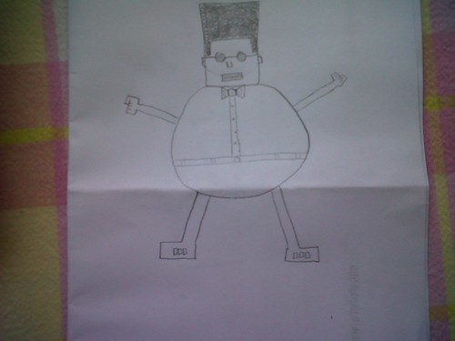
This one is a drawing made of nothing but geometric shapes…

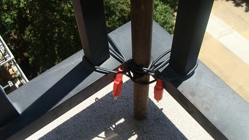
and this one is me noticing our interesting choice for rope material….

Please check out my blog mindofamasri.com for all the stuff I’ve done lately. I’ve been posting a lot lately! Enjoy and hope to see you soon :)

your son,

Mohamed T. Moaz

Comic Book Pro… Yo!

Wednesday, June 27th, 2012

This assignment was really cool! At first I contemplated drawing myself, but thought to further my tinkering with photo editing (which I’ve grown very interested in recently). I tried maybe 4 or 5 different softwares/websites for photo editing. My favorite by far for this assignment was befunky.com. Very user friendly and GUI is appealing. I used the cartoonizer effect, which allows you to adjust everything from color detail, clutter cleaner, smoothness, to sketch detail. As I was playing with the software I also found a really cool feature I thought to add to this… one that will can ‘brush over’ the image… and either ‘paint’ it in original form or in the chosen effect. So I decided to keep 2 things ‘uncartoonized’… my eyes and my watch. Gotta have clear vision and time is everything ;)

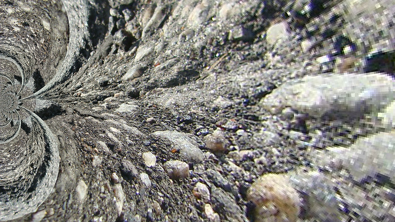
The very ground beneath you.. being sucked into another dimension!

Wednesday, June 27th, 2012

This is a photo I took of a small ditch/pothole in a lot. I got really close to the ground and took the shot. Then using my beloved pixlr.com I used the kaleidoscope filter on it. You can adjust the size, horizontal, and vertical distortions as you like. I kept tinkering with it until I got the effect that I wanted.. the solid ground beneath your feet being sucked into a vortex like a whirlpool into the next dimension *insert trippy music here*

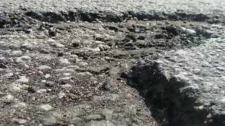
The original photo looked like this…

When I took the original my intent was to take a photo of something and make it bigger than what it seemed… a play with the design element that is proportion. Adding the extra filter only made it that much more what I wanted it to be!

What People Think I do Meme

Wednesday, June 27th, 2012


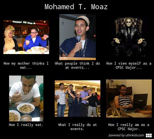
I have always wanted to create a Meme, they are always so amusing to me lol. I used uthinkido.com for this one, it is super easy. I decided to just make it a comical parody of myself in a sense. The first picture on the top left is how my mother thinks I eat all prim and proper… the one below it is how I really eat (when I’m hungry lol). The second column is what people think I do at events as an ISA (Islamic Student Association) Executive Board member… and what I actually do. The last one is how I percieve myself as a computer science major … nothing less than the great Morpheus from The Matrix (that movie has part of my heart), when in reality I just sit in my room and make weird faces at code that refuses to run properly the first go.

I thought to do a single aspect of myself- like a meme on CPSC majors, Egyptians, Africans, Muslim, how I drive my car- but thought it more individual and personally amusing to do one specifically for Mohamed himself.


Design Safari

Tuesday, June 26th, 2012

This photo I took of the keyboard in the CPSC lab (which I spent copious hours in the past 5 weeks). Proportion is key to this photo. It gives the viewer a much different image of a keyboard than is usually seen. By bringing the camera close to the keyboard, I am able to highlight the depth of the buttons, as well as the grainy surface. The lens is so close to the keyboard that bottom 1/3 of the photo is blurry, enhancing the rest of the vivid keys toward the top.

This picture I took last summer while in Egypt is of my uncle and I. It is one of my favorites,        and not only because of the memory it holds. For one the imbalance in this photo gives it so much character. Anyone looking at it can’t help but tilt there head a bit. This gives it such a carefree and exciting feel, very informal of a picture. All the colors seem so vivid too, from the tent cloth pattern, my trunks, our skintones (this photo was not edited in any way).

This was something I never noticed until I was walking around the house with my camera looking for things I never noticed before (funny when you read it out loud). This cable is being used to tie a tiki torch to the corner of my balcony rail. Not really what it was intended for I’m pretty sure, but it still can be used as rope. This picture displays its ‘rope form‘ and how well it serves its new function.


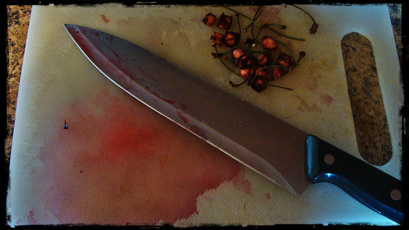
I took this photo after cutting up some cherries for my cereal at breakfast (I know the knife is huge, it was the first one I found so I used it!). The display of color here really make this picture unique. The dominance of the color red, the knife, and pool of blood cherry juice completely dominate the picture. If the stems and seeds weren’t in the picture I would assume this was something out of a scary movie! For such a tasty and wonderful fruit, the picture looks morbid and violent to say the least.

These are 5 elements of design I decided to highlight in my Design Safari!

DS106 Design Review

Tuesday, June 26th, 2012
WHAT THE FONT? OCTOPUS

WHAT THE FONT? OCTOPUS
cc licensed ( BY NC SA ) flickr photo by cryptovalence : http://www.flickr.com/photos/cryptovalence/6910903081/

As I searched through the DS106 Inspire page I found this piece of artwork. As I enlarged the image and took a closer look at it, I was amazed at all the design elements incorporated into it. It looks beautiful! The color scheme chosen creates a very mellow mood, the rhythm of the colors created by the patterns of dark and light ovals/circles gives it a very deep and wavy feel. Everything is consistent in the picture too, even oval shapes are used to draw the octupus itself! This picture was created using layers of variations of sizes and background of the letter “o”! I loved the creative application taken here, as well as a very thorough explanation on how it was done. The assignment was done very uniquely, truly in the spirit of DS106.

The link to this assignment is HERE .

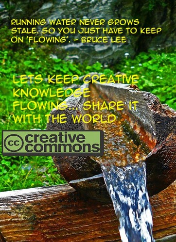
Creative Commons: Irrigation System of Knowledge

Monday, June 25th, 2012
Creative Commons Poster

cc licensed ( BY NC SA ) flickr photo by englishspartan : www.flickr.com/photos/31151097@N06/4173243665/


This is the Creative Commons poster I created. When I think of CC, an irrigation system comes to mind. We want to be able to share our creative works with everyone, because it will feed more creativity and knowledge. When we don’t share our knowledge with others through teaching, application, etc… it becomes stale and almost useless in my opinion.