Archive for the ‘DesignAssignments’ Category
Saturday, June 16th, 2012
School’s out for the summer.* I’ve dedicated at least part of today to ds106 work, finally. I’m working on a Creative Commons poster, but I’m stuck trying to put the CC icon on there. I haven’t given up yet but I did decide to take a break.
Instead I did the One Story/Four Icons assignment. I’ve enjoyed seeing the work of others on this assignment and it seemed doable. I may try some other movies soon as well. The Noun Project made this pretty simple.
*The kids are done but I still have three days next week of meetings and packing up.
Posted in bunk4, DesignAssignments, DesignAssignments358, ds106, magicmacguffin, openonline | Comments Off on Getting my ds106 Game On (Maybe)
Saturday, June 16th, 2012
I chose to complete the Triangle Animal Assignment. Of course, I decided to make a dog out of triangles. My favorite animal is really a turtle, dogs are second best, although I wasn’t really sure how to go about making a turtle out of triangles! With the help of the camp packing list, I chose to use the web-based vector editor called Raven (by Aviary). I have found Aviary to be a really cool site and I plan to use it for many assignments in the future. In addition to the image editor I have used for my visual assignments, along with the vector editor I just mentioned, Aviary also offers a swatch editor, an effects editor, and an audio editor, just to name a few. I can’t wait to continue exploring what the site has to offer.
While doing this project on Raven, I mostly used the “Create Spiro Path” selection, then chose the polygon and edited the vertex count to 3 in order to make triangles. I resized them, arranged them the way I wanted, added a little bit of color, and this is what I came up with:

Posted in bunk3, design assignments, DesignAssignments, DesignAssignments543, magicmacguffin, umwsum12 | Comments Off on Triangle Dog
Saturday, June 16th, 2012
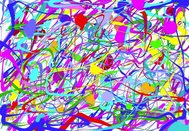
For my first design assignment, I chose to make my own Jackson Pollock painting! I started off by looking Jackson Pollock via Google Images so I could get a better feel for his style. I decided I wanted to use a program like told-school Paint that I used to spend lots of time on back in the day on my huge desktop computer! I completed another Google search for an online version of Paint and I discovered Paint Online. Basically, I just splattered paint around and did my own thing. I experimented with lots of different colors and brush sizes. I had a great time with it, too. I felt like a kid again- no limits! But I also felt like an adult in the sense that no mess came out of it…that’s the best kind of fun!

Posted in bunk3, design assignments, DesignAssignments, DesignAssignments425, magicmacguffin, umwsum12 | Comments Off on Jackson Pollock à la Marcey
Saturday, June 16th, 2012

Track Listing (artist – song):
- Martha Bee & The Buzz – Slide Guy
- Timmmmy Boyd – The ShopVac Shake
- The Bavettes – No, No, Nobody
- Professor Noiz and Doktor Gee – Nice Attitude
- Stella Meme & The Streetcars – Open Source by Starlight
- Ling Ting and the Tongs – Charlie Chan Can Can
- Rebekkah Oblivion – Leopard Skin Pillbox for Dad
- Chauncey Gardner Campbell – Take a Chance on Me
- DJ Dr. Jones and his Sonic Lamb Chops – Gimme Some Vee
- The Cog Dawgs – Chiba-bound and Downes
- Misha, Andy and a Pair of Bens – Oh Papa in Law (Barbershop Quartet Remix)
- LisaM – Lecture Me Later
- The David Kernohan Experience - Apocalypse Follows
- James Groom – Alexander’s Ragtime Band
The Assignment: The objective of the Turn It Up Man assignment is to create an original album cover for a compilation album and to list the album’s songs. I believe it’s all supposed to be made up or fake. At least that’s the thought that guided me while doing the assignment.
The Process: A single frame of a clip from The World’s Greatest Sinner video was the starting point for this album cover. The foreground bit of the Timothy Carey character playing guitar was isolated and exported from GIMP to Inkscape. As I was just tweaking and experimenting with the software, I can’t well explain what I did. The finished result was imported back in to GIMP where it now appears nearly like a hand-drawn sketch.
The lady playing saxophone was isolated as a layer mask and pasted as new layer above the background layer. The background layer had a few focus tricks and color adjustments done to make it all blurry. This is why the “hand-drawn” crouched Carey and the Saxophone lady standout the way they do.
The album title and the medallion with text were both done in Inkscape and imported to GIMP as a PNG file. The blurp of text on the left was done in GIMP. I’m still not sure what the advantage of doing the text in vector form is.
The Story: The title Let’s Spazz quickly came to mind after I discovered this cool new assignment yesterday. I came up with song and names of artists while riding the train in to work yesterday. The idea to use Timothy Carey’s epic rock & roll scene for the album cover came very early in the process as well.
I wish I could do a better job of documenting this one. It took a lot of time and energy. I’m fairly satisfied with how the finished product approximates the original concept. The chance to use all these different tools is certainly fun and makes it feel as though I’m gaining better facility with them.
Posted in DesignAssignments, DesignAssignments599, ds106, magicmacguffin, openonline | Comments Off on Design Assignment: Let’s Spazz
Saturday, June 16th, 2012

Bear with us, we will be moving to the next level of difficulty shortly. Hopefully you are feeling appropriately confident, but keep in mind the next three will separate the parachute pants wearers from the stonewashed jeans junkies.
Icon Credits (all from the Noun Project): Links for downhill skiing, hamburger, BMX, and deer.
Posted in bunkx, DesignAssignments, DesignAssignments358, digital storytelling, ds106, magicmacguffin, namethat80smovie, openonline | Comments Off on Name that 80s Movie #3
Saturday, June 16th, 2012

Here is #2 of the Name that 80s movie, and don’t get cocky people, we are just warming up. Take the lay-ups while you have the chance 
Update (forgot the attribution): The keys are from here, the guitar from here, the protestor from here, and the airplane from here.
Posted in bunkx, DesignAssignments, DesignAssignments358, digital storytelling, ds106, magicmacguffin, namethat80smovie, openonline | Comments Off on Name that 80s movie #2
Saturday, June 16th, 2012
 cc licensed ( BY NC SA ) flickr photo shared by blmiers2
Still not able to devote as much time to DS106 as I would like. I have managed to do a couple of design assignments by now and I have uploaded them to Flickr, but I am running late with blog posts. I will try to keep these posts very short and let the images speak for themselves.
In this design assignment I designed the cover of my “autobiography”, choosing the picture and the title that shows off who I really am.
I used Compfight to search for CC licensed images. I wanted my cover to have a lot of red in it, so I used “red” as my search term. As soon as I saw the robin, I knew I had to use it. It took me some time to think of a title. Finally, I came up with this:

No rational explanation for choosing either colour red or the robin. Not to mention the title. Some things are hard to explain, but they just feel right.

Tags: DesignAssignments,, DesignAssignments359, DS106,
Posted in bunk4, DesignAssignments, DesignAssignments359, ds106, magicmacguffin, openonline | Comments Off on Week 4 – My Autobiography Cover
Friday, June 15th, 2012
I always liked the idea of someone being at the very edge of things and sending back a postcard. I’m never sure if it is because they want others to join them, wish they were back home, or just excited to see how the world barrels over the edge into a pool of oblivion.
None the less, one of the design challenges this week was to create a postcard from a magical place. Specific to Camp Magic MacGuffin style, it needed to be from our Minecraft camp. So, I ventured over to Bunk House X. BH X is the fabled, mysterious and cantankerous island of veteran DS106er’s. Not unlike the Island of Misfit Toys and certainly with more curmudgeony goodness.
So, I find this dragon which is probably the coolest little piece of Minecraft art going (no dig on the others) and grab a screenshot. The hardest part was trying to find the dang screenshot from Minecraft. The instructions from class were spot on but the navigation needed to be entered into a browser window. Then BLAMMO!
So, here is 2 stars of this week’s 10-star design assignment challenge.
Posted in bunk2, DesignAssignments, DesignAssignments363, ds106, Magic MacGuffin, magicmacguffin, minecraft, openonline | Comments Off on Postcard from the Edge
Friday, June 15th, 2012

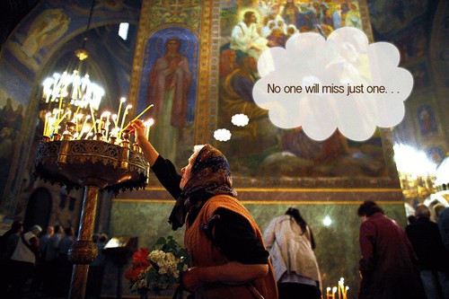
I completed the Big Caption today for another design assignment. The idea behind this one is that you take a photo from the Big Picture Web site and you recaption it so that you completely change the original meaning of the shot.
The original caption on this photo:
A worshipper lights a candle as she attends Sunday Mass led by Patriarch of Moscow and All Russia Kirill and Bulgarian Patriarch Maxim in Alexander Nevski cathedral in Sofia on April 29, 2012.
I actually played with the styling of the thought bubble quite a bit to try and reduce the cheesiness factor of putting the words in an actual thought bubble.
In any case, I’m pleased with it. It makes me giggle.
Posted in bigpicture, DesignAssignments, DesignAssignments6, ds106, magicmacguffin | Comments Off on Wax Ain’t Cheap, you know
Friday, June 15th, 2012

It’s bad form, I know, but I can’t stop doing my own awesome assignment for Animating Magazine Covers. Although I blame this one on Paul Bond, whose animated cover of Parenting featuring a heart-to-heart between Jack and Danny Torrance inspired me to go back to this animated GIF by IWDRM and but The Dude on the cover of GQ. I mean let’s face it, he deserves it, man.
What I love about this take on that assignment is it starts to use pre-exisiting GIFs to culture jam some of the pre-conceived ideas and expectations of a particular magazine’s agenda. And given how many magazines there are, there could potentially be an endless supply of inspiration. I guess the tabloids are next 
Posted in bunkx, DesignAssignments, DesignAssignments597, digital storytelling, ds106, magicmacguffin, openonline | Comments Off on GQ’s Newest Man of the Year Abides

