Archive for the ‘ds106’ Category


I just happened to be here.

Tuesday, June 19th, 2012

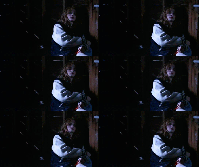
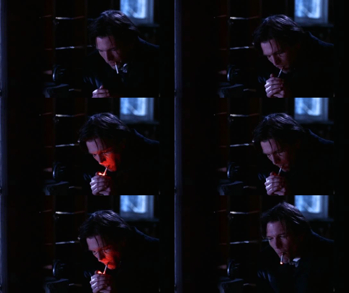
I mentioned it yesterday and couldn’t sleep last night for thoughts of GIFing Hal Hartley’s Trust.  This was easier in Schizopolis in many ways, because Hartleys films are already focused on faces and moments.  But, oh… the faces, the moments.  In the kitchen this morning, in between coffee and rinsing a quart of hair gel off of Annika, I watched the last 3 minutes of the film and bawled.  Schizopolis was our Saturday night party film, the “OMG you have to see this!” film, even though most people passed out or lost interest before the dentist-transmigration.

Trust came on after that, and always ended in tears.  My conscious (but always denied) attempt to live in the stilted Hartley language was certainly a contributor to many of friendship disintegrating fights in college.  It’s an old film – almost as old now as The Conversation was when I first saw Trust in 1998.

Even as the fashion ages into comedy, there emotional core will shift and grow with you.  Here’s my attempt to do some meager justice to this in a handful of frame grabs.

The lines and music under that last GIF add everything.

“Why have you done this?”

“Done what?”

“Put up wth me like this.”

“Somebody had to.”

“But why you?”

“I just happened to be here.”

That’s pop song strength – lines that can grow with you from bleak reflection on relationships into a tear-wrenching reflection on the arbitrary unconditional love of parenthood.  They just happened to be there, and I needed them.

DS106 Design Assignment: I Can Read Movies

Tuesday, June 19th, 2012

I chose one of my favorite movies for the I Can Read Movies design assignment, Groundhog Day from 1993.  It is one of those movies that I can flip to on TV and start watching it from any point and still enjoy it.  Usually, I notice some little thing that I had never seen before.  The amount of thought that went into its production is just amazing – how did they think of so many little things?

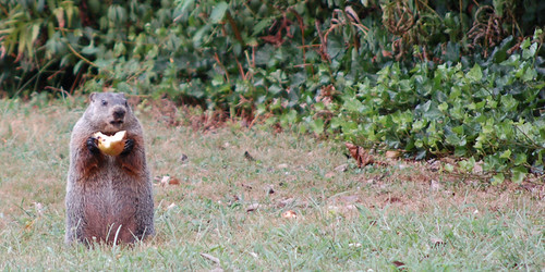
I think I thought of it for this assignment because it had so many repeating elements in its theme, it fit naturally into the I Can Read Movies book cover style.  I chose the groundhog element because it is one constant from each day, but it wasn’t the easiest thing to produce with my limited artistic abilities.  I looked for a CC licensed line art groundhog to use, but could only find ones that I would either have to pay for or were not licensed to be used other than in their original state.  Then I started searching for pictures and found the one below by John Kratz which allowed me to use and remix it however I wished.  Perfect!

ground hog

I dropped the image into SketchBookX on my iPad so I could finger-sketch the outline over  the image as a new layer, resulting in the repeated groundhog graphic.  The alarm clock was just a “Stencil” font surrounded by a rounded edged rectangle.

I chose the same “Share Alike” Creative Commons license as the groundhog image, seemed like the right thing to do.

Here is the final product:

groundhog day

DS106 Week 4 – Wrapping Up Loose Ends

Tuesday, June 19th, 2012
Original photo on Flickr by Paul Bica

If you have been following this blog lately, you know that there has been a lot of activity here ever since I joined Camp Magic McGuffin. I am a little tired, which is why I have decided to send a postcard home instead of my usual letter. I believe it is the right thing to do after a week devoted to studying design.

I would also like to share with you three of my Daily Creates.

In this Daily Create task we were asked to draw an object with our eyes closed:

Flower

I am terrible at drawing and my flower wouldn’t have looked much better if my eyes had been open, but this way at least I have an excuse.

This is a recording of street noise:

But my favourite Daily Create this week was mood inversion – reading something banal and making it sound profound. Here is my modest contribution:

See you in Week 5.

Technorati Tags:


I Believe So Strongly in #ds106

Monday, June 18th, 2012

For a few years, I’ve watched the explosion of amazing film-clip GIFs take over the web. Even as the #ds106 crew churned out fantastic artifacts in class after class, I consistently viewed that as a consumer.  Clearly it involves a lot of aestetic judgment and technical skill.  It belongs in the “complicated with Photoshop” bucket, aka the “Not for me!” pile.

WRONG!  Make art!

So while I know that my craftsmanship is weak, at least I can step it up on a curatorial level.  These are all from one of my favorite films, Soderbergh’s cinematic throat clearing excercise Schizopolis!

I believe so strongly in mayonaise

“I believe so strongly in mayonaise.”

That last GIF is cut from an amazing sequence where Soderbergy runs through a dozen hideous faces in a bathroom mirror, and then snaps back into normalcy in a split second when someone else walks into the restroom.

The other cult gem of my DVD/VHS collection is John Greyson’s Zero Patience.  Sadly, most of my immediate thoughts for GIFs involve incidental or pupet nudity.  I’m living with a holistic public identity, but I recognize the benefits of keeping the bathouse barbershop trio out of my google results.

Oh, and while I’m at it, have a little Fred Rogers.

Things Get Stranger During Week Four!!

Monday, June 18th, 2012

Dear Beloved Family,

Well, week four has drawn to a strange close here at Camp. 

The camp theme for this week was “design” and we asked all of our campers to go on Design Safaris, as they searched the world around them for examples of different elements of design. Unfortunately, I wasn’t able to complete my design safari due to another incident that I was embroiled in. 

About a week ago, I borrowed a camp camera to document some events here. To my surprise, the person who had last used it had been a bad digital citizen and had NOT cleared his old photos off of the device. I couldn’t help but look at what was there, and I found a set of strange, inscrutable shots of a grown man gleefully going down a small child’s slide. Who was this man? Why was he so joyful about sliding? Was there some hidden agenda at play? WERE THESE PICTURES LEFT HERE FOR A REASON FOR ME TO FIND THEM?!?!

In order to better understand the situation, I tried to reconstruct the original incident: 

I wish I could say the exercice helped, but it really just left me with more questions about this mysterious character. I nicknamed him Slide Guy! and decided I needed to do more to understand him. 

I created a new assignment in the DS106 assignment repository (did you know anyone could do that!!??), and asked others to help me spot this man and solve the mystery of his affection for sliding. So far, over 23 other Slide Guy! incidents have been identified. And, let me tell you, Slide Guy! has gotten around. Jim Groom spotted him going over a huge waterfall! Andy Rush discovered that he once starred in a movie! Mike Berta saw him in a bunch of places, including a jar of fermenting yogurt

But then things got REALLY weird, when Slide Guy! was spotted IN CAMP. I don’t know how to feel about this. I mean, we try to be very open and welcoming at CMM, but we do have rules, you know?! No one fitting Slide Guy!’s description has officially registered here at Camp. Is he crashing? Does he have some underhanded intentions? Will he end up threatening us all with power tools and locking us in hidey holes underground?!?! 

ANY WHO, in other news, we had our first campfire meeting around the actual camp fire this week.  I took some shots of the event so that you could see just how magical this place is (and how strange some of our campers look). We were joined at this delightful event by the one-and-only Cheryl Colan (aka Doo Wop Girl), who is a designer herself. She gave lots of good advice and we had a fun and free-ranging conversation about design, in general. 

Over the course of the week, I really tried to keep up with my own design assignments, and I’m quite pleased with my work. I think the one I’m most proud of is my reimagining of the cover of The Girl Who Played with Fire

I think it turned out well, and it captures a certain VIBE that we have going at Camp this week. 

But, really, the biggest turn-of-events was what happened on Saturday! I was all set to sit down and spend the weekend continuing to build duPont Hall at the camp site. (It’s coming along very nicely, as you can see below): 

But then I received an unexpected memo from the head of CVI (Camp Magic MacGuffin’s holding company), telling me they had three new campers that were going to be arriving that evening, whom I needed to devote special time and attention to. 

I was okay with that, of course! After all, welcoming people to Camp is my job! And I love nothing more than orienting newcomers to the magic and light that is MacGuffin. But the three campers that arrived at my doorstep, were NOT what I expected. The oldest is only eight years old! The youngest is three! 

I think this is a bit young for MacGuffin campers, don’t you? Does this symbolize some new business venture of CVI? Why are they recruiting such young members? 

As you can imagine, my hands were full entertaining, feeding, bathing, and tending to these three new arrivals. Right now, I just put a film on to keep them occupied so that I could get this letter written! I’m not even sure how I’m going to record the weekly video with Alan later today (he, by the way, has gone MISSING AGAIN!!! On Twitter he just tells me his sharing his “voice” up “north.” Whatever THAT means.) 

Anyway, here’s a picture of our newcomers entranced by Peter Pan. I’m taking them off campgrounds later this afternoon for chicken nuggets and french fries (not sure how CVI will feel about that, but I’m all out of PB&J in the cabin). But after that, I’m going to make them start creating animated gifs. Nobody gets a pass at Camp Magic MacGuffin. NOBODY. 

Til next week,

Your Beloved Martha 
Postcard from Camp Magic MacGuffin

Monday, June 18th, 2012

Wow. The design assignment opportunity this week at Camp Magic MacGuffin has offered a gazillion ideas — I have a major list I could chip away at — and making the time to get to get to them has been a fun challenge. The Postcards from Magical Places Design Assigment 363 was a blast!

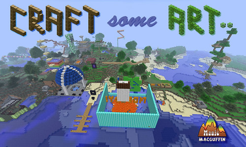
I’ve had this shot of the camp centre for a while now, and liked the idea of riffing on the ds106 “Make Some Art!” battle-cry by substituting the word “Craft” — both as a nod to the creativity evoked by Minecraft, and also the care that the word “craft” seems to embody. So as an invitation to non-campers who might receive the postcard from CMM, that seemed to be a good caption for the card.

"Postcard from Camp Magic MacGuffin (Front)" by aforgrave, on Flickr

“Postcard from Camp Magic MacGuffin (Front)” by aforgrave, on Flickr

Having spent all that time returning transparency (pixel by pixel) to the two block images so that I could use them to “build a tree” for the Monkey Social invitation, I repurposed them to create the two main words in the postcard title. The 3D nature of the lettering suits the Minecraft theme. While I’m not as happy with the text for “some” as I might be, in some ways it is reminiscent of some post card text I’ve seen that really doesn’t mesh with the image beneath. So on that note, it’s staying.  All the bits on the front were assembled in Fireworks in a .PNG, and then flattened to .JPG to post to the web.

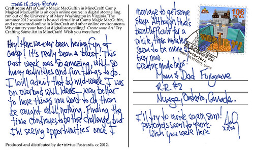
"Postcard from Camp Magic Maguffin (Back)" by aforgrave, on Flickr

“Postcard from Camp Magic Maguffin (Back)” by aforgrave, on Flickr

I had a lot of fun working on the back of the card, which had me editing the CMM logo in Photoshop to remove the colours to produce the postmark outline, creating the border of the stamp, and editing the scanned handwriting (again, more removing pixels to get a nice transparency over the existing postcard back). It seems like every time I need to make something transparent, I need to google how to do it. There must be better ways.

The stamp was especially fun to do. I’m going to do a series of stamps — I have a good number of screen captures of CMM in Minecraft, and a stamp series seems like a nice way to collect them. Given the designation bestowed to the “camp pet” in the week four assignment video, I figured it was best to start the series with that image. Gotta keep him happy.

"CMM Stamp#1 'Nobody Bava Head' "by aforgrave, on Flickr

“CMM Stamp#1 ‘Nobody Bava Head’ “by aforgrave, on Flickr

Were there more space on the postcard, it would be nice for a weekly letter home. As it was, so much has happened this past week, there really isn’t room to even begin.

Fallout in Fredericksburg

Monday, June 18th, 2012

Metaphors and Symbols in design are a simplistic way to communicate in a “universal” language. When using symbolism, it is not always necessary to use words. For instance, with street signs, one is not required to know how to READ words on the signs, but rather to know what the shapes, colors, and symbols or icons mean. Same applies the other public informational or directional signage, like the photo of the old Fallout Shelter sign I found bolted to the side of a building in historic downtown Fredericksburg, Va.


I have no idea how long that sign has been there, except it looks like it’s aged awhile! I find it interesting that the capacity is cited as 210! Fallout Shelters are designed to protect inhabitants from radioactive debris from a nuclear event. Thus, the sign incorporates the radiation symbol large and bold to identify its location. Maybe that should be my destination during the Zombie Apocalypse!

Slide Guy at Camp Magic MacGuffin

Monday, June 18th, 2012

So the Slide Guy took a bit of a visit to the MineCraft incarnation of Camp Magic MacGuffin this week, looking for appropriate places to practice his sliding skills.

He was captured trying out the stairs at the Bunk Five Archery Range

"SlideGuy at CMM Archery Stairs" by aforgrave, on Flickr

“SlideGuy at CMM Archery Stairs” by aforgrave, on Flickr

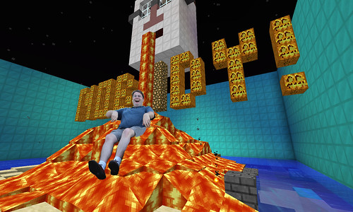
… checking out the Bava lava at the camp centre, …

"SlideGuy at CMM Bava Lava" by aforgrave, on Flickr

“SlideGuy at CMM Bava Lava” by aforgrave, on Flickr

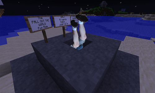
and giving a good ol’ head-first go at the Fall Out The World Fun Ride.

"SlideGuy at CMM FallOut The World Fun Ride by aforgrave, on Flickr

“SlideGuy at CMM Fall Out The World Fun Ride by aforgrave, on Flickr

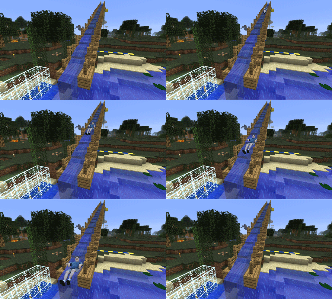
As it would turn out, however, he seemed to spend the most time at the Waterslide over at CampX.   Here is Slide Guy enjoying the waterside. Over and over!

SlideGuy at CMM Camp X Waterslide

SlideGuy at CMM Camp X Waterslide

UPDATE:  I took a close look at all of the Slide Guy images to see if anyone had done the waterslide — and somehow missed Martha’s. When I saw the work of Noise Professor Maybe Next Time D’Arcy and Tim Wins, I decided to go with an animated GIF. So clearly Slide Guy was on that waterside during the day, AND still at sunset. Or maybe at sunset, and STILL the next day.  At any rate, he must love sliding.

Slide on, Slide Guy. Slide on!

ds106 Visual Assignments 595

#DS106 Design Safari

Sunday, June 17th, 2012

Ack, here we are near the end of Design week in DS106 and I’ve still got unfinished work from last week to do. But I really liked this Week 4 Design Safari idea, so I jumped ahead of the other work especially since it gave me a good reason to go outside and take pictures.

I started my Design Safari with the intention of photographing signage of some local businesses and shops along a stretch of road in my neighborhood. I quickly began to realize that in addition to the interesting signs, there was some interesting design thinking in the placement of the signs and the appearance of the storefronts, so my focus shifted to try and capture some of those elements as well.
I took a lot of pictures and the whole collection is saved in a Flickr photoset. I selected a few of my favorites to feature in this blog post.

For example, this Italian grocery store used a unique typeface for the name. It’s distinct and memorable. I was frustrated trying to photograph the sign because I couldn’t get an angle without one of the flagpoles in the way. So I backed up to include the whole scene and I think it makes for a better picture that way.

In the same complex, around the side of the grocery store is this day-care center with its colorful sign and entrance.

Down the street a ways, a hair salon sports this clever logo.

Jerry’s Jewelry and Joys Nails share this building.


This is an impressive  looking tailor shop in a big old building that has been well kept. It was only recently marred by damage to the ‘U’ on the sign.

A strait-on view of the store front is rather striking. Notice the simple logo design on the awning over the door.

As an aside, I spotted this car parked next to the tailor shop. Check the license plate.

I really like the look of this pet shop. The sign has a homemade look to it and the clever name with the paw prints all over it gives it a welcoming appearance.

This picture framers shop has been dressed up nicely. I like the way the picture window is framed by the sign and shutters and flowers. I’ve had some work done here. There’s old-fashioned craftsmanship inside.

Across the street stands this attractive little restaurant. It’s great for lunch, but if you want to go for dinner, you need reservations made weeks in advance.

The medical center is a fairly recent addition. The sign out front has a simple modern looking design.

There’s pictures of many other shoppes and store signs from this area in the Flickr photoset I made for this project. Feel free to take a look.
The pictures posted here have been scaled down in size for the blog. Pictures on Flickr are original resolution.

That’s my story. Any Questions?

ds106.Design Assignment.Postcards from Magical Places – A Minecraft Island Camp

Sunday, June 17th, 2012

I enjoy this island camp which is similar, in many ways, to my island home. I send a postcard to an artist friend who is presently working in Mexico. This is my postcard to Amelia White.

minecraft-texture-pack-border-craft-borderlands-cell-shading

Picture side of postcard

Written side of postcard

This assignment challenged me but was fun because I used skills with with I am familiar along with exciting, new techniques. First, after learning about Minecraft, I copied the Minecraft environment from the site. I determined my desired postcard size. Then, I made the written side of my postcard on paper, ruling it and using two found stamps. I created a message to my fictitious friend and wrote the message in contrasting ink. I photoshopped a bit. Then, I scanned the written side and matched the sizes in my blog.

Please let me know what you think.