Archive for the ‘openonline’ Category


I just happened to be here.

Tuesday, June 19th, 2012

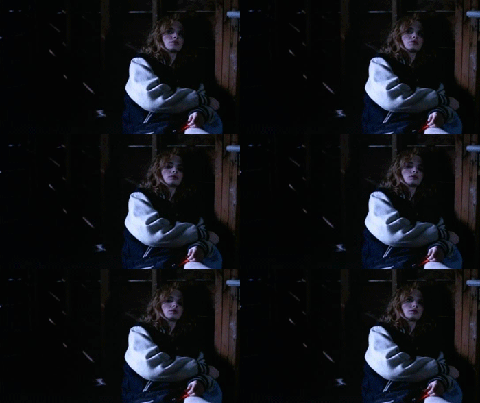
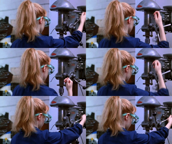
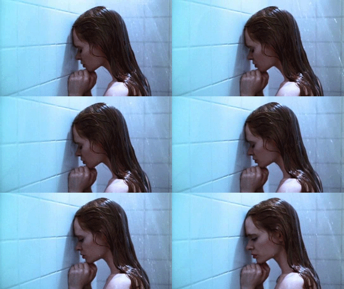
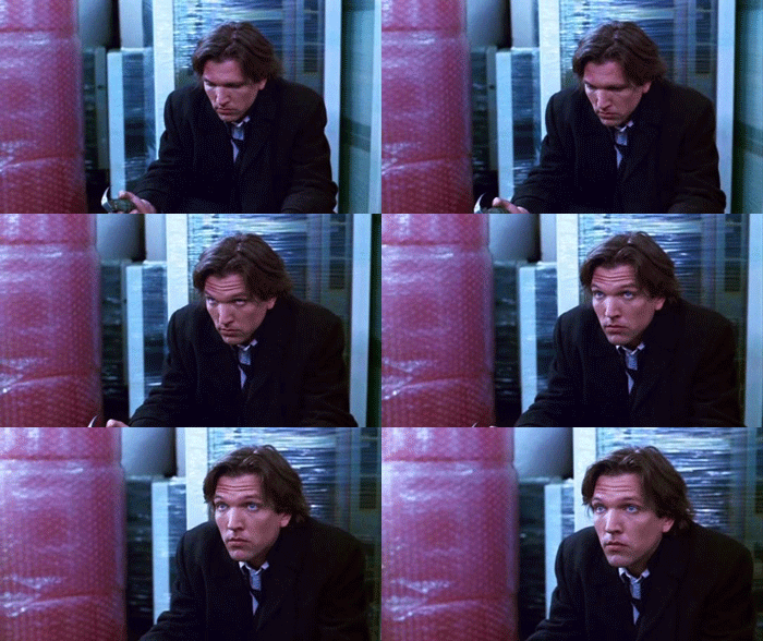
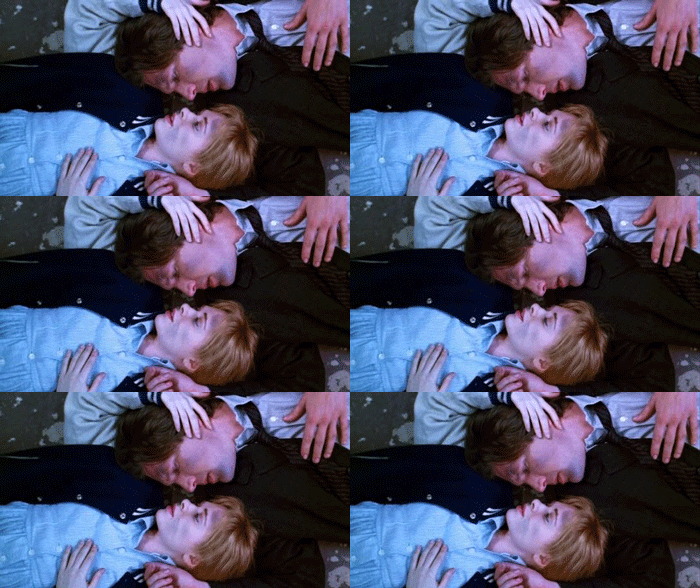
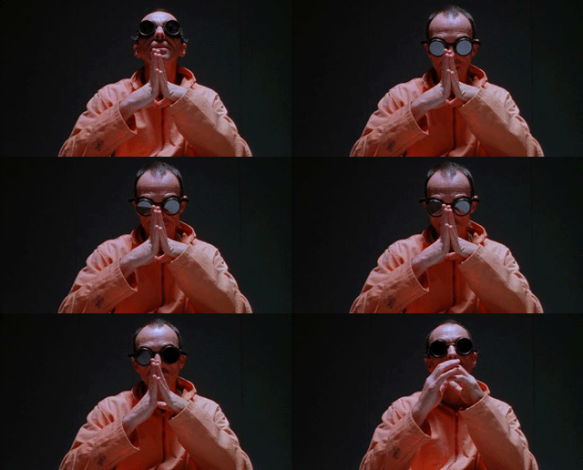
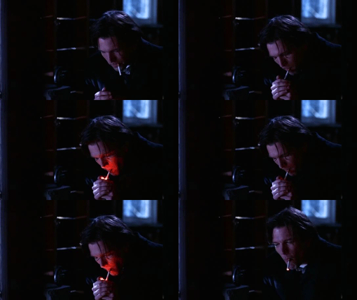
I mentioned it yesterday and couldn’t sleep last night for thoughts of GIFing Hal Hartley’s Trust.  This was easier in Schizopolis in many ways, because Hartleys films are already focused on faces and moments.  But, oh… the faces, the moments.  In the kitchen this morning, in between coffee and rinsing a quart of hair gel off of Annika, I watched the last 3 minutes of the film and bawled.  Schizopolis was our Saturday night party film, the “OMG you have to see this!” film, even though most people passed out or lost interest before the dentist-transmigration.

Trust came on after that, and always ended in tears.  My conscious (but always denied) attempt to live in the stilted Hartley language was certainly a contributor to many of friendship disintegrating fights in college.  It’s an old film – almost as old now as The Conversation was when I first saw Trust in 1998.

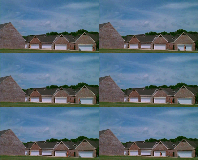
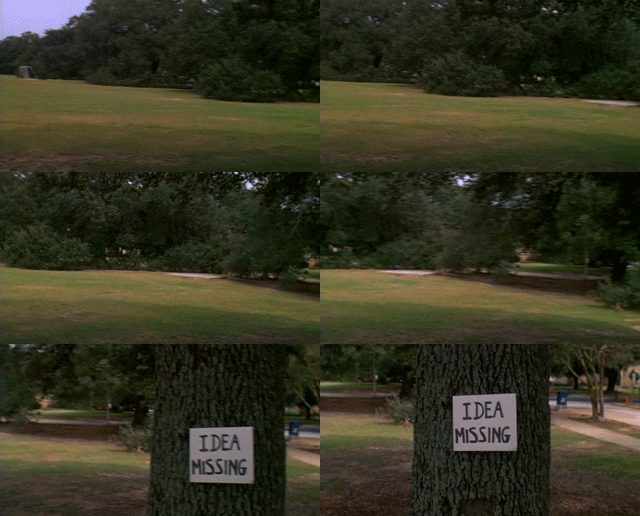
Even as the fashion ages into comedy, there emotional core will shift and grow with you.  Here’s my attempt to do some meager justice to this in a handful of frame grabs.

The lines and music under that last GIF add everything.

“Why have you done this?”

“Done what?”

“Put up wth me like this.”

“Somebody had to.”

“But why you?”

“I just happened to be here.”

That’s pop song strength – lines that can grow with you from bleak reflection on relationships into a tear-wrenching reflection on the arbitrary unconditional love of parenthood.  They just happened to be there, and I needed them.
DS106 Design Assignment: I Can Read Movies

Tuesday, June 19th, 2012

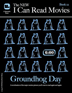
I chose one of my favorite movies for the I Can Read Movies design assignment, Groundhog Day from 1993.  It is one of those movies that I can flip to on TV and start watching it from any point and still enjoy it.  Usually, I notice some little thing that I had never seen before.  The amount of thought that went into its production is just amazing – how did they think of so many little things?

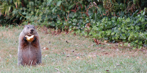
I think I thought of it for this assignment because it had so many repeating elements in its theme, it fit naturally into the I Can Read Movies book cover style.  I chose the groundhog element because it is one constant from each day, but it wasn’t the easiest thing to produce with my limited artistic abilities.  I looked for a CC licensed line art groundhog to use, but could only find ones that I would either have to pay for or were not licensed to be used other than in their original state.  Then I started searching for pictures and found the one below by John Kratz which allowed me to use and remix it however I wished.  Perfect!

ground hog

I dropped the image into SketchBookX on my iPad so I could finger-sketch the outline over  the image as a new layer, resulting in the repeated groundhog graphic.  The alarm clock was just a “Stencil” font surrounded by a rounded edged rectangle.

I chose the same “Share Alike” Creative Commons license as the groundhog image, seemed like the right thing to do.

Here is the final product:

groundhog day

DS106 Week 4 – Wrapping Up Loose Ends

Tuesday, June 19th, 2012
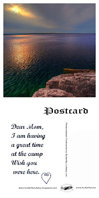
Original photo on Flickr by Paul Bica

If you have been following this blog lately, you know that there has been a lot of activity here ever since I joined Camp Magic McGuffin. I am a little tired, which is why I have decided to send a postcard home instead of my usual letter. I believe it is the right thing to do after a week devoted to studying design.

I would also like to share with you three of my Daily Creates.

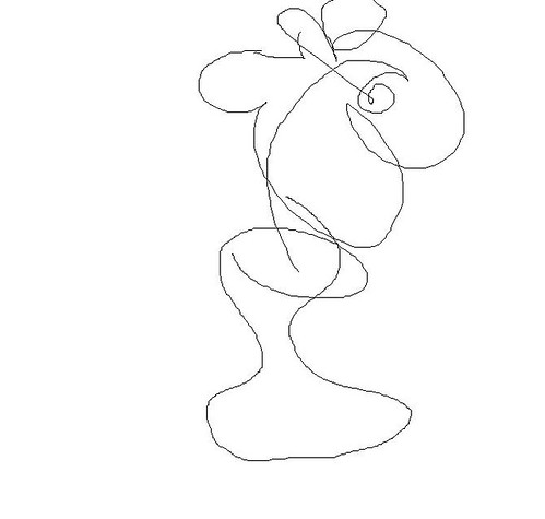
In this Daily Create task we were asked to draw an object with our eyes closed:

Flower

I am terrible at drawing and my flower wouldn’t have looked much better if my eyes had been open, but this way at least I have an excuse.

This is a recording of street noise:

But my favourite Daily Create this week was mood inversion – reading something banal and making it sound profound. Here is my modest contribution:

See you in Week 5.

Technorati Tags:


An Animated GIF-est Confession

Monday, June 18th, 2012


True confession: One of the greatest appeals of animated GIFs for me is part of a science fiction fantasy. My notebooks contain many attempts at writing a story about digital anthropology graduate students of the future whose task it is to decipher the bits and bytes of information left behind by earlier generations. I like to imagine that there is specialty field within this future discipline that looks specifically at animated GIFs for clues about a particular civilization’s whose cultural record is otherwise inscrutable.

Would these little silent moving miniatures assume the status of the cave paintings in Lascaux, Egyptian heiroglyphics, or Andean Quipus as an entry point into interrogating the earlier times for these scholars? Well certainly for the sake of the radio play I hope to write this would have to happen. And then a fun story arc to imagine is how our grad student would deal with the discovery of a dusty old hard drive full of ds106 animated GIFS? What would she make of a Slide Guy whooshing down a water slide?

I suppose my purpose in beginning this post with this true confession is to provide a bit of explanation as to what animates my interest in these little curios.

Shifting gears: When I woke up this morning I had a sudden recollection of another moment in Paths of Glory that struck me as being good for an animated GIF. This time it’s Kirk Douglas as Colonel Dax as he emerges from 701st regiments bunker to lead the charge to retake the anthill from the Germans. The battlefield sequence that follows, shot with handheld camera in a documentary style, is electrifying.

It seems that what I look for in a possible clip for an animated GIF is an isolated brief motion that stands out in some way. The idea of standing out is fuzzy and too subjective. I think what has happened is that I’ve gradually developed an eye for such moments when watching moving pictures. I wonder if others have had the experience of a film scene saying “GIF me” while viewing.

Another Angle: The sequence of Colonel Dax waving his pistol in the direction of the charge lasted less than two seconds. I set the capture rate at 4 frames per second (as opposed to 8 fps for yesterday’s Tavern scene). As there were only five frames captured and too much background movement, there was no cause to use layer masking to reduce the file size. Besides the exploding shell and flying debris are essential to the scene.

The size of this five frame file is 586 kb. The final step of creating an animated GIF in GIMP is to provide the delay rate. This refers to how long each frame is delayed before going to the next one. The default setting is 100 milliseconds (ms). This usually results in a playback rate that is too fast for my liking. I used 140 ms for this one and for the tavern scene. The delay rate is an important variable in determining how realistic the motion in the animated GIF is. I believe it is in some ways affected by the original capture rate from mpeg stream clip.

Though I’ve yet to confirm it, I believe that a clip captured at 4 fps will play back at a different rate than one captured at 8 fps even when an identical delay rate. This is a hypothesis I will need to confirm. If nothing else, I hope the experiment provides interesting data for future digital anthropologists and other scholars.

Falling short

Monday, June 18th, 2012

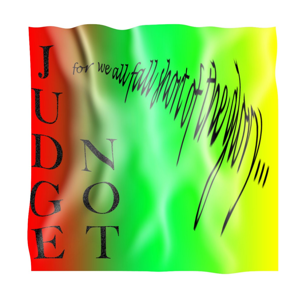
After last week’s excitement, I have fallen a little short of my own expectations this week. I’ve not been near minecraft, didn’t even get started on the Design Safari. I manage one Design Assignment, the creative commons one and then tried the Lyric Typography Poster.. I saw a couple of great results (and this looks like something professional) for this and though it didn’t look too hard. I cranked through iTunes until I remembered one of my favourite song Judge Not, there are a few different reggae songs with this title but the one I like is by Dennis Brown:

The phrase I like is Judge Not, for we all fall short of the glory of Jah. I’ve taken Jah out of the quote as I am not religious. I like the idea of trying and falling short more than Judge not lest you be judged (Matt. 7:1).

I started thinking about this, googling King James font, I saw a reference to calson, so decided to go with Big Calson which seems to be on my mac. I was hoping to get a sort of old looking text and spent a couple of hours failing to get anything like my imagination. I did consider the old english type of font. I was also thinking for some reason about flags and decided on a flag background; red gold and green seemed obvious. Many tutorials and tests later I ended up with this:


This falls very short of the target: Choose one of your favorite lines from a song and illustrate it using only typography. Consider how the font, color, sizes and placement of the typography can reflect or emphasize the meaning of the words.

Nevertheless I have now spent a deal of time playing with photoshop and trying out various tutorials, hopefully this will help.
Here are a few of the tutorials I read through:

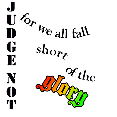
So I had another go:
I do not think I have much natural design sense. I have enjoyed and learned from other ds10ers design assignments this week.

My week 4 flickr daily creates:

And a soundcloud one:


I Believe So Strongly in #ds106

Monday, June 18th, 2012

For a few years, I’ve watched the explosion of amazing film-clip GIFs take over the web. Even as the #ds106 crew churned out fantastic artifacts in class after class, I consistently viewed that as a consumer.  Clearly it involves a lot of aestetic judgment and technical skill.  It belongs in the “complicated with Photoshop” bucket, aka the “Not for me!” pile.

WRONG!  Make art!

So while I know that my craftsmanship is weak, at least I can step it up on a curatorial level.  These are all from one of my favorite films, Soderbergh’s cinematic throat clearing excercise Schizopolis!

I believe so strongly in mayonaise

“I believe so strongly in mayonaise.”

That last GIF is cut from an amazing sequence where Soderbergy runs through a dozen hideous faces in a bathroom mirror, and then snaps back into normalcy in a split second when someone else walks into the restroom.

The other cult gem of my DVD/VHS collection is John Greyson’s Zero Patience.  Sadly, most of my immediate thoughts for GIFs involve incidental or pupet nudity.  I’m living with a holistic public identity, but I recognize the benefits of keeping the bathouse barbershop trio out of my google results.

Oh, and while I’m at it, have a little Fred Rogers.

Postcard from Camp Magic MacGuffin

Monday, June 18th, 2012

Wow. The design assignment opportunity this week at Camp Magic MacGuffin has offered a gazillion ideas — I have a major list I could chip away at — and making the time to get to get to them has been a fun challenge. The Postcards from Magical Places Design Assigment 363 was a blast!

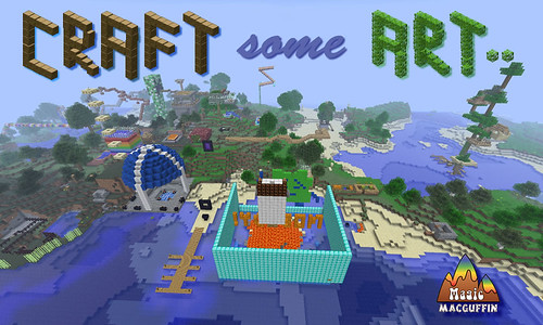
I’ve had this shot of the camp centre for a while now, and liked the idea of riffing on the ds106 “Make Some Art!” battle-cry by substituting the word “Craft” — both as a nod to the creativity evoked by Minecraft, and also the care that the word “craft” seems to embody. So as an invitation to non-campers who might receive the postcard from CMM, that seemed to be a good caption for the card.

"Postcard from Camp Magic MacGuffin (Front)" by aforgrave, on Flickr

“Postcard from Camp Magic MacGuffin (Front)” by aforgrave, on Flickr

Having spent all that time returning transparency (pixel by pixel) to the two block images so that I could use them to “build a tree” for the Monkey Social invitation, I repurposed them to create the two main words in the postcard title. The 3D nature of the lettering suits the Minecraft theme. While I’m not as happy with the text for “some” as I might be, in some ways it is reminiscent of some post card text I’ve seen that really doesn’t mesh with the image beneath. So on that note, it’s staying.  All the bits on the front were assembled in Fireworks in a .PNG, and then flattened to .JPG to post to the web.

"Postcard from Camp Magic Maguffin (Back)" by aforgrave, on Flickr

“Postcard from Camp Magic Maguffin (Back)” by aforgrave, on Flickr

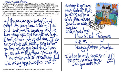
I had a lot of fun working on the back of the card, which had me editing the CMM logo in Photoshop to remove the colours to produce the postmark outline, creating the border of the stamp, and editing the scanned handwriting (again, more removing pixels to get a nice transparency over the existing postcard back). It seems like every time I need to make something transparent, I need to google how to do it. There must be better ways.

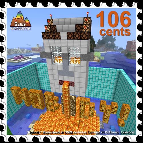
The stamp was especially fun to do. I’m going to do a series of stamps — I have a good number of screen captures of CMM in Minecraft, and a stamp series seems like a nice way to collect them. Given the designation bestowed to the “camp pet” in the week four assignment video, I figured it was best to start the series with that image. Gotta keep him happy.

"CMM Stamp#1 'Nobody Bava Head' "by aforgrave, on Flickr

“CMM Stamp#1 ‘Nobody Bava Head’ “by aforgrave, on Flickr

Were there more space on the postcard, it would be nice for a weekly letter home. As it was, so much has happened this past week, there really isn’t room to even begin.

Slide Guy at Camp Magic MacGuffin

Monday, June 18th, 2012

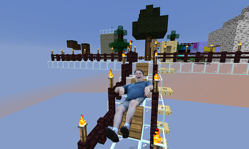
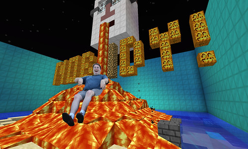
So the Slide Guy took a bit of a visit to the MineCraft incarnation of Camp Magic MacGuffin this week, looking for appropriate places to practice his sliding skills.

He was captured trying out the stairs at the Bunk Five Archery Range

"SlideGuy at CMM Archery Stairs" by aforgrave, on Flickr

“SlideGuy at CMM Archery Stairs” by aforgrave, on Flickr

… checking out the Bava lava at the camp centre, …

"SlideGuy at CMM Bava Lava" by aforgrave, on Flickr

“SlideGuy at CMM Bava Lava” by aforgrave, on Flickr

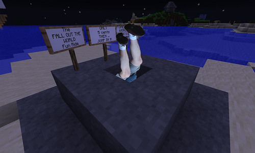
and giving a good ol’ head-first go at the Fall Out The World Fun Ride.

"SlideGuy at CMM FallOut The World Fun Ride by aforgrave, on Flickr

“SlideGuy at CMM Fall Out The World Fun Ride by aforgrave, on Flickr

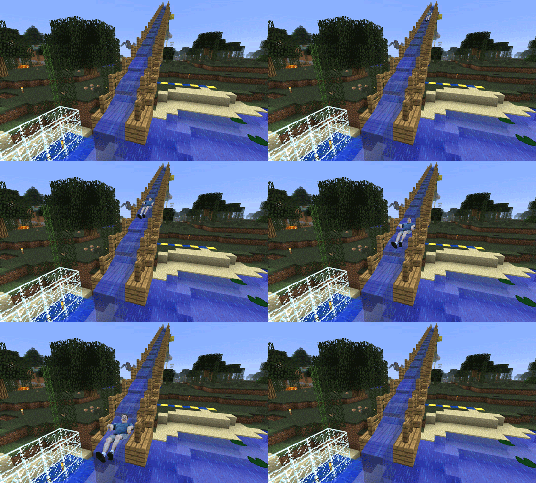
As it would turn out, however, he seemed to spend the most time at the Waterslide over at CampX.   Here is Slide Guy enjoying the waterside. Over and over!

SlideGuy at CMM Camp X Waterslide

SlideGuy at CMM Camp X Waterslide

UPDATE:  I took a close look at all of the Slide Guy images to see if anyone had done the waterslide — and somehow missed Martha’s. When I saw the work of Noise Professor Maybe Next Time D’Arcy and Tim Wins, I decided to go with an animated GIF. So clearly Slide Guy was on that waterside during the day, AND still at sunset. Or maybe at sunset, and STILL the next day.  At any rate, he must love sliding.

Slide on, Slide Guy. Slide on!

ds106 Visual Assignments 595

Daily Create 161: Record 10 seconds of street noise.

Sunday, June 17th, 2012


Daily Create 161: Record 10 seconds of street noise.

#DS106 Design Safari

Sunday, June 17th, 2012

Ack, here we are near the end of Design week in DS106 and I’ve still got unfinished work from last week to do. But I really liked this Week 4 Design Safari idea, so I jumped ahead of the other work especially since it gave me a good reason to go outside and take pictures.

I started my Design Safari with the intention of photographing signage of some local businesses and shops along a stretch of road in my neighborhood. I quickly began to realize that in addition to the interesting signs, there was some interesting design thinking in the placement of the signs and the appearance of the storefronts, so my focus shifted to try and capture some of those elements as well.
I took a lot of pictures and the whole collection is saved in a Flickr photoset. I selected a few of my favorites to feature in this blog post.

For example, this Italian grocery store used a unique typeface for the name. It’s distinct and memorable. I was frustrated trying to photograph the sign because I couldn’t get an angle without one of the flagpoles in the way. So I backed up to include the whole scene and I think it makes for a better picture that way.

In the same complex, around the side of the grocery store is this day-care center with its colorful sign and entrance.

Down the street a ways, a hair salon sports this clever logo.

Jerry’s Jewelry and Joys Nails share this building.


This is an impressive  looking tailor shop in a big old building that has been well kept. It was only recently marred by damage to the ‘U’ on the sign.

A strait-on view of the store front is rather striking. Notice the simple logo design on the awning over the door.

As an aside, I spotted this car parked next to the tailor shop. Check the license plate.

I really like the look of this pet shop. The sign has a homemade look to it and the clever name with the paw prints all over it gives it a welcoming appearance.

This picture framers shop has been dressed up nicely. I like the way the picture window is framed by the sign and shutters and flowers. I’ve had some work done here. There’s old-fashioned craftsmanship inside.

Across the street stands this attractive little restaurant. It’s great for lunch, but if you want to go for dinner, you need reservations made weeks in advance.

The medical center is a fairly recent addition. The sign out front has a simple modern looking design.

There’s pictures of many other shoppes and store signs from this area in the Flickr photoset I made for this project. Feel free to take a look.
The pictures posted here have been scaled down in size for the blog. Pictures on Flickr are original resolution.

That’s my story. Any Questions?