Still not able to devote as much time to DS106 as I would like. I have managed to do a couple of design assignments by now and I have uploaded them to Flickr, but I am running late with blog posts. I will try to keep these posts very short and let the images speak for themselves.
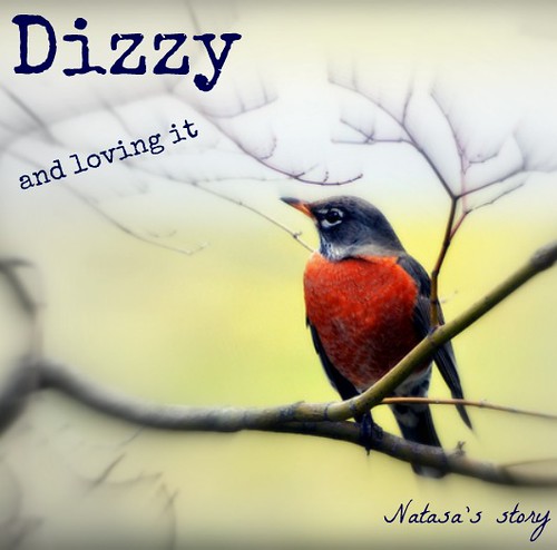
In this design assignment I designed the cover of my “autobiography”, choosing the picture and the title that shows off who I really am.
I used Compfight to search for CC licensed images. I wanted my cover to have a lot of red in it, so I used “red” as my search term. As soon as I saw the robin, I knew I had to use it. It took me some time to think of a title. Finally, I came up with this:
No rational explanation for choosing either colour red or the robin. Not to mention the title. Some things are hard to explain, but they just feel right.
I always liked the idea of someone being at the very edge of things and sending back a postcard. I’m never sure if it is because they want others to join them, wish they were back home, or just excited to see how the world barrels over the edge into a pool of oblivion.
None the less, one of the design challenges this week was to create a postcard from a magical place. Specific to Camp Magic MacGuffin style, it needed to be from our Minecraft camp. So, I ventured over to Bunk House X. BH X is the fabled, mysterious and cantankerous island of veteran DS106er’s. Not unlike the Island of Misfit Toys and certainly with more curmudgeony goodness.
So, I find this dragon which is probably the coolest little piece of Minecraft art going (no dig on the others) and grab a screenshot. The hardest part was trying to find the dang screenshot from Minecraft. The instructions from class were spot on but the navigation needed to be entered into a browser window. Then BLAMMO!
So, here is 2 stars of this week’s 10-star design assignment challenge.
What I love about this take on that assignment is it starts to use pre-exisiting GIFs to culture jam some of the pre-conceived ideas and expectations of a particular magazine’s agenda. And given how many magazines there are, there could potentially be an endless supply of inspiration. I guess the tabloids are next
Probably the most important thing I learned in camp this week is that I can outrun zombies. Now, giant spiders are another story. They can reach a land speed of 120 mph, I hear.
Okay, so my imagination is running wild but that’s what Camp MacMuffin, er, MacGuffin is all about.
I’ve written about the Minecraft experience that gave me a new appreciation for this boxy Neverland. For weeks, I wondered around accepting my fate that I would continue to die horrible deaths — eaten by zombies or giant spiders, drowning, blown up — until I could earn my “creative” wings and leave the temporary hell of Survivor mode behind. What Vsansing taught me, besides where to find safe haven and how to protect myself, is that there must be brave individuals who actually choose to live in-game in survivor mode. Residents of this ilk must enjoy this storyworld and the challenges it provides. I can understand the appeal.
The real lesson for the week was on photography and I’ll remember the talk around the campfire about how to take good pictures with any available camera. Norm tweeted something to the effect that a good photographer trumps a good camera. So I’ve gotten over my fancy camera envy and will focus with the one little lens of my Canon Sureshot 160 on being imaginative and limber in pursuit of good shots.
I was impressed also that Cogdog said that practically all of his shots are edited. Somehow, I had this idea that it’s a point of pride to present an unedited shot. Now I’m excited to explore GIMP and I’ve completed my first Visual Assignments:
Visual Assignment 13 Jamfish — Sort of an averaging assignment. I use an image multiple times to create a new one.
Visual Assignment 560: Four-Square, Warhol-Style an assignment in which I edit a Warhol-style product using GIMP and generate another with an online tool, The Warholizer.
Visual Assignment 191: Demotivate Me — If a First . . . I poke a bit of fun at those who are are not highly effective with a demotivational poster.
Visual Assignment 347: Start with a Bang . . . My first and loud animated GIF. I’m working on a subtle, quiet one.
Vonnegut Assignment: The Story Shaper App My take on Vonnegut’s story shaper theory.
You’ll see below some samples of my media craft projects for The Daily Create this week.
I’ll try to do better about being on-time with these weekly letters. Know that no news means I’m having fun! Or was eaten by a giant spider
Love,
********************
The Daily Create 147: Take a photo with stone, water, and clouds.
The clouds roll in . . . after a long, hot, steamy shower
The Daily Create 148:
Create a photograph today where some/all of your subject isn’t in focus.” Stella maris is Latin for “star of the sea.” This one is in the Indian Ocean on my globe. Thought of the compass rose because I often start out thinking that I’m clear on where I’m going but often everything goes foggy before I find my way. Such is life . . .
The Daily Create 149:
You Say Tomato; I Say Kumato
Thanks to Trader Joe’s, I’ve discovered kumatoes — European designer tomatoes that are sweeter than your typical variety and have slightly stronger skin so they ship and store well.
The Daily Create 150:
A Day in My Life, June 5
The Daily Create 149: Take a photo at six past the hour for an entire day.
Photos on the hour, ;06, from 3 pm to 3 am. Starring Ariely, my “predictably irrational” kitten.
The Daily Create 151:
Flight Feather Envy
The Daily Create: Take a photograph of something you are envious of (physical or metaphorical).
My alter ego can float to to the top of the stratosphere with her flight feather. Weightlessness has its benefits — physically and metaphorically.
The Daily Create 152:
A Place Time Won’t Forget
Saluda, North Carolina, alias Andy Griffith’s Mayberry.
Only dead giveaway is the market and grill sign.
The Daily Create 153: Take a photo of the oldest building near you. Add filters to make your photo look even older.
The Daily Create 153:
knot me
Who dressed the cables? The Daily Create: Take a picture featuring rope or knots.
“The mob will be coming out soon. Keep the door closed and you’ll be safe.”
And, with that, my boxy hero returned to the dark forest.
I did feel safe. For the first time in what seemed like hours, I could breathe without feeling the hot, putrid breath of zombies down my neck. I could enjoy the luxury of standing still, really still, and not feel the need to swivel my head constantly to pick up marauding spiders.
I was caught up in this storyworld, hook, line, and sinker.
I think this is the kind of experience that Martha referred to as emergent storytelling in Campfire#2. It really is, in many ways, improvisational storytelling — and more. There is something about “being there” in a virtual embodiment that makes the storytelling an even more immersive experience.
For a brief delusional moment, I thought I had coined a new term and then googled to learn that immersive storytelling is a form of transmedia storytelling, a term I first heard Henry Jenkins discuss. Beyond the Screen, a forum on immersive storytelling, describes this as a new age of storytelling when “audiences are transitioning from simple consumers of entertainment into dynamic participants in their media of choice.”
Bryan Alexander, who as Alan likes to say, “wrote the book on digital storytelling,” chronicles this evolution of storytelling as he describes the “public performance” nature possible through blogging. I find blogging as a storytelling device fascinating, and I’m blown away by the The World Without Oil concept with multiple bloggers collaborating to produce the unfolding story of a reality game. I understand better now the relationship of storytelling and gaming.
As a teacher-educator, I’m always on the lookout for projects that could be replicated in the classroom, and the time-based historical blog projects, such as “The Orwell Diaries” or “World War II Today” would work great. Creative teachers have always designed projects that require students to build a storyworld where they collaborate, assume new identities, and role-play. One of my all-time favorites was the La Verona Ning where English students became characters in the setting of Shakespeare’s Romeo and Juliet and “lived” there during their reading and discussing of the play. Immersive worlds like Minecraft offer a new space for accomplishing emergent storytelling that transcends any physical or geographical limitations.
Just wanted to add that I have worked/played in Second Life for over five years now. We have built installations, for example, the “Unwind Room” from Schusterman’s YA novel, Unwind, and we often dress in costumes. But, primarily, we use the space to meet in seminars and book clubs to discuss learning though literature with young adults. We talk about stories but we’re not participating in stories. We can do more.
There is unprecedented potential — in part technology-related. In a sense, this is the greatest time in human history to be a learner. — Bryan Alexander
When Bryan Alexander made this comment in a recent Future of Education webinar I got goose bumps. I know I wouldn’t have wanted to miss this ride.
After reading a bit from Bryan’s book and hearing him present twice in one week, The Future of Education and the Camp MacGuffin=DS 106 campfire, I’d say we could extrapolate “this is the greatest time in human history to be a storyteller.”
The Assignment: It’s time for the Design Assignments at Camp Magic MacGuffin. It is in attempting the assignments from this category that I come to face-to-face with my limitations to execute an idea as first envisioned. I’m totally comfortable with this and it motivates to try to pick up one or two new tricks or techniques each time out.
In doing the ds106 I Can Read Movies assignment, the goal is to create a beaten and battered book cover that depicts the novelization of an iconic film. Alan’s recent Andromeda Strain rendition led me to take a stab at Freak Friday (1976 version).
To get a true sense of what is possible with this assignment, there’s no better place to go than the original source: Spacesick.
The Process: I didn’t think it would be possible for me to come up with a cool minimal image such as those on the Spacesick site, so I decided to focus on the typography. For some reason, I’m under the impression that it is best to use a vector editing program when working with fonts. If someone can confirm or refute this, I’d be obliged. So the application I chose was the open source InkScape. As with the GIMP, it is available in Mac, Windows, and Linux version. When working on a Mac, it is also necessary to have the X11 environment installed (I assume this is now standard but am not certain).
So before I opened the application and found a suitable font, I put pencil to paper and fairly quickly came up with the idea to play of the symmetry between the two words – same first and final letter and similar length. The idea for the 4F logo in the center didn’t come until later in the process. With the idea on paper, I decided to find a new font for the project.
For the font, I went to Da Font and browsed through the retro category until I found Locked Window. It was a spontaneous decision which I really can’t explain or justify – it just seemed to be the right font for what I had in mind. Installing newly downloaded fonts is much easier than it used to be on a Mac, I assume the same is true for Windows. The Da Font site has help files that explain the procedure.
Working in Inkscape is a wee bit of a challenge. As I rarely use it, it always takes several rounds of mistakes and undos to figure how to do things. Fortunately, this was a fairly simple task. I’ve not run text vertically before nor have I had occasion to flip it as was done both vertically and horizontally here. Once I’d figured out how to command the application, the design fell into place rather quickly. I was able to use my new facility with flipping text to put the 4F icon in the center together. But next was the question of color.
I’m indebted to a former student for introducing me to the ColourLovers site. ColourLovers is more than a site, it a community of creative image and design people who share resources and ideas. Though most of what’s on offer there is way over my head, I’m grateful for the color palettes that are available. Essentially a color palette is series of colors that have been put together because they work well together. Each of the colors includes hexadecimal and RGB codes. It is even possible to export the entire palette and load it in to your image editor so all of the colors are easily selectable. For Freaky Friday, I went with the Sherbet palette.
Once I was satisfied with the typographic representation, I exported it as a PNG file. Prior to that, I had downloaded one of the covers from the Spacesick site and opened it in GIMP. The Freaky Friday PNG was then opened as new layer. The Maroon background, from the Sherbet palette, was painted as a layer over the original cover.
I decided to keep the original portion of the cover because I didn’t want to get that involved with building the thing from scratch. Also I didn’t have the time, energy or know how to give the cover the worn look that is so important.
In the end, I feel that I’ve moved the ball midway down the field and decided to punt on 4th and 2 on opponent’s 47 yard line. I should have gone for it, but didn’t
The Story: This is where I would like to explain the deeper significance for the film I selected for the project. Sadly, I don’t really have much of a story. It was the words of the title that led me to go with it. I do remember seeing the 1976 version of the film with Jodie Foster and Barbara Harris changing roles as daughter and mother for a day. I think I would love to see it again now because I am more and more drawn to the mid-70s aesthetic.
As for the 2003 version with Julia Roberts and Lindsay Lohan, I have nothing to say. I didn’t see it. Can anyone recommend it?
We are very busy this week at Camp McGuffin, with design assignments, the Design Safari, the research on Creative Commons and all the readings we need to do.
I am also really, really busy at work, so I’ll keep this post short.
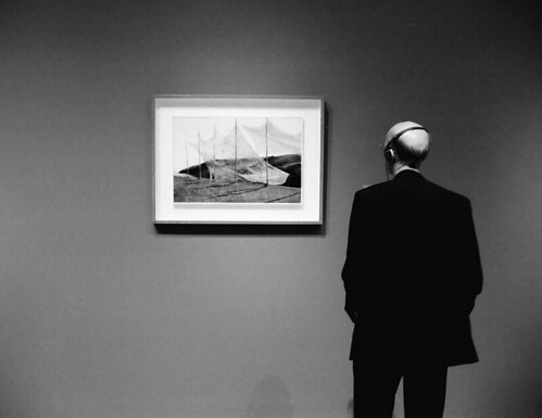
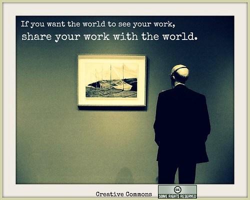
The picture you see above is the one I chose for my Creative Commons Poster. In this assignment, our task was to use a Creative Commons licensed image to design a poster about how cool Creative Commons is.
I started with the image above and, using Pic Monkey, I created this:
I tried to make that outer frame similar to the inner one. I hope the message is clear – this is what I feel Creative Commons can do for you if you CC your images or lesson plans. If they appear on other people’s blogs and Facebook profiles and the attribution leads back to you, more people will see your work. Isn’t that what the internet is all about?
Thank you, Creative Commons, for being there for all of us. And big thanks to everybody who decides to share their work with others through a CC licence.
Camp is now over (see the final story. If you are craving an experience like this, head over to ds106 and see how to participate. For more on the Summer of Magic Macguffin, see.....