Archive for the ‘openonline’ Category


I’m Not Flipping Over this Idea

Saturday, June 9th, 2012

Flipping the classroom is an idea being thrown around everywhere. I’ve had conversations about it with folks both in and out of education and teaching at all levels. No one has convinced me.

I may be hard to convince because it’s not something I seriously need to consider. I teach first graders. I don’t give them homework much less expect them to do any significant academic work outside the classroom. Plus, many of them lack internet access. So, the idea is shot down on two counts.

That doesn’t stop me from having strong opinions on it. Why should it?

Valerie Strauss, at the Washington Post, wrote about the flipped classroom this week. She quotes some folks to explain their support and shares others’ concerns about the idea. To my mind, nothing there hits on my really big issues.

First of all, a flipped classroom is not revolutionary. (I do understand that many folks don’t feel we need to be revolutionizing education but plenty are throwing this idea out there as groundbreaking.) All it does is take traditional instruction and switch it around. Teachers are still lecturing at students.* Recording those lectures and sending them home allows students to watch them multiple times but doesn’t allow any interaction. If something in the video doesn’t make sense, there is no way for that to be addressed. How does watching a video, possibly more than once, equate to significant learning?

Secondly, let’s imagine this really flies and most folks start doing it. How long will these videos be? How many videos will each student watch at night? Are we talking about half an hour per class? A high school student taking six class will have three hours of video to watch. Is that a good use of time? Is that even remotely reasonable? If teachers are taking their classroom lectures, from each class period of nearly an hour, that may be a conservative estimate. (Of course, I have serious issues with homework in general so these thoughts are tainted by that.)

Finally, this idea is so teacher focused it causes me pain. Students all get the same instruction at home (or possibly a teacher makes multiple videos for the same idea to offer differentiation – that’s a lot of work for something that is not really specific to student needs). The message is that a teacher knows exactly what the students need to know and can just impart that knowledge and move on. The student’s role is simply to listen and soak it all in.

I’d much rather see us rethinking our use of classroom time, rethinking our instructional models. Not just moving around the deck chairs.

* I do believe there is a place for lecture. My concern is that currently it is the default mode, used most often without any thought or question.
My Day in Pictures

Saturday, June 9th, 2012
What Is This?
Visual Assignment 107 – Common Everyday Object

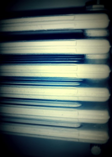
I admit, I am not one of those people who wake up easily. It usually takes me a while to focus and at first my surroundings might seem strange and unfamiliar to me. Is it a wonder, then, that the object you see in the picture above appeared to me exactly as you see it? It is one of the first things I see when I open my eyes every day. Can you guess what it is? Though, I have to say, I am notorious for giving tasks that are too easy. See my previous attempt at being mysterious.

It took me a lot of coffee and tea and good music to wake up properly:

One Shot
Visual Assignment 42 - One Shot

I should have read the task more carefully, though, since I missed an important point here – this set of photos doesn’t really tell a story, nor does it create tension, unless you are worried about what I might write into that notebook after all the caffeine that I am about to consume.

By the way, the above set of photos were created from a single shot which looks like this:

My Favourite Things

The photo was taken in front of my holiday house in the country last spring and it shows some of my favourite things, including a Kurt Vonnegut book. As I am a proud resident of Slaughterhouse 4, I chose this picture on purpose here.

If you are wondering what music my ipod was playing at the time, wonder no more. It was my favourite group, Experience Rating. Their new album The Spiritual Equivalent of Oxygen is something I warmly recommend:

AlbumCover
Visual Assignment 44 – An Album Cover

Then I spent some time thinking about people who really matter to me:

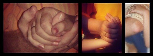
Love: In Three Frames
Visual Assignment 357 – Love: In Three Frames

After that, I was ready to face the world. And this time I faced it with a camera in hand.

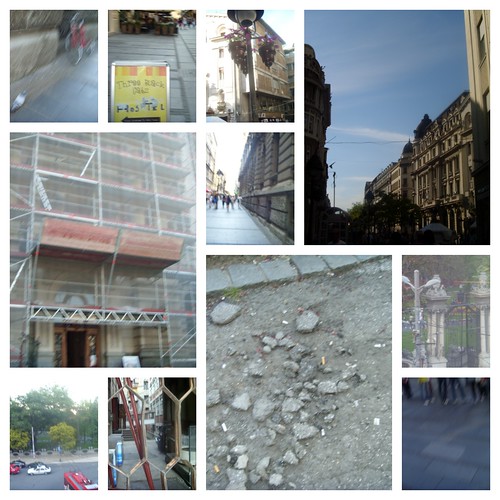
The school where I teach is in the centre of Belgrade and the day was lovely, so I decided to attempt Visual Assignment 376. I was also influenced by several of our weekly readings, particularly by Photography as Mindful Seeing and the advice that we should take photos of ugly things and constantly search for the odd angle. What this meant for me was walking down the street and quickly shooting random photos at some really weird angles. Some of the photos were terrible, some barely usable. I chose ten of the barely usable ones and kept them just as they were. So I produced this:

UnderConstruction
Visual Assignment 376 – Mission Defamiliarize

After school, I listened to Experience Rating some more and did my Daily Create assignment. I also wrote a blog post.

It was getting rather late at night (or, shall I say, early in the morning) and I was beginning to feel hungry, so first I demotivated myself:

My Demotivational Poster
Visual Assignment 191 – Demotivate Yourself

And then I opened that fridge…


Caught mid action

Friday, June 8th, 2012

It’s been interesting to see what effects I can get to enhance a moving image.  It wasn’t quite ‘caught’ mid action as this scalextrix train was evidently on the move in the pic (the idea was to freeze the face behind it instead).  But by adding intelligent blur and asking the software to enhance the horizontal lines, the effect of the train is softened to a streak, and given a kind of painted quality.


(2 star visual assignment for ds106)

Demotivation, anyone?

Friday, June 8th, 2012

Image

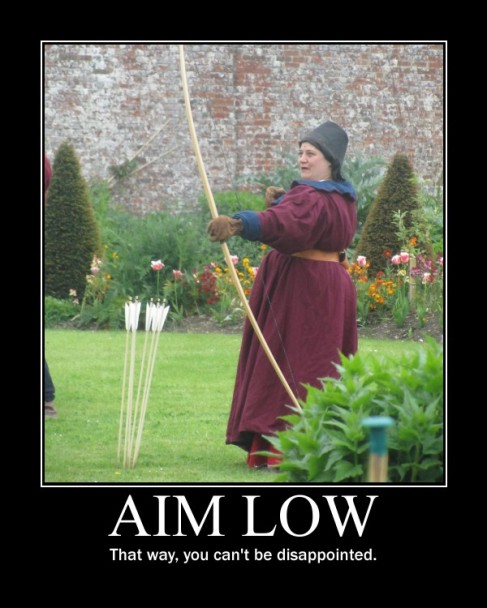
It was great fun making my own demotivating poster using these instructions and it appealed to my cynical side.

I thought that the photo I took of the archer at a medieval reenactment might come in handy at some point and here we are, the perfect metaphor.  The second line was more of a challenge – I guess it’s all about adding to the headline in a clever way, not sure if I achieved that, but it’s suitably demotivating anyway!

(2 star visual assignment for ds106)

Famous Monsters of Filmland Animated Magazine Cover

Friday, June 8th, 2012


It’s a big file, but big is beautiful in this case. Feast your eyes on this animated magazine cover which is a more literal interpretation of the June 1975 issue of the classic Famous Monsters of Filmland magazine (more of a fanzine, really) featuring the scene from The 7th Voyage of Sinbad (1958) that is famous for the first of Ray Harryhausen’s legendary animated skeletons. You can see the original cover below, which interestingly has a few things wrong if you want to get literal. Namely, the color of Sinbad’s pants, the orientation of the fight, and the fact that the skeleton hadn’t lost its sheild just yet. This was a total blast to do, and I am working on a fullblown tutorial, but I must have spent four or five hours on it already, so I will simply leave it here to animate into eternity.

A Whole New World

Friday, June 8th, 2012

This challenge is about placing members of your family in a world that’s too big for them. I chose to place my mum next to some daffodils. The two photos were taken metres apart within seconds, but in this photo they juxtapose well.

Image

I used this video from Serif’s own bank of tutorials to help me with this technique, which was new to me.

The greatest challenges – and how to overcome them – are:

1. Choosing a good image of your subjects – the cleaner the background, the easier it will be to remove them from it.  I made the mistake of choosing a pic of my mum in front of a historic house!

2. Fine tuning those virtual scissors - again, choosing a nice simple image is key, but also be sure to use the ‘zoom’ tool when you’re extracting people from your original scene as even the smallest bits of background will show up in your new creation

3. Is it a fitting tribute? - as you choose your images, it’s wise to consider your subject’s expression, their body language and what they’re wearing… before you place a beautifully cut out skier on a lush green meadow….

Thanks for the challenge, ds106!

(2 stars in the visual assignments category)


Slacker!

Friday, June 8th, 2012

I promise, I was not slacking this week. It was just that…well, no excuses, I was slacking at DS106/Magic MacGuffin this week, entirely. The week, though, was very productive in non-DS106 ways.

This week I managed to get two of the assigned five Daily Creates finished. I am holding out hope but with a Brinner Party to get ready for Saturday night, I can make no promises other than I’ll have DS106 Radio to keep me company.

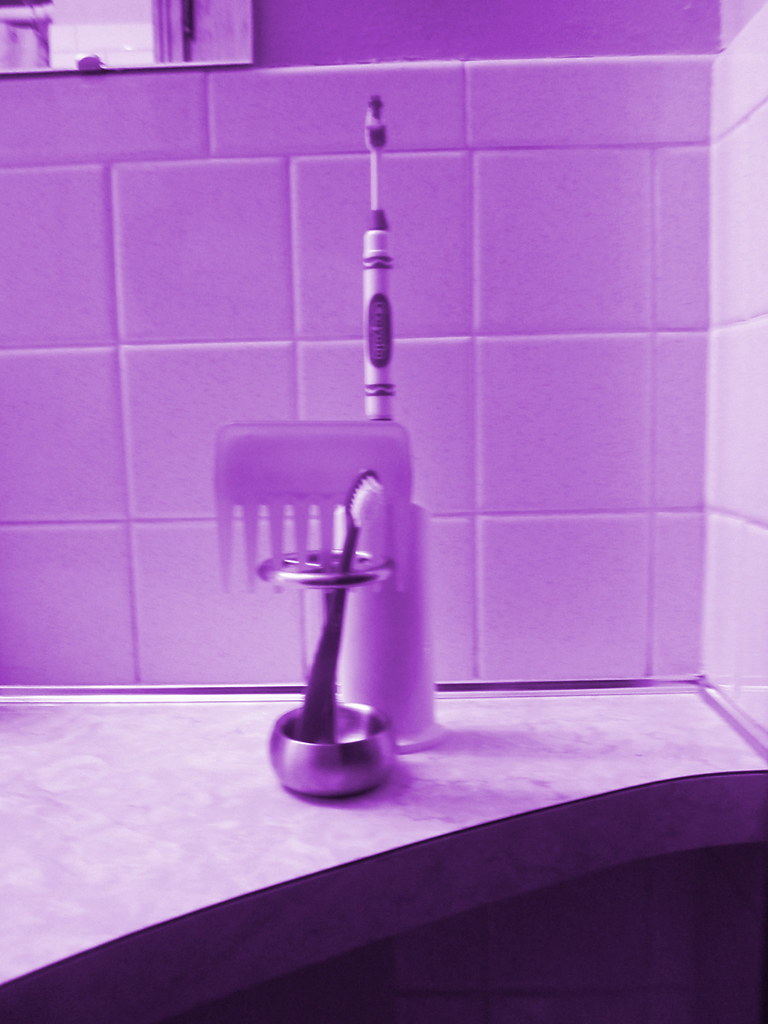
Daily Create #1 – Make a monochrome photo.

I took this picture of my daughter’s bathroom sculpture and I’ve been trying to find ways to use her inspiration to jumpstart my week of storytelling.

The toothbrush in front is the “introducer” who announces you
as you enter the comb/toothpaste/toothbrush tower.

Daily Create #2 – Tell a story about your most random job.

This was a ripper of a job and this is only part of the story. Oh the things I could tell you. Like the time when one of my crew tried out the invisible fence and almost passed out or the time when I slipped on an muddy incline during a rain storm and fell only to find out from my boss that was my fault. None the less, here’s the story.

So, those are my two of five creates. I’ll try to slip in one or two more this weekend. The brinner party might provide some storytelling materials.

Turning a photo into a drawing

Friday, June 8th, 2012

Task for digital storytelling course DS106 was to transform a photo into a drawing.

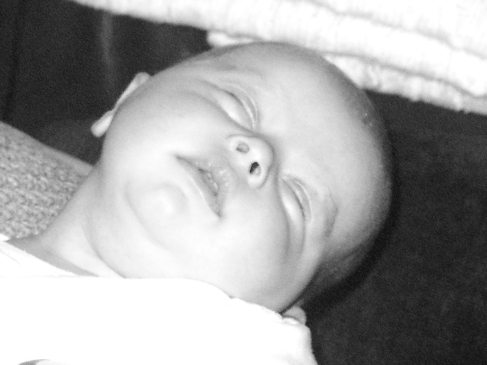
Here’s the original – I chose a photo that meant something to me (this is a friend’s baby) and that had plenty of light and dark areas.  

Image

Using Serif PhotoPlus (don’t ask, it came with my computer), I wanted to see if you could represent the curve of skin as effectively through digital shading as you can with a pencil…. I tried this two ways: firstly, by using the pencil draw quick-fix tool under the Artistic menu.  It didn’t work out that well, as you can see:

Image


I then followed J-rabbit’s excellent tutorial which got me much close to the effect I was hoping for….

Image

It needs a little more grainyness, and perhaps some more dark areas to really show the potential of the shading, but overall I think this is a good start.  Thanks J-Rabbit!

You’re All Right

Friday, June 8th, 2012

I didn’t know about the Say It Like the Peanut Butter assignment until I noticed kag0715′s awesomely frightening first animated GIF come through the ds106 stream.

The assignment requires us to create an animated GIF from our favorite or least favorite film – the clip should be one which captures the essence of the scene with a minimal amount of movement. I chose to go with a moment in my favorite scene from my favorite movie: The You’re All Right scene from Repoman.

The brilliant YouTube Downloader plugin for the Chrome browser was used to grab the clip. With this plugin installed, videos on YouTube can be downloaded with a single click of a button that automagically appears below the player.

The next step was to trim the segment of the clip I wanted to use in MPEG StreamClip – I chose 8 frames per second for the 1.2 second clip. This produced a half dozen or so png files which were opened in GIMP as layers.

Using the Filters > Animation menu choice, which I just learned about today from Alan, I was able to narrow my choice down to three frames. As there was a bit of distracting camera movement causing Otto to jitter back and forth, I decided to use Jim’s layer masking technique to animate just the beer pouring out of the can. Everything but the beer has been removed from the two topmost layers except for the bear stream. This allows the still frame from the bottom layer to show for the entire loop.

After cropping and resizing (scaling) the image, I saved it as a GIF and set the delay rate to 160 ms.

I’m pleased and surprised that the entire file weighs in at 70 kb. My next step will be to turn it into a tga texture file and take into Second Life to sell at Scottlo’s Animated GIF Emporium. The price, as with all other items, will be 106 Linden dollars – or two for twice the price.

Visual Assignment–Time of Day and TDC 149

Friday, June 8th, 2012

My second attempt at one of the Visual Assignments from the DS106 repository is Time of Day, which appealed to me because of the image appearance and because I wanted to try some more work with layers and combining photographs.

Take a picture of the same spot outside several times in a day, then merge them all together in a way that shows the differences in appearance over the day.

When the Daily Create for that day turned out to be take a picture multiple times over the course of a day and represent it as one picture, it seemed an obvious choice.   So I set up a small camera on a tripod and took a picture every hour at 6 after for 12 or so hours.

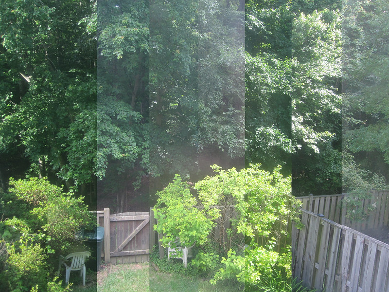
This was my finished product with the earliest photo in the strip on the left and the latest in the strip on the right, but it didn’t come easy for me.

Time of Day

The editing of these images (I ultimately used 8 of the 12) was particularly difficult one for me, mostly because of my unfamiliarity with Photoshop.

Scott Plunkett‘s tutorial for the assignment gave me a good approach for what I needed to try to do (specifically to just cut off increasing slices and layer them on top of the base image), but he used MS Paint and I wanted to try to figure it out in Photoshop.

I tried multiple wrong ways to edit them down and managed to crash Photoshop three times and my computer twice  in the process.  I walked away and came back the next day.  This is the process I finally figured out:

  • I opened up all of the images I was going to use in Photoshop
  • My base image here was the last image taken (on the finished photo, you can see the strip on the right side).
  • Then I took the next-to-last image and selected the section I wanted to keep – I calculated that each section would need to be 1/8 of the photo (in this case, I was using inches, ~2.75 per slice).  That meant that each section would be 2.75 inches smaller than the previous one.
  • For each photo, after selection the section that I wanted to keep, I right clicked on the photo, chose Layer via Cut, which creates a separate layer with just the selected material.  Then I right clicked on that layer (Layer control is usual in the right lower corner of the PS screen) and chose Duplicate Layer.  For output, I used the pull down menu to choose the base layer photo.  That places the cropped layer onto the original photo.
  • Then I just repeated the process, in reverse chronological order, cutting more and more off of the succeeding photos until the last one was just a single 2.75″ wide strip from the far left size and layering them onto the base image with all the other images.  The result, an image with 8 layers, saves as the image you see above.

Once I figured out the process, it was fairly easy, but it was a bit frustrating as I flailed around a bit.  Still, I’m pretty satisfied with the result.