Martha Burtis tweeted this bag of gold a day or two again from the great John Cage. I am posting it here for posterity, it very much describes the way in which we have tried to approach ds106, and I think I will be writing this into any and all future syllabi I create from here on out.
Archive for the ‘magicmacguffin’ Category
John Cage’s 10 Rules for Students and Teachers
Saturday, June 16th, 2012
Name that 80s Movie #3
Saturday, June 16th, 2012
Bear with us, we will be moving to the next level of difficulty shortly. Hopefully you are feeling appropriately confident, but keep in mind the next three will separate the parachute pants wearers from the stonewashed jeans junkies.
Icon Credits (all from the Noun Project): Links for downhill skiing, hamburger, BMX, and deer.
Name that 80s movie #2
Saturday, June 16th, 2012
4 Weekly Letter home week of Design
Saturday, June 16th, 2012Dear Mom and Dad and dogs of course,
We are coming to the end of Week 4. This has by far been my favorite week, like our counselors warned us everyone usually loves Design Week and I can see why. We have been able to use creative outlets to design funky and unique images.
First we learned about a new(ish) thing called “Creative Commons” its basically copyright with adjustments. There motto is instead of all rights reserved “some rights reserved.” Which is true! People upload creative work of any kind and can slap on a Creative Commons copy right. Its totally free (and legal) in which people can decide how limited they want their work to be to the public. I experimented with this license on some of my images. (All found on FLICKR) I allowed some of my images to be accessible and edited by other people but just not 100% theirs. I still have ownership of all my work. I wrote a blog on this new idea of Creative Commons and the different outlets I used to research it!
Our two main projects consisted of doing design. The first big one was like last week were we had to earn AT LEAST 10 stars of design assignments. However we were assigned three mandatory ones and could pick two of them. I decided to do an image for advertising Creative Commons. The second one was a blog review of one of the top DS106 design assignments that was submitted. I chose one about Valentines Day… and how more its like Single Awareness day.
The second big project was to take pictures of elements of designs (at least four) and blog about how they are important. I decided to work with color, typography, metaphors, forms, minimalism, and rhythm.
I learned different elements that go into design, something that I just never thought about. Some of these elements that I worked with were, color, typography, Metaphors, forms, functions, minimalism, rhythm, and dominance. They all play important roles into what a design is made up of.
I finally got involved in Mine Craft and wow am I having trouble with it. I never knew a computer game could be so difficult. I am trying to building a house but failing a little bit. Hopefully over the next few weeks I will get the hang of it and have a little castle to live in. ![]()
Our long term project that we have coming up is making a tutorial and making our own assignments to add to the DS106 page. I wont lie… I have no ideas right now for what I’m going to make as my own assignment but hopefully something will inspire me.
Thats all for now!
Love and miss you both.
Katie
Week 4 – My Autobiography Cover
Saturday, June 16th, 2012
cc licensed ( BY NC SA ) flickr photo shared by blmiers2
Still not able to devote as much time to DS106 as I would like. I have managed to do a couple of design assignments by now and I have uploaded them to Flickr, but I am running late with blog posts. I will try to keep these posts very short and let the images speak for themselves.
In this design assignment I designed the cover of my “autobiography”, choosing the picture and the title that shows off who I really am.
I used Compfight to search for CC licensed images. I wanted my cover to have a lot of red in it, so I used “red” as my search term. As soon as I saw the robin, I knew I had to use it. It took me some time to think of a title. Finally, I came up with this:
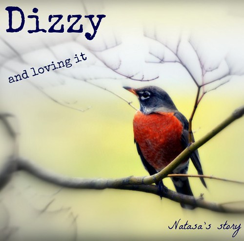
No rational explanation for choosing either colour red or the robin. Not to mention the title. Some things are hard to explain, but they just feel right.
Design Review… and the Winner is?
Saturday, June 16th, 2012I would like to start off and say all of them were absolutely AWESOME. The one that stuck out to me the most though was “Palentinesday” http://inspire.ds106.us/palentinesday/
The Artists: Annie Belle Trsulow and Rachel McQuirk
There image found below on FLICKR:
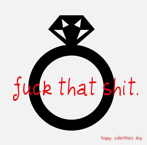
Being a female and have had many “single awareness days” aka “Valentines Day” this is hilarious and relatable. It contains almost all of the elements of designs. Something that a newbie (beginner) like me would have a lot of trouble with. Starting off with COLOR, the artists use three colors, black, white, and red. Black and White are perfect colors for a base. Red on the other hand is bold and stands out especially among whites and blacks. This quickly grabs attention (mine at least) and holds it.
TYPOGRAPHY, the next element, grabbed my attention immediately because of “Fuck”, lets not lie to ourselves anytime anyone hears or sees that word, attention is grabbed. The font is not very professional giving it a humorous feel. The main message is placed right in the middle, for attention purposes which is very effective. Then to add on to it at the bottom right hand corner “happy valentines day” is small and not capitalized to show how this holiday has not much respect from the two artists.
METAPHORS/SYMBOLS
A Wedding ring, the perfect symbol for a Valentines Day hate image. It shows these artists are ironic and have a nice dry sense of humor. Instead of the typical “broken heart” or a fat girl eating ice cream, a wedding ring is supposed to symbolize commitment and love, something these two artists are not rooting for (maybe just temporarily).
MINIMALISM
This Valentine hate image, could not have been simpler. The use of (or lack of) colors helps add to the minimalistic value. A simple image is used with two short phrases. Its quick and to the point. There is no fluff involved which makes the audience of the image focus on the message of what the artists are trying to get across.
DOMINANCE
Though the red font is bold and is the first thing I looked at, the Wedding Ring is the dominated feature of the design. It makes up the background and towers over the font(S). However it balances really well with the “Fuck that shit”, they are good compliments to each other which can be hard to achieve when trying to balance a font/message and a graphic image.
FORM/FUNCTION/MESSAGE
What I took from this image as a message, is don’t take these types of Holidays (well I guess this the only one) too seriously. Have fun with life and don’t tie yourself down to someone just because its what your friends and family is doing. Now maybe I’m knit picking this image too much but then again art is free to interpretation. It depicts the message that love isn’t totally lost just because there isn’t a red circle with a line going through it placed any where.
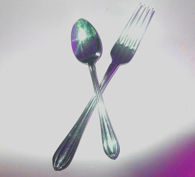
Common Everyday Object
Friday, June 15th, 2012For the Common Everyday Object Visual Assignment, I started off by taking a bunch of pictures around my house. I had a hard time choosing between a photo of a clock and one of a fork and a spoon. As you will see below, I went with the fork and spoon photo! I chose to use the Aviary website again, after learning how to change the colors in photos using the hue and saturation editor through Step 9 of the “Warholizing” tutorial provided by Aviary, which I used for my “Warhol Something” Visual Assignment. I figured this new skill would be helpful in completing the assignment. I was excited to be able to reuse something I just recently learned!
Basically, all I did was experiment with the hue and saturation of my original photo. It was fairly simple, but I think the following picture looks pretty cool!
Draw It.
Friday, June 15th, 2012For the “Draw It” assignment, I used the free web-based image editing site, Photoshop Express. It was one of the only sites on the packing list that had a drawing transformation feature. The sites on the packing list have all been very helpful and have liked each of them for different reasons. As I continue to post Visual Assignments, you will see that I work with a variety of imagine editing sites!
I chose to use a picture of an elephant that I photographed at the zoo a few months ago.
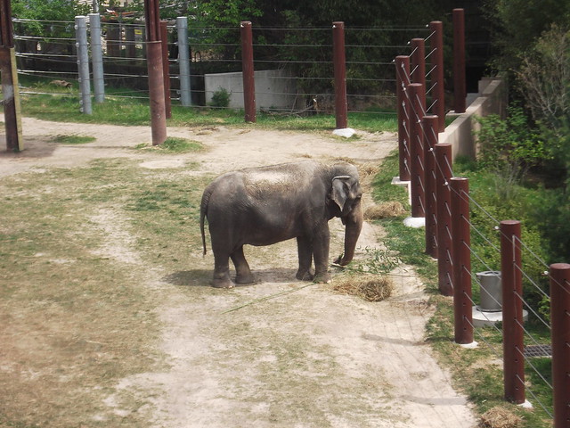
(Original photo)
First, I cropped the photo so the focus would be more on the cute, little (well– big) elephant! I edited the photo a bit, by sharpening the lines. I changed the color scheme to black and white and tried to brighten the white spots so they would stand out better. Then, I used the “sketch” effect and got the following result:
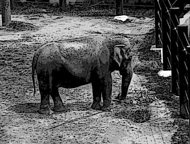
Kinda cool, huh?
Warhol Something
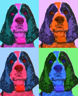
Friday, June 15th, 2012For this second visual assignment, I “Warholed Something” using the photo editing site called Aviary, mentioned on our camp packing list. Aviary actually provided a tutorial on “Warholizing” an image using their photo editing tools. I chose a picture of my dog, Tux, to “Warhol.” I followed the instructions step-by-step in the tutorial and I think I was fairly successful!
Postcard from the Edge
Friday, June 15th, 2012I always liked the idea of someone being at the very edge of things and sending back a postcard. I’m never sure if it is because they want others to join them, wish they were back home, or just excited to see how the world barrels over the edge into a pool of oblivion.
None the less, one of the design challenges this week was to create a postcard from a magical place. Specific to Camp Magic MacGuffin style, it needed to be from our Minecraft camp. So, I ventured over to Bunk House X. BH X is the fabled, mysterious and cantankerous island of veteran DS106er’s. Not unlike the Island of Misfit Toys and certainly with more curmudgeony goodness.

So, I find this dragon which is probably the coolest little piece of Minecraft art going (no dig on the others) and grab a screenshot. The hardest part was trying to find the dang screenshot from Minecraft. The instructions from class were spot on but the navigation needed to be entered into a browser window. Then BLAMMO!
So, here is 2 stars of this week’s 10-star design assignment challenge.