Archive for the ‘bunk3’ Category


Caught mid action

Friday, June 8th, 2012

It’s been interesting to see what effects I can get to enhance a moving image.  It wasn’t quite ‘caught’ mid action as this scalextrix train was evidently on the move in the pic (the idea was to freeze the face behind it instead).  But by adding intelligent blur and asking the software to enhance the horizontal lines, the effect of the train is softened to a streak, and given a kind of painted quality.


(2 star visual assignment for ds106)

Demotivation, anyone?

Friday, June 8th, 2012

Image

It was great fun making my own demotivating poster using these instructions and it appealed to my cynical side.

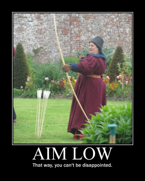
I thought that the photo I took of the archer at a medieval reenactment might come in handy at some point and here we are, the perfect metaphor.  The second line was more of a challenge – I guess it’s all about adding to the headline in a clever way, not sure if I achieved that, but it’s suitably demotivating anyway!

(2 star visual assignment for ds106)

A Whole New World

Friday, June 8th, 2012

This challenge is about placing members of your family in a world that’s too big for them. I chose to place my mum next to some daffodils. The two photos were taken metres apart within seconds, but in this photo they juxtapose well.

Image

I used this video from Serif’s own bank of tutorials to help me with this technique, which was new to me.

The greatest challenges – and how to overcome them – are:

1. Choosing a good image of your subjects – the cleaner the background, the easier it will be to remove them from it.  I made the mistake of choosing a pic of my mum in front of a historic house!

2. Fine tuning those virtual scissors - again, choosing a nice simple image is key, but also be sure to use the ‘zoom’ tool when you’re extracting people from your original scene as even the smallest bits of background will show up in your new creation

3. Is it a fitting tribute? - as you choose your images, it’s wise to consider your subject’s expression, their body language and what they’re wearing… before you place a beautifully cut out skier on a lush green meadow….

Thanks for the challenge, ds106!

(2 stars in the visual assignments category)


Turning a photo into a drawing

Friday, June 8th, 2012

Task for digital storytelling course DS106 was to transform a photo into a drawing.

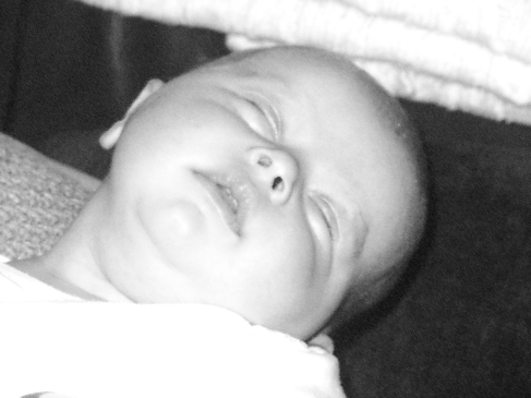
Here’s the original – I chose a photo that meant something to me (this is a friend’s baby) and that had plenty of light and dark areas.  

Image

Using Serif PhotoPlus (don’t ask, it came with my computer), I wanted to see if you could represent the curve of skin as effectively through digital shading as you can with a pencil…. I tried this two ways: firstly, by using the pencil draw quick-fix tool under the Artistic menu.  It didn’t work out that well, as you can see:

Image


I then followed J-rabbit’s excellent tutorial which got me much close to the effect I was hoping for….

Image

It needs a little more grainyness, and perhaps some more dark areas to really show the potential of the shading, but overall I think this is a good start.  Thanks J-Rabbit!

Visual Assignment–Time of Day and TDC 149

Friday, June 8th, 2012

My second attempt at one of the Visual Assignments from the DS106 repository is Time of Day, which appealed to me because of the image appearance and because I wanted to try some more work with layers and combining photographs.

Take a picture of the same spot outside several times in a day, then merge them all together in a way that shows the differences in appearance over the day.

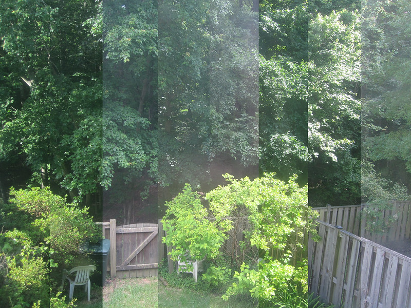
When the Daily Create for that day turned out to be take a picture multiple times over the course of a day and represent it as one picture, it seemed an obvious choice.   So I set up a small camera on a tripod and took a picture every hour at 6 after for 12 or so hours.

This was my finished product with the earliest photo in the strip on the left and the latest in the strip on the right, but it didn’t come easy for me.

Time of Day

The editing of these images (I ultimately used 8 of the 12) was particularly difficult one for me, mostly because of my unfamiliarity with Photoshop.

Scott Plunkett‘s tutorial for the assignment gave me a good approach for what I needed to try to do (specifically to just cut off increasing slices and layer them on top of the base image), but he used MS Paint and I wanted to try to figure it out in Photoshop.

I tried multiple wrong ways to edit them down and managed to crash Photoshop three times and my computer twice  in the process.  I walked away and came back the next day.  This is the process I finally figured out:

  • I opened up all of the images I was going to use in Photoshop
  • My base image here was the last image taken (on the finished photo, you can see the strip on the right side).
  • Then I took the next-to-last image and selected the section I wanted to keep – I calculated that each section would need to be 1/8 of the photo (in this case, I was using inches, ~2.75 per slice).  That meant that each section would be 2.75 inches smaller than the previous one.
  • For each photo, after selection the section that I wanted to keep, I right clicked on the photo, chose Layer via Cut, which creates a separate layer with just the selected material.  Then I right clicked on that layer (Layer control is usual in the right lower corner of the PS screen) and chose Duplicate Layer.  For output, I used the pull down menu to choose the base layer photo.  That places the cropped layer onto the original photo.
  • Then I just repeated the process, in reverse chronological order, cutting more and more off of the succeeding photos until the last one was just a single 2.75″ wide strip from the far left size and layering them onto the base image with all the other images.  The result, an image with 8 layers, saves as the image you see above.

Once I figured out the process, it was fairly easy, but it was a bit frustrating as I flailed around a bit.  Still, I’m pretty satisfied with the result.


TED Talk: “APOPcalypse”

Friday, June 8th, 2012

I took this class, I worked with this guy. Epic.

CC AttributionJim Groom talks about the crisis narrative in pop culture and how it relates to education. He discusses the ground-breaking class DS106 and how students become informed, empowered citizens of the Internet.

The new audience for stories

Thursday, June 7th, 2012

The best storytelling on the web won’t come from the author.

That’s the lesson for me coming out of Bryan Alexander’s fascinating book and post on the subject of digital storytelling.

When a book is published, it grows little angel wings and flies out into the world. It might have 4999 little brothers and sisters flying with it; it might, if it’s Harry Potter, have millions, or it might, if a vanity project, have just 4, one for each member of the author’s family.  When the book comes off the press, we know that the audience is out there, and how the book will reach them through bookshops and Amazon and Oxfam, but we don’t know who those readers are.  Most importantly, we don’t in a million years expect to ever hear from them.

That’s a big example of publishing to a delayed anonymous reader, but in my opinion we all do that every day.  If you’re short on time,  do you open first your mail, or your email?  I go for the email – I can get through a few of them in the time it takes to open a letter. It’s not just about the (truncated) content and easy click, though, there’s also an expectation in an email that my friend will get a reply quicker than they might if they write.  So I feel that I need to meet that expectation by replying promptly.

Whether tweeting the trenches,  live tweeting Samuel Pepys’ diary or microblogging the sinking of the Titanic, the instant medium of Twitter assumes an importance that seems to relate to life now.  The audience is approached immediately, within seconds of publication, and that immediacy evokes a similarly unhindered response. It’s not like sitting down to write a considered letter to your favourite author, it’s as fast as a quick retweet.

I work in PR, so social media for me has been largely about broadcasting successes, listening to the response, responding to concerns.

But what happens when you stop broadcasting and listening and start instead to light a fire, tend that fire, and go with the flow?  You get more.  You learn more. And your story grows.

So in light of this, I’m interested to go back to Kurt Vonnegut’s storytelling arcs.   It seems to me less easy to trace the flow of the story when you’re prepared to let the other participants in your story take control a little. When, for example, you can even let go of Dracula (blogged by Bryan over several years) and run a blog a bit like a book club.  Even where there is a single storyteller, digital storytelling allows us to present multiple narrators – as in Project 1968 - so that a single curve doesn’t really fit the brief any more.

Perhaps I’ll find, over the coming weeks, that all stories really are all the same.  Or perhaps this hypothesis, that the digital story is a bit different, will hold true.  Either way, this is all new to me, and I’m learning that my English degree was just one side of the coin….

Visual Assignment 1 — An Album Cover

Wednesday, June 6th, 2012

An Album Cover — DS106 Assignment here

So here’s something fun for everyone to do, should be quick and easy, but try to make it pretty. First, go here: http://en.wikipedia.org/wiki/Special:RandomThe title of the article is now the name of your band.

Swiss Emigration to Russia is my band name


Next, go here: http://www.quotationspage.com/random.php3 Go to the bottom of the page. The last four to five words of the last quote are the title of your first album

“Contemplate What Is Happening” is my album title.  [Appropriately enough for a digital media course, it's from a line by Marshall McLuhan.]

Lastly, go here: http://www.flickr.com/explore/interesting/7days Select the 3rd image. It is the picture for your album cover.

I had several great images, but none of them were creative commons licensed.  Given that I was going to be changing it around, I decided I wanted to have something with some clearer copyright.  So I thought of the Flickr Commons, the partnership Flickr started with the Library of Congress (though its promise is mostly unrealized still).  There I found this image (3rd in the random Commons Sampler). Given my band’s name and album title, it seemed perfect.

Views in Sydney and New South Wales, 1930-40 / by Charles F. Walton

Views in Sydney and New South Wales, 1930-40 / by Charles F. Walton

Manipulate the picture, resize it, add some other color, whatever. Do the same with the band name and album title, put them over top. However you wanna do it. Make it look cool.


Then I dumped it into Photoshop, cropped it to a square, and used the Sun Faded Photo style to make it a little more yellow so that I could more easily put text on it.  I did some new layers with the text of the band name, which I changed to red.  I had initially thought I would try to place the title of the album on the hanging clothes, but “contemplate” and “happening” are awfully long words.  So, instead I went with this, which I like better in terms of spacing.  I also like the way “happening” ends up highlighting the two people just visible at the edge of the album cover.  Contemplating what is happening is exactly what I hope this design causes people to do.


Fake album cover for DS106 class

Swiss Emigration to Russia (2012)

Troll Quotes

Tuesday, June 5th, 2012

For this assignment, I found an image of a (fairly) well known figure, Coco Chanel. Then, I added a quote by Marilyn Monroe, one that I find mildly amusing, and attributed the quote to Audrey Hepburn. I knew I wanted to use these three women. Marilyn Monroe has a pretty distinct image, so I decided not to use a photo of her or attribute the quote to her. Coco Chanel is not recognized as easily as Audrey Hepburn may be. They both have a pale complexion and shorter, dark hair. I figured the two would be easiest to interchange. Therefore, “nothing about [my] image is correct, and [I'm] trolling fans of all three characters at once!”

I used the text feature on the PicMonkey website. Because of the variety of dark and light, it was hard to find a text color/font that would be bold enough to show. I went to the Effects editor and chose “Soften” and moved the sliding cursor under “Fade,” so the picture would not be as dominating over the text. Then, I chose the font, “Marcelle Script” in white. It is bold and sort of rustic looking. I also liked the name! If only there was an “a” on the end instead of an “e”! (My name is Marcella ;) )

Adventures In Minecraft

Tuesday, June 5th, 2012

I’ve been really busy on Minecraft these past couple weeks! Here are some highlights of the things I’ve built (you can see the whole “Adventures in Minecraft” album on Flickr):

Rainbow Bridge

Rainbow Bridge!

Observatory

An observatory

Inside the Observatory

Inside the Observatory. You can watch the sun and moon!

A Myseterious Pond

A myseterious pond… Won’t you throw something in?

These creations are actually old new news, but I’ve been away from my blog for some time. I guess things have been busy on the “first world” side of the computer universe. I’ll be sure to take some screenshots of new happenings and update the Interblags about my travails when I can.