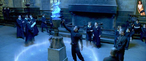
Inspired by Groom’s animated magazine cover, I decided to try my own. I thought of those creepy Jack Nicholson GIFs from The Shining, and how they really belong on the cover of Parenting magazine.
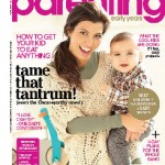 So I did a search for Shining GIFs to find the right one, then did an image search for Parenting magazine to find a good one to work with. I picked this particular issue for the pixel dimensions. (If you hover over one of the search result thumbnails, you’ll see the size. This one was something like 1600 pixels tall. Most of them were 200-400, which wouldn’t give very good results.) It was a nice bonus that it had an article about tantrums. I tried using Select-Color Range to pull out the type, but wasn’t too happy with the results.
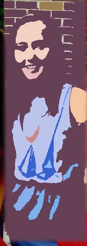
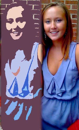
 Instead, I used the rectangular selection tool to replace most of Kourtney with the background color from the cover, and then used the paintbrush tool to clear up the parts where her sweater gets behind the type. I duplicated the second “n” to fix the part of the title covered by her hair, and had to do a little more manual work to fix the “e”. It was a little tedious, but not too much.
 Then I used Select-Color Range to grab the background color, played with the fuzziness a little, and inverted the selection. A flash of insight told me to change the Image Size of the GIF to match the height of the cover before trying to put the two together.
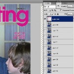 I pasted it in as the top layer, and the animation plays underneath. I didn’t like the way the GIF aligned with the type, so I undid my pasting and cropped off some of the right side to bring Jack’s head more towards the center. Repasted the type layer and cropped the whole image to magazine proportions, then reduced the image size to make the resulting GIF under 1 MB.


