Archive for the ‘bunk4’ Category


Hey me, Hey mama

Sunday, June 17th, 2012

Dearest Fam,

I’ve concluded my fourth week here at Camp Magic MacGuffin. So far, so good. I got some feedback from my esteemed directors early in the week, and I really took it to heart. I started working on my design assignments a lot earlier and posting them throughout the week instead of all in a clump. I also got more active and remembered to check Google reader for updates from my fellow campers.

On another note, I’ve started my first week at a new camp as a staff member! It’s a 7 week camp at UVa for academics, tennis, and golf. I’m an RA, but really I’m a camp counselor who is in charge of making sure nobody sneaks out at night. Or sneaks in… It’ll probably get difficult to split time between the two camps I’m simultaneously participating in, but being able to take breaks at the one I’m at physically to attend the one I’m at virtually will be a great help. I have lots of down time, and luckily I enjoy doing ds106 activities.

This week, I focused on design. I used both Photoshop and GIMP for my assignments. I had two really really favorite assignments I did, which all turned out in the same style-esque.

To Oz

The above photo is the most recent assignment. It’s a Minimalist Travel Poster and it looks so inviting! I think? It was a definite favorite and you should read my blog post about it! Definitely a favorite.

And also, I’m very proud of this assignment I did for Minimalize your Philosophy.

Dumbledore

I’m going to give myself a pat on the back for these, because not only did I greatly enjoy doing it, I’m very pleased with the final product, and also another pat on the back for bragging to all my fellow staff members about how much better my online summer class is than their boring history, econ, etc., classes.

Also, on another note, I did some stuff with CreativeCommons this week, including changing my flickr account to BY-NC!!

Until then,

KG

Week 4: Design

Sunday, June 17th, 2012

Dear Mom and Dad,

This week at camp I learned about Design. We started with the basic elements of designs: color, typography, balance, rhythm, proportion, symbols, minimalism, function, and unity.  After an introduction to the basics of design, we were sent off in search of real-life examples. It opened my eyes to how we are literally surrounded by design 24/7. Our brains process design, subconsciously picking out the individual elements yet we never stop to actually think about the design and how it tells us a story.

Also, while learning about design, we were sent off to investigate Creative Commons. An organization that is devoted to open online sharing. They allow creativity and learning to span across the globe through the internet like it should. I not only learned about Creative Commons, but about who uses CC and how they use it.

This week, I dove into design. I found it eye-opening to how much can be expressed through design. Looking back, my favorite assignment this week was Illustrate a Catchphrase. I had so many ideas and just couldn’t stop myself. I love to play with symbols and illustrations, so to me, this assignment fell from heaven.

I am throughly exhausted! Yet, I am still strangely energized for next week. Bring it on because I can’t wait!

Excitedly yours,

Jolie

DS106 Week 4 – Design: A Sansing Sprint

Sunday, June 17th, 2012

Inspired by my Slaughterhouse IV bunkmate Chad Sansing, I composed a Design Assignment Sprint. I spent a lot of time in tinkering in Adobe Illustrator and Adobe Photoshop, which always leaves me wishing I could do more than I actually … Continue reading

Creative Commons

Sunday, June 17th, 2012

In my research on Creative Commons, I was surprised that I hadn’t heard of it. CC is a non-profit organization devoted to providing free and easy to use legal tools that work with copyright laws to reach the full potential of the internet. This enables anyone to share their work, while allowing other to use, share, and build upon the work.

I found that there are many fields in which CC can be used.

Creative Commons allows someone to change the default copyright terms from “all rights reserved” to “some rights reserved.” They do this by several different licenses that are tailored to how you want others to use your work.

  • Attribution
  • Attribution-ShareAlike
  • Attribution-NoDerivs
  • Attribution-NonCommerical
  • Attribution-NonCommerical-ShareAlike
  • Attribution-NonCommerical-NoDerivs

All licenses are based on attribution the original creator of the work. Certain licenses are based on being used by noncommercial purposes. While others are based on not being altered from the original. Learning about all the different licenses, in the future, I would choose to license under the Attribution License. It is the most open license and I have no qualms about allowing things I create being used commercially as long as I am credited for what they borrowed from my work.

In researching Creative Commons, I found that the two most useful websites were http://www.creativecommonsza.org/ and http://creativecommons.org/.

Alternative Book Covers – Cat’s Cradle

Sunday, June 17th, 2012

For me, DS106 seems to be revolving around Kurt Vonnegut. First, there was that task in Week 2. Then, my bunkhouse was named Slaughterhouse 4. So, I just had to do Design Assignment 366, which was to create an alternative book cover suggesting that the book is about something entirely different. I know I am being mean, but I just couldn’t help it.

Here it is:

Cat's Cradle
Original image used: cc licensed ( BY NC ) flickr photo by Sergiu Bacioiu: http://flickr.com/photos/sergiu_bacioiu/4327564714/

By the way, since this is primarily a TEFL blog, I believe there is a great lesson plan here, especially if the students are all reading the same book. Then they could compare the cover story to the original, or even develop the story from the cover further. Or they could create their own book covers. It would be fun to create the cover and leave out the title. Then they could try to guess what book the cover creator had in mind.


Everyday Safari

Saturday, June 16th, 2012

I found the different elements of design interesting. Some where obvious, but others elements I wouldn’t have thought of when it comes to design and how many different designs surround us every single day. Here are a few that I found on my Safari this week.

Color

This is a watercolor drawing that my step-sister did years ago. In a way, the drawing is a manual color splash. The way she uses color is definitely effective because it draws you to a single leaf, forcing you to look at what she wants you to see.

Symbols

Such a simple symbol, yet it is so well-known that it can mean many things. This symbol represents a business, an industry, products, ideas, and people. When I see this tiny image, I think, Apple… technology… iPhone… iPod… iTunes… Macbook… Macintosh.. .knowledge… speed… performance… style… Steve Jobs… the future… All that in just an image. Because it is internationally known, this symbol is very powerful and effective at representing ideals. Not only the ideals of the decision makers of Apple Inc., but also the ideals of those who own Apple products.

Minimalism

This is a perfect use of space as well as an elegant design. It is simple and nothing extraneous is featured. There are no embellishments or textures which creates a sleek look and makes the keys stand out. This design is so striking because it is so uncomplicated. It serves its function without any unnecessary additions, while simultaneously showing the world that sleek and simple is elegance.

Function

Here are several different designs for doorknobs. Yet, none of them are being used their design intended. They were designed to be turned and used for opening doors. However, these have been recycled into coat hooks. The design has not changed, yet the function and the message they send are different. The message, as they were designed, was this family has money, style, and class. Now, the message means this family is creative, thrifty, and busy.

Balance

This design shows us the element of balance, specifically, symmetrical balance. As a whole, the balance creates a pattern that makes the piece look stylish. It also pulls attention to the ends and the center of the board. Taken in parts, it shows us how balance creates our thoughts on physical structure.

Proportion

Someone obviously made a mistake in the proportions of this design. There is only a quarter inch of space between the door and the stairs when the door swings open. There was no thought put into the dimensions of the design. The relationship between the door and stairs was not considered in the real world, when someone needs to stand at the bottom of the stairs and then open the door. This picture shows us how important proportions truly are to design.


Getting my ds106 Game On (Maybe)

Saturday, June 16th, 2012

School’s out for the summer.* I’ve dedicated at least part of today to ds106 work, finally. I’m working on a Creative Commons poster, but I’m stuck trying to put the CC icon on there. I haven’t given up yet but I did decide to take a break.

Instead I did the One Story/Four Icons assignment. I’ve enjoyed seeing the work of others on this assignment and it seemed doable. I may try some other movies soon as well. The Noun Project made this pretty simple.


*The kids are done but I still have three days next week of meetings and packing up.

4 Weekly Letter home week of Design

Saturday, June 16th, 2012

Dear Mom and Dad and dogs of course,


We are coming to the end of Week 4. This has by far been my favorite week, like our counselors warned us everyone usually loves Design Week and I can see why. We have been able to use creative outlets to design funky and unique images.


First we learned about a new(ish) thing called “Creative Commons” its basically copyright with adjustments. There motto is instead of all rights reserved “some rights reserved.” Which is true! People upload creative work of any kind and can slap on a Creative Commons copy right. Its totally free (and legal) in which people can decide how limited they want their work to be to the public. I experimented with this license on some of my images. (All found on FLICKR) I allowed some of my images to be accessible and edited by other people but just not 100% theirs. I still have ownership of all my work. I wrote a blog on this new idea of Creative Commons and the different outlets I used to research it!


Our two main projects consisted of doing design. The first big one was like last week were we had to earn AT LEAST 10 stars of design assignments. However we were assigned three mandatory ones and could pick two of them. I decided to do an image for advertising Creative Commons. The second one was a blog review of one of the top DS106 design assignments that was submitted. I chose one about Valentines Day… and how more its like Single Awareness day.

The second big project was to take pictures of elements of designs (at least four) and blog about how they are important. I decided to work with color, typography, metaphors, forms, minimalism, and rhythm.

I learned different elements that go into design, something that I just never thought about. Some of these elements that I worked with were, color, typography, Metaphors, forms, functions, minimalism, rhythm, and dominance. They all play important roles into what a design is made up of.


I finally got involved in Mine Craft and wow am I having trouble with it. I never knew a computer game could be so difficult. I am trying to building a house but failing a little bit. Hopefully over the next few weeks I will get the hang of it and have a little castle to live in. :)


Our long term project that we have coming up is making a tutorial and making our own assignments to add to the DS106 page. I wont lie… I have no ideas right now for what I’m going to make as my own assignment but hopefully something will inspire me.


Thats all for now!


Love and miss you both.


Katie

Week 4 – My Autobiography Cover

Saturday, June 16th, 2012

cc licensed ( BY NC SA )  flickr photo shared by blmiers2

Still not able to devote as much time to DS106 as I would like. I have managed to do a couple of  design assignments by now and I have uploaded them to Flickr, but I am running late with blog posts. I will try to keep these posts very short and let the images speak for themselves.

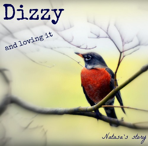
In this design assignment I designed the cover of my “autobiography”, choosing the picture and the title that shows off who I really am.

I used Compfight to search for CC licensed images. I wanted my cover to have a lot of red in it, so I used “red” as my search term. As soon as I saw the robin, I knew I had to use it. It took me some time to think of a title. Finally, I came up with this:

Dizzy

No rational explanation for choosing either colour red or the robin. Not to mention the title. Some things are hard to explain, but they just feel right.


Design Review… and the Winner is?

Saturday, June 16th, 2012

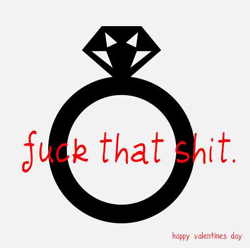
I would like to start off and say all of them were absolutely AWESOME. The one that stuck out to me the most though was “Palentinesday” http://inspire.ds106.us/palentinesday/

The Artists: Annie Belle Trsulow and Rachel McQuirk

There image found below on FLICKR:

palentinesday


Being a female and have had many “single awareness days” aka “Valentines Day” this is hilarious and relatable. It contains almost all of the elements of designs. Something that a newbie (beginner) like me would have a lot of trouble with. Starting off with COLOR, the artists use three colors, black, white, and red. Black and White are perfect colors for a base. Red on the other hand is bold and stands out especially among whites and blacks. This quickly grabs attention (mine at least) and holds it.

TYPOGRAPHY,  the next element, grabbed my attention immediately because of “Fuck”, lets not lie to ourselves anytime anyone hears or sees that word, attention is grabbed. The font is not very professional giving it a humorous feel. The main message is placed right in the middle, for attention purposes which is very effective. Then to add on to it at the bottom right hand corner “happy valentines day” is small and not capitalized to show how this holiday has not much respect from the two artists.

METAPHORS/SYMBOLS

A Wedding ring, the perfect symbol for a Valentines Day hate image. It shows these artists are ironic and have a nice dry sense of humor. Instead of the typical “broken heart” or a fat girl eating ice cream, a wedding ring is supposed to symbolize commitment and love, something these two artists are not rooting for (maybe just temporarily).


MINIMALISM 


This Valentine hate image, could not have been simpler. The use of (or lack of) colors helps add to the minimalistic value. A simple image is used with two short phrases. Its quick and to the point. There is no fluff involved which makes the audience of the image focus on the message of what the artists are trying to get across.


DOMINANCE 


Though the red font is bold and is the first thing I looked at, the Wedding Ring is the dominated feature of the design. It makes up the background and towers over the font(S). However it balances really well with the “Fuck that shit”, they are good compliments to each other which can be hard to achieve when trying to balance a font/message and a graphic image.

FORM/FUNCTION/MESSAGE 

What I took from this image as a message, is don’t take these types of Holidays (well  I guess this the only one) too seriously. Have fun with life and don’t tie yourself down to someone just because its what your friends and family is doing. Now maybe I’m knit picking this image too much but then again art is free to interpretation. It depicts the message that love isn’t totally lost  just because there isn’t a red circle with a line going through it placed any where.