Archive for the ‘DesignAssignments’ Category


Ain’t it though?

Tuesday, June 12th, 2012

Day one of week four and I’m getting my grips on the Design Assignments.

I tried the Lyric Typography Poster assignment, which can be found here.

Typography Poster

Waddya think? I chose the lyrics “Ain’t it just like the present to be showing up like this” from Bon Iver’s Blood Bank. A beautiful song by Grammy award winning artist Justin Vernon, if you haven’t heard it yet, listen to it!

Watch this video on YouTube.

If you haven’t heard of Bon Iver, clearly you were living in a hole in February when it angered many pop culture fanatics when the band won Best New Artist. While I love Bon Iver, it angered me too because as I like to remind people just because it is new to you does not make it new.

Anyway, I used Photoshop on my father’s design computer for this project. I started with a blank canvas, typed the lyrics separately into Text Boxes, then moved them, resized them, etc., until I came up with a design that I liked. The clocks I got from openclipart.org… Check it out!


Find Me in the Beach = )

Monday, June 11th, 2012

–>> To Find  More “Where I Come From’s” <<–

autobiography

Monday, June 11th, 2012

–>> For More “Cover of Your Autobiography” <<–

Hungry?

Monday, June 11th, 2012

–>> For More “The Little Caption” <<–

Why You Don’t Get Paid to Think…

Monday, June 11th, 2012

–>> For More “What People Think I Do’s” <<–

ds106ing Creative Commons Posters

Monday, June 11th, 2012

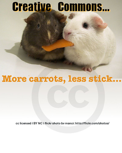
Martha and I are adding a new element to the ds106 syllabus area on design, we want students to get practice understanding creative commons by seeking licensed media and then doing a design assignment using it- make a creative commons poster

Use creative commons licensed images to design a poster about how groovy Creative Commons is! Use a tool like Compfight to find creative commons licensed images in flickr (be sure to select the right option on the search pane), and then use photo editing software to add your message, call to arms, rallying cry, urgent plea. INclude as well a creative commons logo– look to the creative commons itself for ones to use.

Most importantly, in your poster be sure to give attribution credit to the source image.

Lest you think we want blind allegiance, if you do not like creative commons or want to have fun with it, do the opposite; create a poster that makes a case that creative commons is a commie pink plot of subversion. This is the thing about ds106- you never should take the assignments literally- mess with ‘em.

To get this going, I quickly put together some posters in GIMP (I miss Photoshop, I miss Photoshop, I miss Photoshop, I miss Photoshop, I miss Photoshop, I miss Photoshop…) doing some simple layering, using fills with background to make text more readable, some transparency fudging. I had trouble getting my attribution to paste into the text editor box, so I resorted to putting it in a text file, and opening it from the file.

Here are two posters to seed the pot


cc licensed ( BY ) flickr photo shared by cogdogblog


cc licensed ( BY ) flickr photo shared by cogdogblog

Master of the Flying Guillotine Animated Movie Poster

Thursday, June 7th, 2012

When I saw the Master of the Flying Guillotine movie poster, I knew I had to animate it for this ds106 design assignment. This is a very rough first draft, and I only got this far thanks to Tim Owens’ seemingly boundless patience with my idiotic Photoshop questions (it was a good refresher of the details I learned for the animated Hulk comic book cover I did). Like I said, it is a very rough first draft, but I have a sense of what I need to do to fix it up now. The difficulty with this one was getting the elliptical movement of the guillotine to be convincing and somewhat centered, on my next run through on this work-in-progress I’m gonna see if I can’t master that. Any and all future versions of this draft will added as an update to this post.

Three Chinese Officials in front of duPont Hall

Friday, May 25th, 2012

For today’s Daily Create I photoshopped in the Three Chinese Officals meme which actually doubles as a design assignment (3 stars—which is far too many for this!). I love the idea of three hovering Chinese government officials congregating in front of duPont wondering what’s going to come out of the epicenter of Teaching and Learning technologies next.

Design Assignment: Man in the Arena

Thursday, May 3rd, 2012

Minimize Your Philosophy: Pick your favorite quote OR make up your own phrase which describes a philosophy that you try to live by. It can be about love, friendship, family, education, culture, health, charity, etc. Design a minimalist poster depicting the concept.

Man in the Arena

Man in the Arena

Click to see it here on Flickr.

The quote is from a well-known part of a speech given by Theodore Roosevelt. Although the entire speech is called “Citizenship in a Republic,” this famous portion is known as “The Man In the Arena.”

It is not the critic who counts; not the man who points out how the strong man stumbles, or where the doer of deeds could have done them better. The credit belongs to the man who is actually in the arena, whose face is marred by dust and sweat and blood; who strives valiantly; who errs, who comes short again and again, because there is no effort without error and shortcoming; but who does actually strive to do the deeds; who knows great enthusiasms, the great devotions; who spends himself in a worthy cause; who at the best knows in the end the triumph of high achievement, and who at the worst, if he fails, at least fails while daring greatly, so that his place shall never be with those cold and timid souls who neither know victory nor defeat.

It’s a paragraph that has always given me chills, and its sentiments are things I’ve tried to live my life by. I’m a shy and anxious person by nature, and when I was younger I found myself missing opportunities because of it. When I heard this speech, I decided I would never let fear keep me from doing something I wanted. Whether my efforts ended with victory or defeat, at least I would have been in the arena.

I used Adobe Photoshop to manipulate one of the “Gladiator” posters, painstakingly erasing the littlest bits of the image I didn’t want. Then I used a filter to render the image as you see it (sorry, I forget which filter I used), and paintbucket’d the beige background color. I wanted a dirt-color, but not too dark so that it wouldn’t take away from the contrast of Crowe and the arena itself. Then it was a simple matter of putting the text in and adjusting it to the appropriate size.