Archive for the ‘umwsum12’ Category


Hey me, Hey mama

Sunday, June 17th, 2012

Dearest Fam,

I’ve concluded my fourth week here at Camp Magic MacGuffin. So far, so good. I got some feedback from my esteemed directors early in the week, and I really took it to heart. I started working on my design assignments a lot earlier and posting them throughout the week instead of all in a clump. I also got more active and remembered to check Google reader for updates from my fellow campers.

On another note, I’ve started my first week at a new camp as a staff member! It’s a 7 week camp at UVa for academics, tennis, and golf. I’m an RA, but really I’m a camp counselor who is in charge of making sure nobody sneaks out at night. Or sneaks in… It’ll probably get difficult to split time between the two camps I’m simultaneously participating in, but being able to take breaks at the one I’m at physically to attend the one I’m at virtually will be a great help. I have lots of down time, and luckily I enjoy doing ds106 activities.

This week, I focused on design. I used both Photoshop and GIMP for my assignments. I had two really really favorite assignments I did, which all turned out in the same style-esque.

To Oz

The above photo is the most recent assignment. It’s a Minimalist Travel Poster and it looks so inviting! I think? It was a definite favorite and you should read my blog post about it! Definitely a favorite.

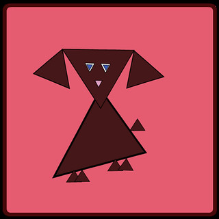
And also, I’m very proud of this assignment I did for Minimalize your Philosophy.

Dumbledore

I’m going to give myself a pat on the back for these, because not only did I greatly enjoy doing it, I’m very pleased with the final product, and also another pat on the back for bragging to all my fellow staff members about how much better my online summer class is than their boring history, econ, etc., classes.

Also, on another note, I did some stuff with CreativeCommons this week, including changing my flickr account to BY-NC!!

Until then,

KG

Week 4: Design

Sunday, June 17th, 2012

Dear Mom and Dad,

This week at camp I learned about Design. We started with the basic elements of designs: color, typography, balance, rhythm, proportion, symbols, minimalism, function, and unity.  After an introduction to the basics of design, we were sent off in search of real-life examples. It opened my eyes to how we are literally surrounded by design 24/7. Our brains process design, subconsciously picking out the individual elements yet we never stop to actually think about the design and how it tells us a story.

Also, while learning about design, we were sent off to investigate Creative Commons. An organization that is devoted to open online sharing. They allow creativity and learning to span across the globe through the internet like it should. I not only learned about Creative Commons, but about who uses CC and how they use it.

This week, I dove into design. I found it eye-opening to how much can be expressed through design. Looking back, my favorite assignment this week was Illustrate a Catchphrase. I had so many ideas and just couldn’t stop myself. I love to play with symbols and illustrations, so to me, this assignment fell from heaven.

I am throughly exhausted! Yet, I am still strangely energized for next week. Bring it on because I can’t wait!

Excitedly yours,

Jolie

My life; My Safari

Sunday, June 17th, 2012

Color 

Color Creates Mood. Draws Attention To Key Elements

I decided to use a stop sign. First off, the color of the stop sign is bright red. I assume that the reason why a stop sign is read is to capture the drivers attention. As the quote above said, “draws attention to key elements.” The stop sign is indeed a key element when it comes to driving. Missing a stop sign can lead to fatal outcomes, so I believe that a stop sign is a good display of color.

Typography

The Visual Component Of A Word

I know this is very feminine, but the Always writing was something that I always found intriguing. First of all it uses some type of cursive, but it’s not regular old cursive. This type of cursive doesn’t connect all of the letters, it only connects to at a time.  For example the AL is connected, the WA is connected, but the Y and the S stand alone. Although, it’s a weird type of cursive, the way it looks is perfect. Something about the writing style captures your attention and it makes you wonder why it is the way it is.


Metaphors/Symbols

Using Symbols to Represent Objects, Things, and Ideas


This is one of my favorite shirts. I got it about 2 month after Michael Jackson died. This shirt’s creativity is simple but amazing at the same time. First of all, the shirt only says “Michael Jackson” but the A in Michael, and the S in Jackson are very different. The creators of this shirt uses images of Michael Jackson to display letters. In my opinion, those images make the shirt so much more attractive. When I wear this shirt, people STILL to this day, compliment me on how cute my shirt is.


Minimalism / Use of Space

Doing Less With More


This is my flat screen t.v with a dvd player attached. Now no more than 20 years ago, Tv’s had big backs and most times you had to buy a dvd player separate from your tv. But now, in 2012, they have flat screen tv’s with dvd’s connected. I think this is one of the best inventions ever. Not only does the tv take up less space, but it is easy to carry and I don’t have to buy a separate dvd player.

Creative Commons

Sunday, June 17th, 2012

In my research on Creative Commons, I was surprised that I hadn’t heard of it. CC is a non-profit organization devoted to providing free and easy to use legal tools that work with copyright laws to reach the full potential of the internet. This enables anyone to share their work, while allowing other to use, share, and build upon the work.

I found that there are many fields in which CC can be used.

Creative Commons allows someone to change the default copyright terms from “all rights reserved” to “some rights reserved.” They do this by several different licenses that are tailored to how you want others to use your work.

  • Attribution
  • Attribution-ShareAlike
  • Attribution-NoDerivs
  • Attribution-NonCommerical
  • Attribution-NonCommerical-ShareAlike
  • Attribution-NonCommerical-NoDerivs

All licenses are based on attribution the original creator of the work. Certain licenses are based on being used by noncommercial purposes. While others are based on not being altered from the original. Learning about all the different licenses, in the future, I would choose to license under the Attribution License. It is the most open license and I have no qualms about allowing things I create being used commercially as long as I am credited for what they borrowed from my work.

In researching Creative Commons, I found that the two most useful websites were http://www.creativecommonsza.org/ and http://creativecommons.org/.

Everyday Safari

Saturday, June 16th, 2012

I found the different elements of design interesting. Some where obvious, but others elements I wouldn’t have thought of when it comes to design and how many different designs surround us every single day. Here are a few that I found on my Safari this week.

Color

This is a watercolor drawing that my step-sister did years ago. In a way, the drawing is a manual color splash. The way she uses color is definitely effective because it draws you to a single leaf, forcing you to look at what she wants you to see.

Symbols

Such a simple symbol, yet it is so well-known that it can mean many things. This symbol represents a business, an industry, products, ideas, and people. When I see this tiny image, I think, Apple… technology… iPhone… iPod… iTunes… Macbook… Macintosh.. .knowledge… speed… performance… style… Steve Jobs… the future… All that in just an image. Because it is internationally known, this symbol is very powerful and effective at representing ideals. Not only the ideals of the decision makers of Apple Inc., but also the ideals of those who own Apple products.

Minimalism

This is a perfect use of space as well as an elegant design. It is simple and nothing extraneous is featured. There are no embellishments or textures which creates a sleek look and makes the keys stand out. This design is so striking because it is so uncomplicated. It serves its function without any unnecessary additions, while simultaneously showing the world that sleek and simple is elegance.

Function

Here are several different designs for doorknobs. Yet, none of them are being used their design intended. They were designed to be turned and used for opening doors. However, these have been recycled into coat hooks. The design has not changed, yet the function and the message they send are different. The message, as they were designed, was this family has money, style, and class. Now, the message means this family is creative, thrifty, and busy.

Balance

This design shows us the element of balance, specifically, symmetrical balance. As a whole, the balance creates a pattern that makes the piece look stylish. It also pulls attention to the ends and the center of the board. Taken in parts, it shows us how balance creates our thoughts on physical structure.

Proportion

Someone obviously made a mistake in the proportions of this design. There is only a quarter inch of space between the door and the stairs when the door swings open. There was no thought put into the dimensions of the design. The relationship between the door and stairs was not considered in the real world, when someone needs to stand at the bottom of the stairs and then open the door. This picture shows us how important proportions truly are to design.


Apocalypse Anyone?

Saturday, June 16th, 2012

Design Assignments 473—Otherworldly Distortion (1 star). Take a picture of a geographical location on earth and try to alter or distort it to make it seem like its from a foreign dimension.

Apocalypse Anyone?

This was a fun and easy assignment. I started with another photo I took yesterday in the mountains of Virginia. With Picasa, I played with different filter effects until I found one with a “foreign dimension” impact. The winner was the “heat map” filter. Cool colors. I think it creates an interesting, colorful image of a post-apocalyptic world!

Triangle Dog

Saturday, June 16th, 2012

I chose to complete the Triangle Animal Assignment. Of course, I decided to make a dog out of triangles. My favorite animal is really a turtle, dogs are second best, although I wasn’t really sure how to go about making a turtle out of triangles! With the help of the camp packing list, I chose to use the web-based vector editor called Raven (by Aviary). I have found Aviary to be a really cool site and I plan to use it for many assignments in the future. In addition to the image editor I have used for my visual assignments, along with the vector editor I just mentioned, Aviary also offers a swatch editor, an effects editor, and an audio editor, just to name a few. I can’t wait to continue exploring what the site has to offer.

While doing this project on Raven, I mostly used the “Create Spiro Path” selection, then chose the polygon and edited the vertex count to 3 in order to make triangles. I resized them, arranged them the way I wanted, added a little bit of color, and this is what I came up with:

Triangle Dog

Jackson Pollock Ă  la Marcey

Saturday, June 16th, 2012

For my first design assignment, I chose to make my own Jackson Pollock painting! I started off by looking Jackson Pollock via Google Images so I could get a better feel for his style. I decided I wanted to use a program like told-school Paint that I used to spend lots of time on back in the day on my huge desktop computer! I completed another Google search for an online version of Paint and I discovered Paint Online. Basically, I just splattered paint around and did my own thing. I experimented with lots of different colors and brush sizes. I had a great time with it, too. I felt like a kid again- no limits! But I also felt like an adult in the sense that no mess came out of it…that’s the best kind of fun!

Make Your Own Jackson Pollock

Create A New You

Saturday, June 16th, 2012

For this assignment, I went back to the handy dandy camp packing list, per usual! When I used PicMonkey for my first visual assignment, I noticed that there were many photo editing tools which could potentially be used to “improve” one’s appearance. I started off with a photo of myself and uploaded it to the free, web-based photo editing site, PicMonkey.

Create A New You: Original

(Original photo)

I did the typical edits, such as sharpening and cropping. Then, I selected the “Touch Up” editing tool on the site. It is represented by the lipstick tube symbol. I experimented with all of the effects. Under the “skin” touch-ups, there is a blemish fix, airbrush tool, wrinkle remover, shine reduce, blush boost, and spray tan. The “mouth” touch-ups include teeth whitening and lip tint. When I first whitened my teeth, it reminded me of an episode of Friends where Ross overly whitens his teeth for a date. It was almost scary looking! Who knew teeth could ever be too white?!

The “eye” touch-up tools include eye brightening, mascara, eye tint, and red eye remover (I did not use because I had previously dered my eyes in the photo). And finally, “the rest” of the touch-up tools included weight loss, highlights, and clone (something I also did not use).

Create A New You: Edited

I tried to implement all of the touch up tools at least a little, though I used some more than others. For instance, I used the spray tan and blemish remover. Though my eyes are naturally blue, I believe they were originally red in the photo, so I edited it with red eye removal, making my eyes dark and somewhat colorless. My eyes are not naturally as blue as they are in the edited photo, but I thought it was cool to see what it might look like! Honestly, I think I look really fake in the edited photo, but it was worth a try! Maybe I just didn’t do a good job editing ;)

Mother Nature’s Mountain Rhythm

Saturday, June 16th, 2012

Mountain Valley

This is a photo I took yesterday on our way back from Lexington. This beautiful mountain valley scenic overlook off of I-64, showcases Mother Nature’s design rhythm. The majestic, tree covered mountain range has a fluid movement about it, with it curves, evaluations, and spacing. It tempts your eyes to flow the curves, texture of the trees, and shapes of the mountain, with color variance aiding in the guidance of the viewers vision. You are so engrossed in taking in the rhythm of the view, that the white house in the foreground is almost an afterthought!