Archive for the ‘bunk4’ Category


Lost Mail

Friday, June 15th, 2012

Dear Family of Jolie Thomas,

We, at the pony express, deeply regret that your mail has been delayed in reaching you. The pony that was carrying the letters addressed to you got lost and was only found recently. We hope that these letters find you well and the delay has not caused you any unwarranted worry or concern.

Our sincerest apologies,

The PonyExpress


Dear Mom,

I know that you hated to drop me off at camp. Don’t worry I am excited and everyone is really nice here. It is a bit crazy as everyone is getting settled in here at camp and set up in the bunkhouses. I belong to Bunkhouse #4, just in case you want or need to send something. Something like, the flashlight I forgot to pack. It gets creepy here at night and there is no indoor plumbing (in true camp fashion). Give my love to everyone and make sure that my dearly loved sibling stays out of my room. I set up my domain and cannot wait to learn what we will be doing at camp.

Miss you already,

Jolie


Dear Mom,

This week at camp we learned about story-telling. Simple, you say? Not so dear mother. There many different ways stories can be told, shared, and visualized. Especially, in this new age of everything digital and instantaneous. My favorite lesson this week was the Shape of Stories, the lecture was told by Kurt Vonnegut. He explained how you can show the shape of a story based on the events and plot line of the story. It was a fascinating topic that I truly enjoyed. I can’t wait for next week! I miss you tons. By the way, my bunkhouse is now called Slaughterhouse 4. So, please send me my flashlight. I need it desperately because I got lost on my way back from the mess hall one night and ended up near some toxic waste disposal center. I will have you know that it took me forever to get clean.

Cleanly yours,

Jolie Thomas

Must the sky be blue?

Friday, June 15th, 2012

Use creative commons licensed images to design a poster about how groovy Creative Commons is!

Using Compfight, I found this photo by Ross Webdale. I added text and the Creative Commons icon in photoshop.

I chose the back ground image because ever since I was a small child, coloring has been a fun and most times therapeutic hobby. I was taught how to color by my grandmother. I remember her sitting me down on the floor with a coloring book and large bucket of crayons. She instructed, “Now, be careful, stay inside the lines.” Yet, the joy of a creative mind is finding ways to purposefully stray outside those lines. Rebel against what is normal. The whole premise of Creative Commons is a community that creates new things and shares their creativity with the world. So why should we color inside the lines, stick to the mainstream notions that the sky is blue, and bottle the creative juices inside?


Toucan Sam?

Friday, June 15th, 2012

Take one of your own photographs, one from Flickr Creative Commons or one from the DS 106 Flickr group and caption it.

I used a picture that I took last year for this assignment. In Word, I used Word Art to create the caption. Then, in Photoshop, added the two together.

This picture was from a family vacation to Panama. We were driving out to a rural coastal town and stopped at an open air restaurant on the way. Surprise, they had toucans! I was fascinated because I had never actually seen a real toucan before. The toucans, however, were more fascinated by the skirt I was wearing. The caption came to me instantly. If I think of toucans my mind immediately goes to Toucan Sam and his Froot Loops. Now, with the caption in place, the entire meaning of the picture has changed. The attitude of this avian went from inquisitive to impatient. Obviously, Toucan Sam also has relatives that he doesn’t like to talk about.

Week 4 – The Creative Commons Poster

Thursday, June 14th, 2012

cc licensed ( BY NC SA )  flickr photo shared by WadeB

We are very busy this week at Camp McGuffin, with design assignments, the Design Safari, the research on Creative Commons and all the readings we need to do.

I am also really, really busy at work, so I’ll keep this post short.

The picture you see above is the one I chose for my Creative Commons Poster. In this assignment, our task was to use a Creative Commons licensed image to design a poster about how cool Creative Commons is.

I started with the image above and, using Pic Monkey, I created this:

Creative Commons Poster 2

I tried to make that outer frame similar to the inner one. I hope the message is clear – this is what I feel Creative Commons can do for you if you CC your images or lesson plans. If they appear on other people’s blogs and Facebook profiles and the attribution leads back to you, more people will see your work. Isn’t that what the internet is all about?

Thank you, Creative Commons, for being there for all of us. And big thanks to everybody who decides to share their work with others through a CC licence.


Mission: ds106 – lyric typography poster design assignment

Thursday, June 14th, 2012

Inspired by several campers’ lyric typography posters (2 stars), I decided to go back to this assignment. I passed over it during my design sprint because the first few ideas I tried didn’t work – I wanted to do something purely typographical with the background color being the only non-textual adornment. I couldn’t pull it off by myself. I didn’t really get the examples, which looked good, but didn’t always marry the lyrics and designs in ways I could grok.

My subconscious kicked around a few ideas – I wanted to do something with Radiohead; I played our Florence + the Machine CD on today’s drive to Grammy and Poppy’s.

Here’s what I came up with while working entirely in Acorn.

Florence + the Machine

Florence + the Machine

First, I tackled this Florence + the Machine poster. I had originally thought about using inverted carrots to make teeth for the dog days, but then I decided to try coding some impact into the poster. I used a bold Rockwell font to lend weight and vibrancy to happiness and a few other bits of text. I threw in a bracket and a wide-stanced Bank Gothic font for the hit. I used Cracked (always stop at 3 fonts, Chad!) for “bullet” and rotated some forward and backward slashes to suggest a spider-web of stress fractures from a bullet hole in the middle of the “b”. I also left “bullet” in all lower case to contrast it against the other lines of text which are all capital. Finally, I kerned the last line to -12 (I go past the absolute value of 11) so I could have the text wind back on itself and fit the bottom of the page. I also split it into “in the b” and “ack” so I could make it wind back in a less predictable way. I like the gap. I think it helps punctuate a kind of hard return and possibility of escape up or down the page in the recursive loop that the last line creates. Maybe that’s where the happiness-bullet hole is.

I also worked on a Radiohead poster combining the colors and sans-serif-ness of the In Rainbows album typography (I used a bold Euphemia UCAS font) with lyrics from “Fake Plastic Trees.”

I decided to repeat the line about the town getting rid of itself, omitting one word per iteration so that the quote would get rid of itself. I put the text in a box that takes up most of the page, sized the text to fill the box, and let the line breaks take care of themselves to approximate the random aesthetic common to many pieces of Radiohead art and web design. I love the way the last line doubles itself while disappearing itself. The last bar of background is white to complete the vanishing and create some ambiguity about whether or not there is anything there in an invisible, white font.

Here’s the poster:

Radiohead

Radiohead

I’m very glad I found a way back into this assignment. Thanks, ds106 campers! Learning in community!

In gratitude, let me share this wicked pair of multi-layer stencils of Thom Yorke that a student did as a learning project this year.

Thom Yorke stencil art from a learning project

Thom Yorke stencil art from a learning project

Picture Riddle Me This

Thursday, June 14th, 2012

Come up with a riddle, or even an every day phrase, and use basic pictures or icons to lay it out.

Picture Riddle

I created this in Word by inserting the images. After each insert, I went under Wrap Text and chose Tight. This allows the image to be moved around the page, rather than be treated like regular text. To upload the file, I saved it as a PDF.

As a kid, I loved these picture riddles. I had worksheets full of them. I got really excited doing this assignment because I had so many phrases that I was already converting into picture riddles in my mind. This one happened to be my favorite. I won’t give away the answer, but it should be pretty easy for any of you that love anything to do with the final frontier.

To Dwell on Dreams

Thursday, June 14th, 2012

I can openly acknowledge my love affair with the Harry Potter series, and both books and movies alike, I can’t get enough. As I worked on this latest design assignment I was watching a special on the Harry Potter movies, which moved me emotionally because of the story itself, as well as reminiscing on the frustration that I never received my owl.

I chose the Minimalize Your Philosophy assignment which I saw for the first time on Chad’s blog. I loved the assignment for the simplicity and another opportunity to play around with typography. I’ve got a book of favorite quotes longer than the HP series (because the entire series counts, but regardless), so this assignment let me open it up and pick one.

But! This quote, reminded me that despite not being magical, It does not do to dwell on dreams and forget to live.

Dumbledore

I played around with the colors in this for a while, but I eventually chose a pale yellow and blue because they felt dream-like. I needed something in the blue space, so I put three yellow dots and then I changed the opacity on each to increase, as if the clarity of the speaker is also increasing. I wanted the “forget to live” to stand out, because it is the main premise of the quote.

I feel like I try to live by this quote. It isn’t the most spectacular like Shoot for the stars or If you can dream it you can achieve it. To me, it isn’t about what could be, or what we shoot for in our lives, because if we, for whatever reason, aren’t able to reach our ultimate goals of doctors and lawyers, so long as I can look back and have had the time of my life getting where ever it is I eventually end up, that’ll be OK too. Don’t get me wrong, it’s good to have dreams! But don’t let the obsession of the goal obscure the path you take.


Zazzy Does Minecraft

Thursday, June 14th, 2012

Don’t go in the sky.

Click here to view the embedded video.

Wait, is that Lindsey Lohan?

Thursday, June 14th, 2012

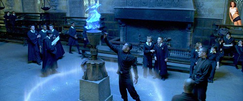
“Wait, Where’d that guy come from?” I thought would be fun to do and apparently so did a lot of other people! I decided to clash Harry Potter and the Goblet of Fire with the infamous Lindsey Lohan doing one of her sexy poses. Try and find her!

HarryPotterandLL? © by katherinekd101katherinekd101

I uploaded each image to Photoshop and reduced the size of Lindsey Lohan to make her squeeze into the frame. I then used the “Lasso” tool to get an exact cutout of her body and face to copy and paste into the image of Harry Potter and classmates circling the Goblet of Fire.


I chose to do Harry Potter because I am a Harry Potter fan/geek/way too obsessed with the books and movies. It only seemed appropriate. I chose Lindsey Lohan because she has been notorious for stealing the medias attention in the past years with “scandalous” stunts. So who would be better to steal the attention from this great scene?

Image can be found on my FLICKR account :)

http://www.flickr.com/photos/79114434@N05/

Cartoon me! (comparisons involved)

Thursday, June 14th, 2012

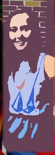
cartoon me © by katherinekd101

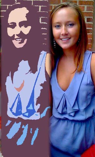
cartoon comparison © by katherinekd101

I edited this photo through Photoshop by playing with a filter called “Cutout” under Artistic filters. I then adjusted the Brightness and Contrast of the image so it still had texture and that “comic book cartoonish” feeling.


I chose this image in particular because I am wearing a blue dress (really there is a pattern here) with great textures that I thought would compliment being a cartoon character very well. I chose this assignment in particular because honestly it was always been a secret of mine to know what I would look like as a cartoon character/drawing.

Both images can be found on my FLICKR account :)

http://www.flickr.com/photos/79114434@N05/